GEE(4):计算两个变量(影像)之间的相关性并绘制散点图
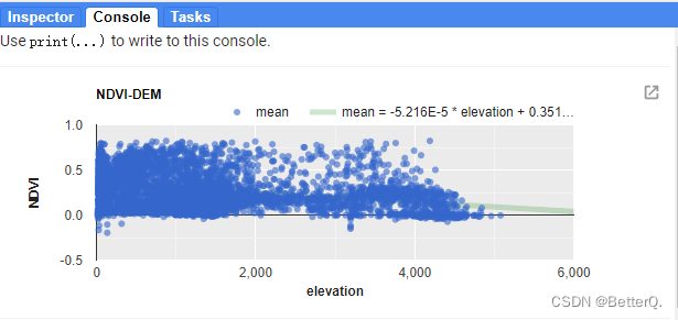
最近使用Google Earth Engine(GEE)分析了一下高程和NDVI的相关性,并绘制二者的散点图,计算其决定系数。
计算时主要用到了GEE中的图表 ui.Chart.image.byRegion(),将研究区域内的高程和NDVI的散点图先绘制出来,再添加趋势线,计算决定系数,就可以知道二者之间的相关性有多高。
NDVI-高程散点图及决定系数计算实现代码如下:
//研究区域,可自己绘制或导入
var roi = /* color: #d63000 */ee.Geometry.Polygon([[[104.34385678174718, 27.233899188878446],[114.80284115674718, 28.477166904461537],[117.52745053174718, 34.61402019968164],[111.99034115674718, 40.99546927185892],[95.11534115674718, 37.87379212761336]]]);//导入 DEM
var DEM=ee.Image("CGIAR/SRTM90_V4").reproject('SR-ORG:6974',null,500);
//从DEM中抽取样本点,这里选取500个
var rroi = DEM.sample({region: roi, scale: 30, numPixels: 500, geometries: true});//导入NDVI数据
var ndvi=ee.ImageCollection('MODIS/006/MOD13A1').filter(ee.Filter.date('2020-01-01', '2020-02-01')).first().multiply(0.0001);// 设置图表属性,包括样式颜色等
var chartStyle = {title: 'NDVI-DEM',hAxis: {title: 'elevation',titleTextStyle: {italic: false, bold: true},gridlines: {color: 'FFFFFF'}},vAxis: {title: 'NDVI',titleTextStyle: {italic: false, bold: true},gridlines: {color: 'FFFFFF'},},pointSize: 4,dataOpacity: 0.6,chartArea: {backgroundColor: 'EBEBEB'},//添加趋势线trendlines: {0: {  // add a trend line to the 1st seriestype: 'polynomial',  // or 'polynomial', 'exponential'color: 'green',showR2:'true', //show R2 cofficientlineWidth: 5,opacity: 0.2,visibleInLegend: true,}}
};//绘制散点图
var charten=ui.Chart.image.byRegion({image:ndvi.select('NDVI'),regions:rroi,reducer:ee.Reducer.mean(),scale:500,xProperty: 'elevation'});
charten.setChartType('ScatterChart').setOptions(chartStyle);
print(charten)
结果如图所示:
.
.
.
.
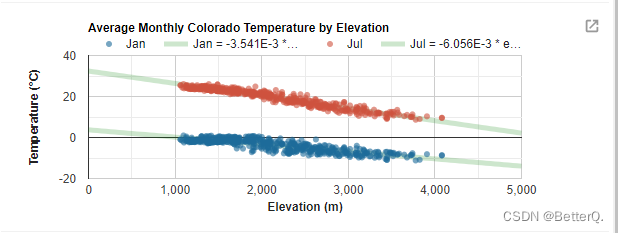
这里还做了温度和高程之间的关系,实现代码:
// Load SRTM elevation data.
var elev = ee.Image('CGIAR/SRTM90_V4').select('elevation');// Subset Colorado from the TIGER States feature collection.
var colorado = ee.FeatureCollection('TIGER/2018/States').filter(ee.Filter.eq('NAME', 'Colorado'));// Draw a random sample of elevation points from within Colorado.
var samp = elev.sample({region: colorado, scale: 30, numPixels: 500, geometries: true});// Load PRISM climate normals image collection; convert images to bands.
var normClim = ee.ImageCollection('OREGONSTATE/PRISM/Norm81m').toBands();// Define the chart and print it to the console.
var chartte = ui.Chart.image.byRegion({image: normClim.select(['01_tmean', '07_tmean']),regions: samp,reducer: ee.Reducer.mean(),scale: 500,xProperty: 'elevation'}).setSeriesNames(['Jan', 'Jul']).setChartType('ScatterChart').setOptions({title: 'Average Monthly Colorado Temperature by Elevation',hAxis: {title: 'Elevation (m)',titleTextStyle: {italic: false, bold: true}},vAxis: {title: 'Temperature (°C)',titleTextStyle: {italic: false, bold: true}},pointSize: 4,dataOpacity: 0.6,colors: ['1d6b99', 'cf513e'],trendlines: {0: {  // add a trend line to the 1st seriestype: 'linear',  // or 'polynomial', 'exponential'color: 'green',showR2:'true', //R2 cofficientlineWidth: 5,opacity: 0.2,visibleInLegend: true,},1: {  // add a trend line to the 1st seriestype: 'linear',  // or 'polynomial', 'exponential'color: 'green',showR2:'true', //R2 cofficientlineWidth: 5,opacity: 0.2,visibleInLegend: true,}}});
print(chartte);
.
结果如图:
.
.
.
.
以及绘制植被指数随时间变化的曲线图:
// Import the example feature collection and subset the glassland feature.
var grassland = ee.FeatureCollection('projects/google/charts_feature_example').filter(ee.Filter.eq('label', 'Grassland'));// Load MODIS vegetation indices data and subset a decade of images.
var vegIndices = ee.ImageCollection('MODIS/006/MOD13A1').filter(ee.Filter.date('2010-01-01', '2020-01-01')).select(['NDVI', 'EVI']);// Set chart style properties.
var chartStyle = {title: 'Average Vegetation Index Value by Day of Year for Grassland',hAxis: {title: 'Day of year',titleTextStyle: {italic: false, bold: true},gridlines: {color: 'FFFFFF'}},vAxis: {title: 'Vegetation index (x1e4)',titleTextStyle: {italic: false, bold: true},gridlines: {color: 'FFFFFF'},format: 'short',baselineColor: 'FFFFFF'},series: {0: {lineWidth: 3, color: 'E37D05', pointSize: 7},1: {lineWidth: 7, color: '1D6B99', lineDashStyle: [4, 4]}},chartArea: {backgroundColor: 'EBEBEB'},trendlines: {0: {  // add a trend line to the 1st seriestype: 'linear',  // or 'polynomial', 'exponential'color: 'green',showR2:'true',lineWidth: 5,opacity: 0.2,visibleInLegend: true,}}
};// Define the chart.
var chart =ui.Chart.image.doySeries({imageCollection: vegIndices,region: grassland,regionReducer: ee.Reducer.mean(),scale: 500,yearReducer: ee.Reducer.mean(),startDay: 1,endDay: 365}).setSeriesNames(['EVI', 'NDVI']);// Apply custom style properties to the chart.
chart.setOptions(chartStyle);// Print the chart to the console.
print(chart);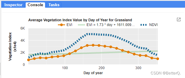
本文来自互联网用户投稿,文章观点仅代表作者本人,不代表本站立场,不承担相关法律责任。如若转载,请注明出处。 如若内容造成侵权/违法违规/事实不符,请点击【内容举报】进行投诉反馈!