前端利用div划分区域实战:猫脸动画
此次学习目标:学会利用div划分区域
通过过度效果、圆角来实现
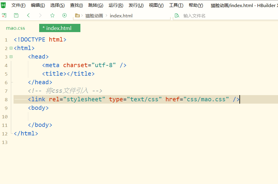
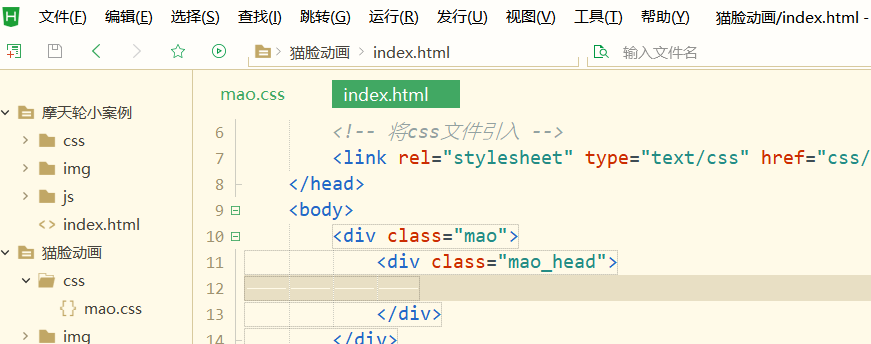
外部文件引入:在css包里创建css文件,在html里将css文件引入
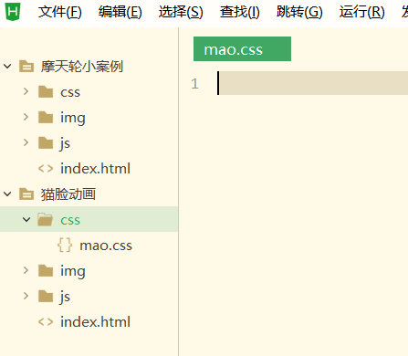
回到html(index.html)里引入css文件
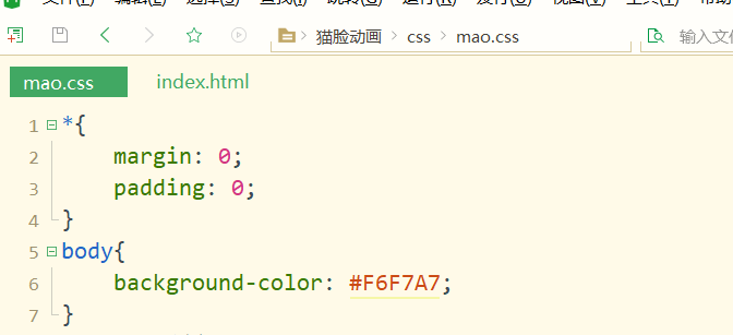
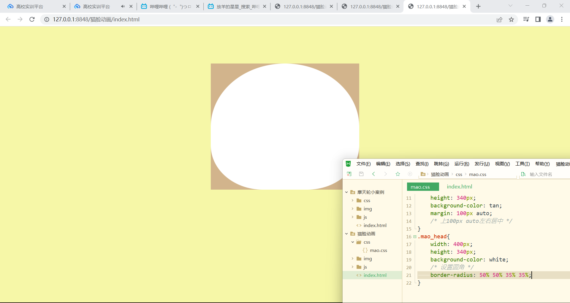
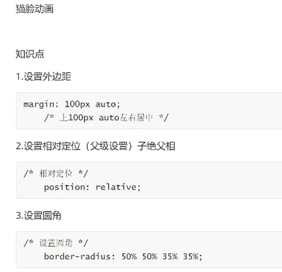
设置背景颜色:
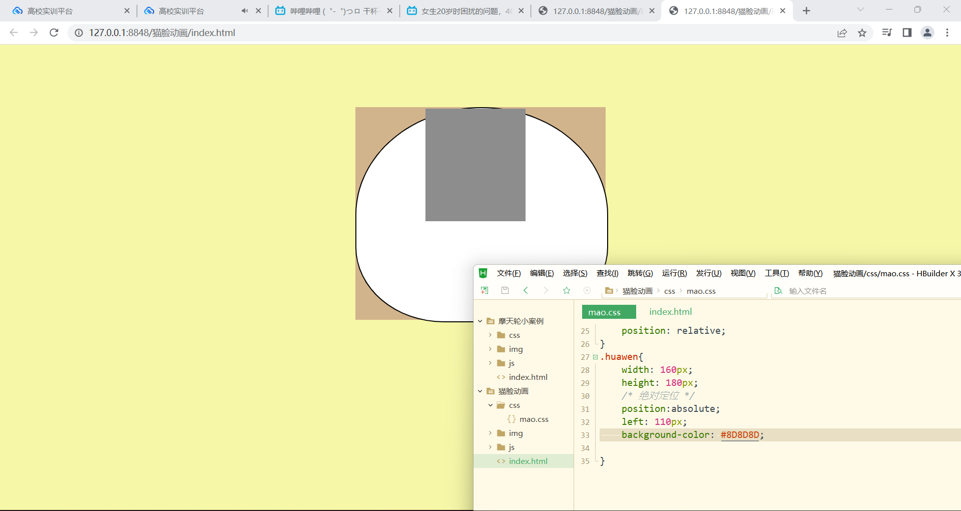
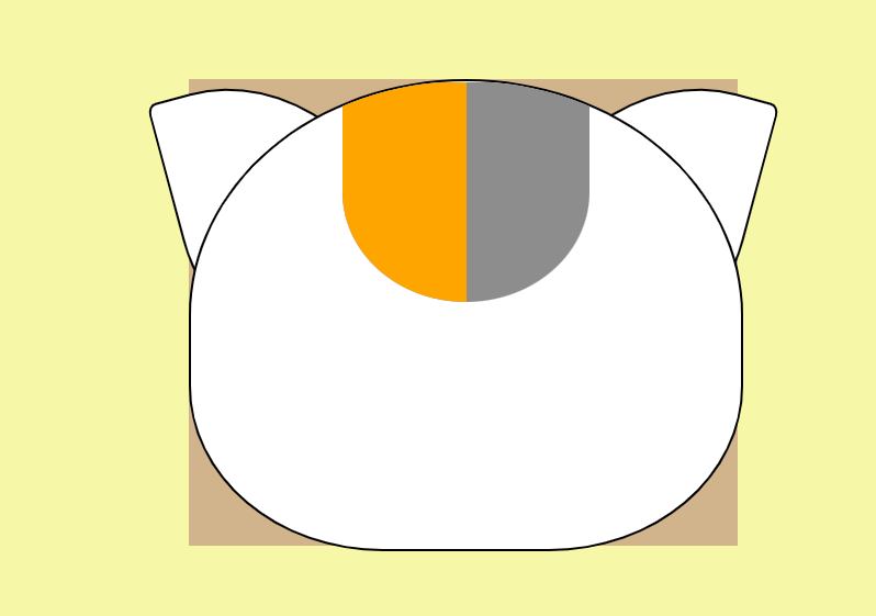
区域划分:
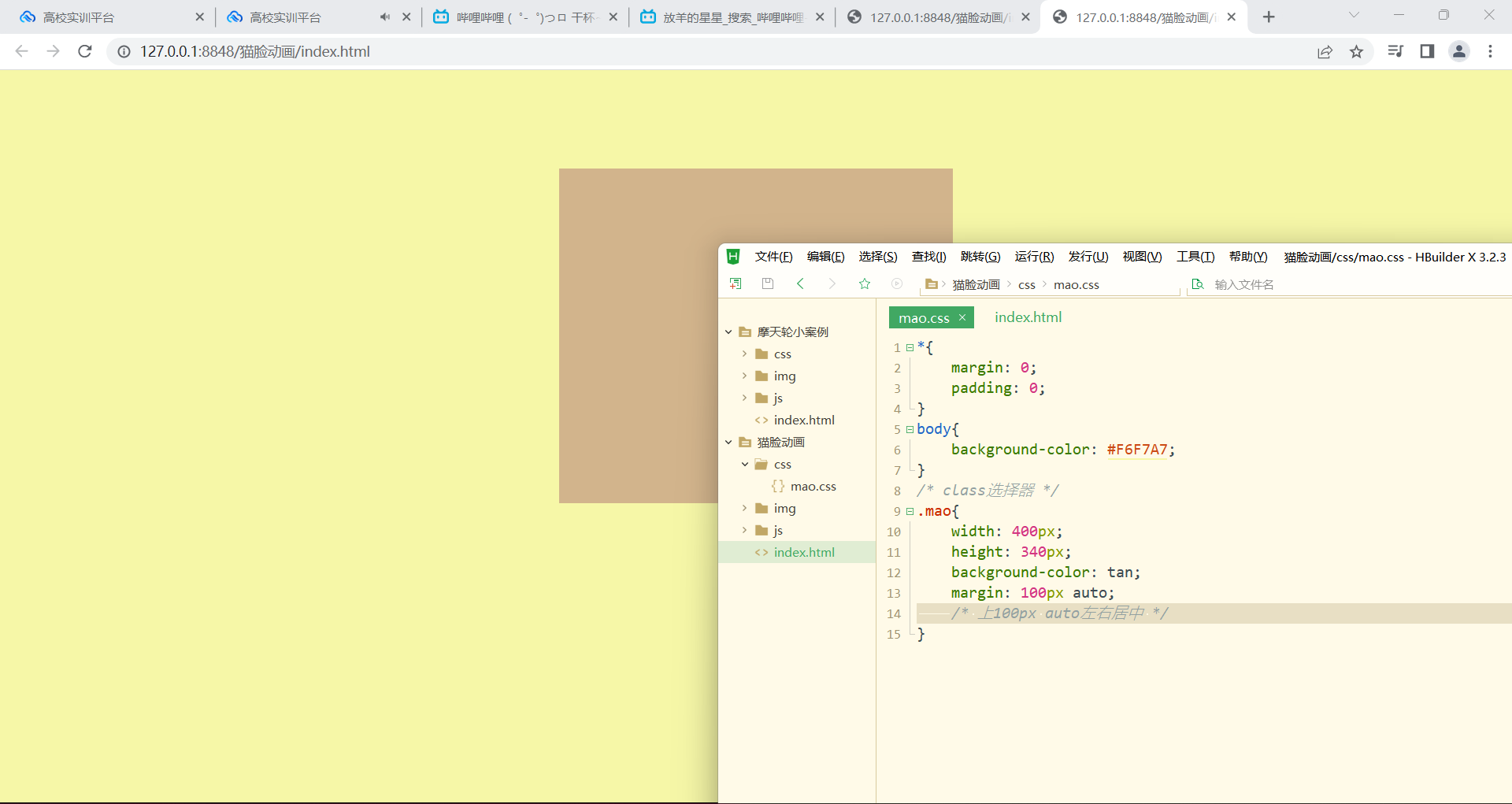
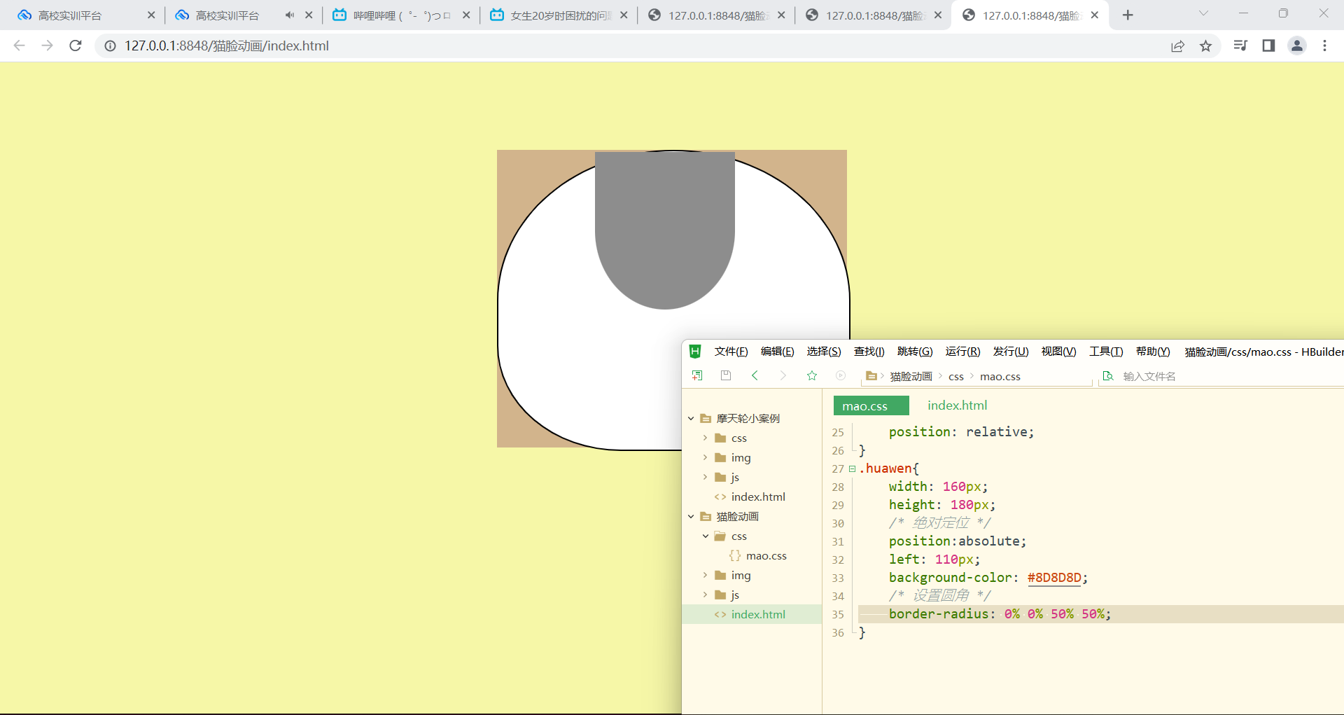
头:
设置圆角
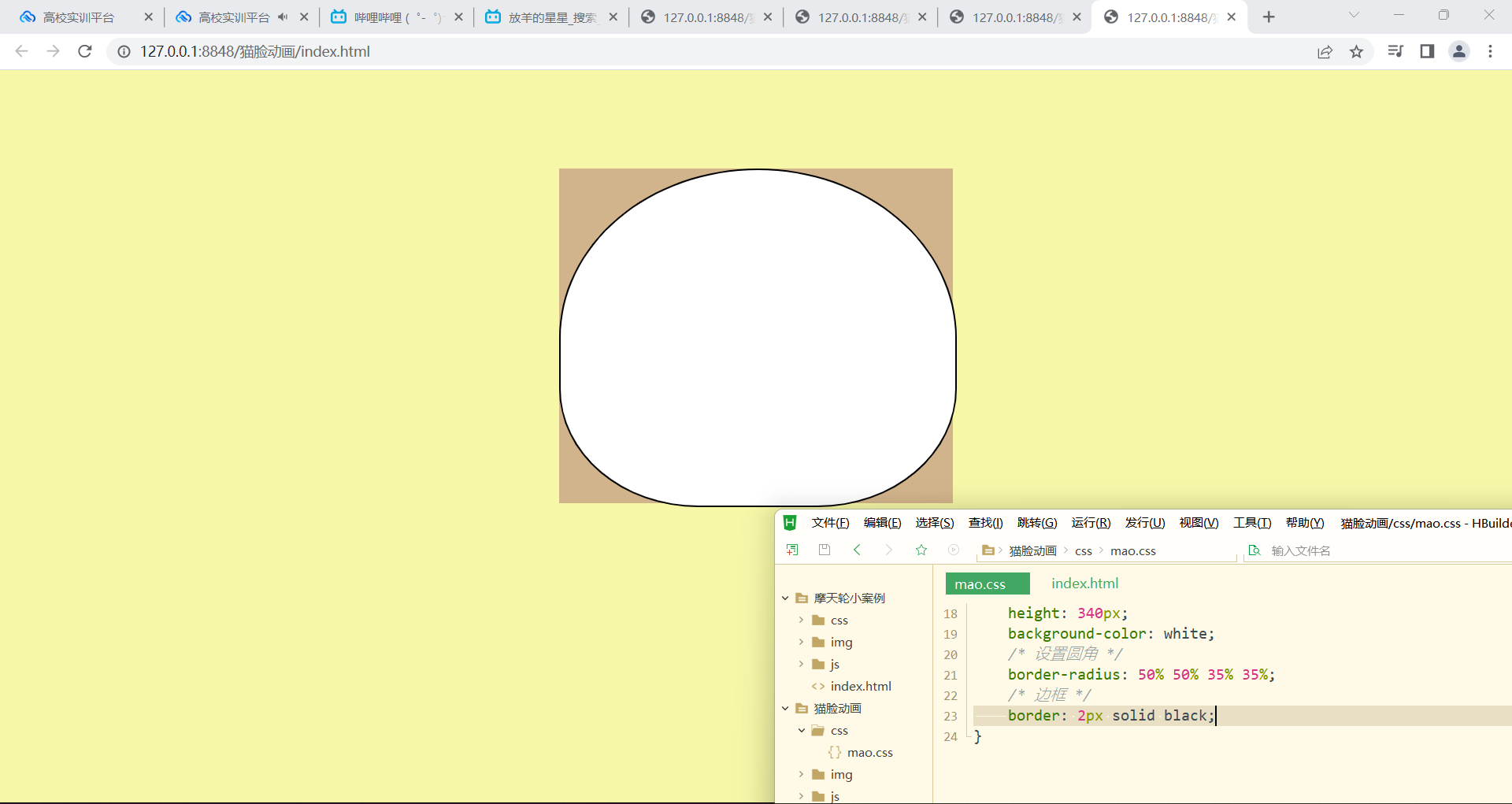
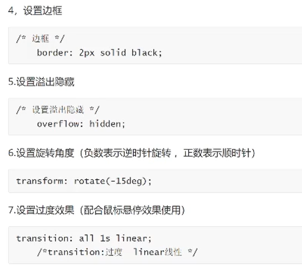
边框:
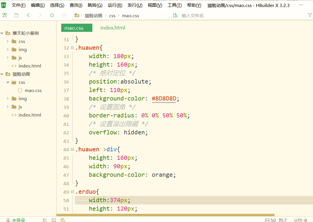
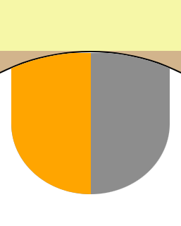
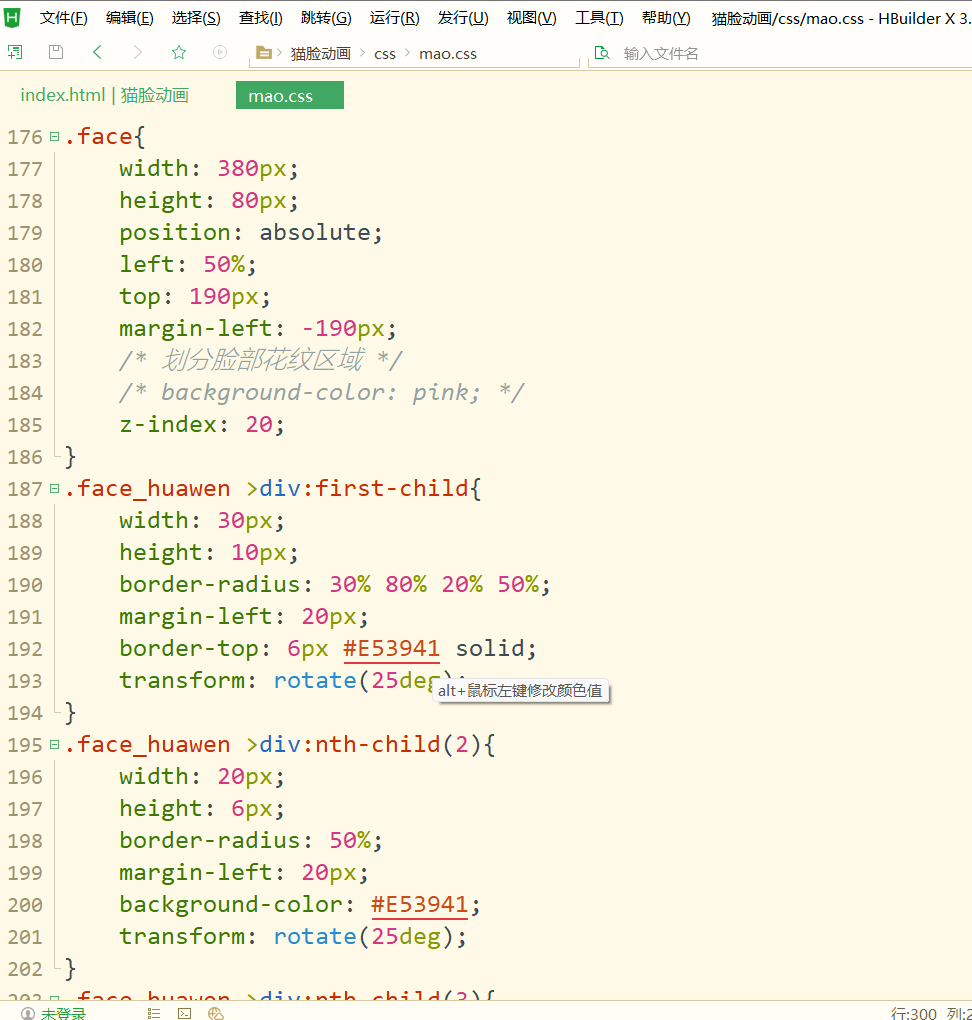
头上的花纹:
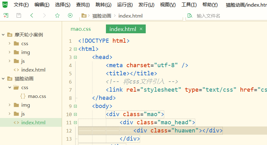
橘色花纹:
小知识:溢出隐藏:
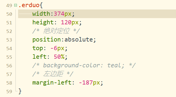
耳朵:
耳朵是和头同级的,并且分左右耳
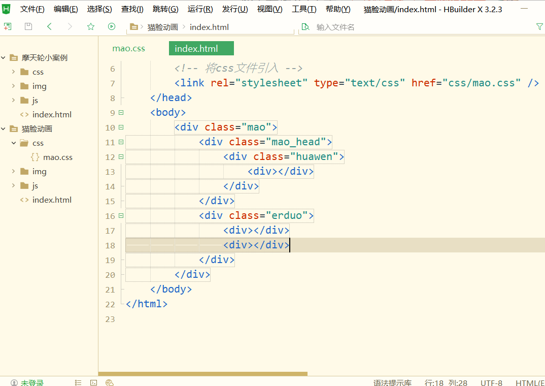
先划分耳朵区域
耳朵放在头后面,用到层级
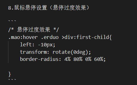
小知识点:悬停溢出效果:
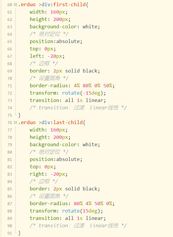
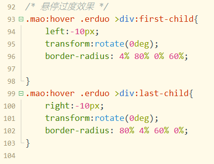
图这里的猫耳朵是会动的
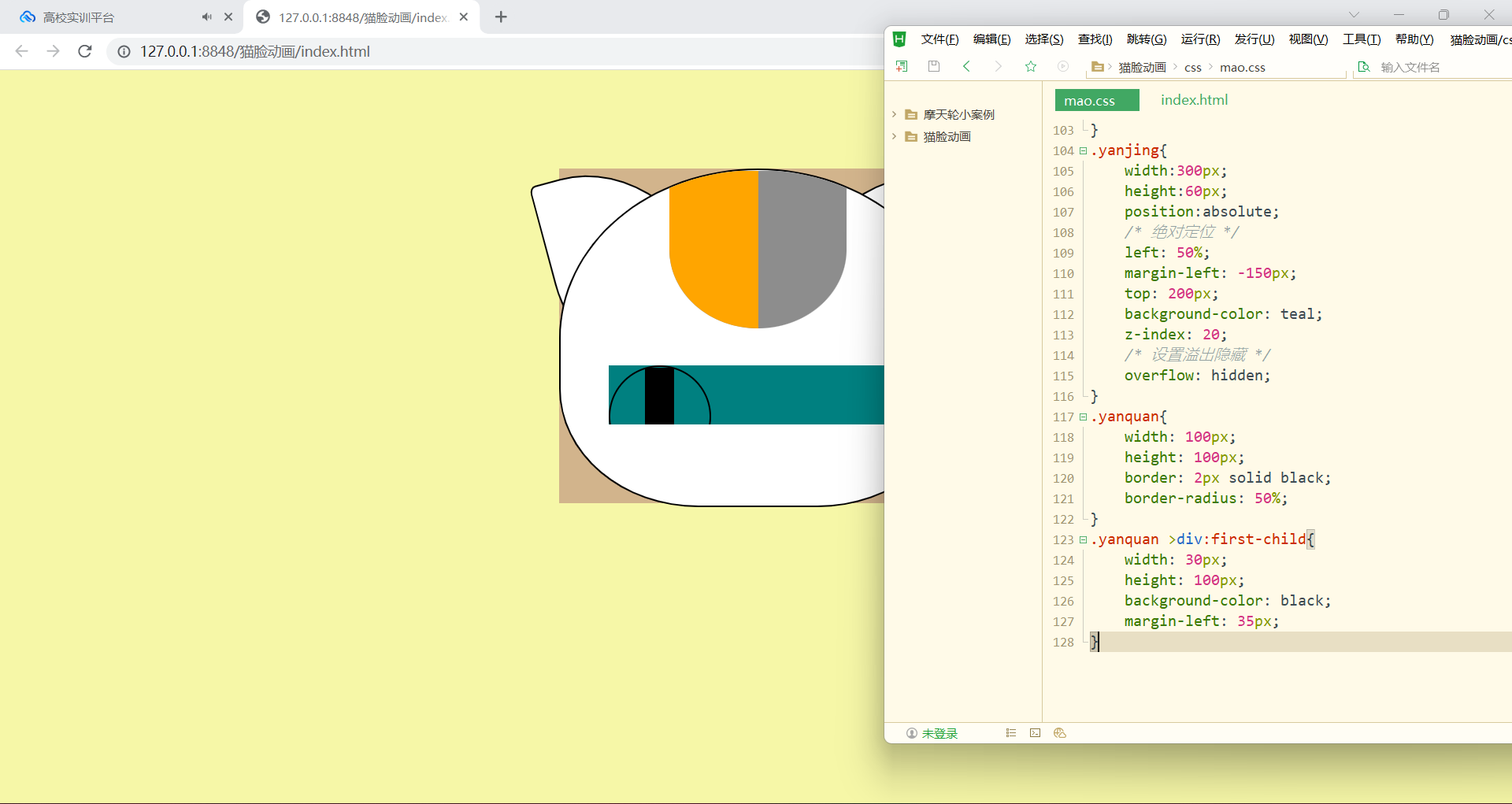
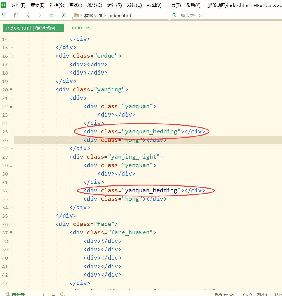
眼睛部分
也是在猫的区域里面,和耳朵和头部是同级
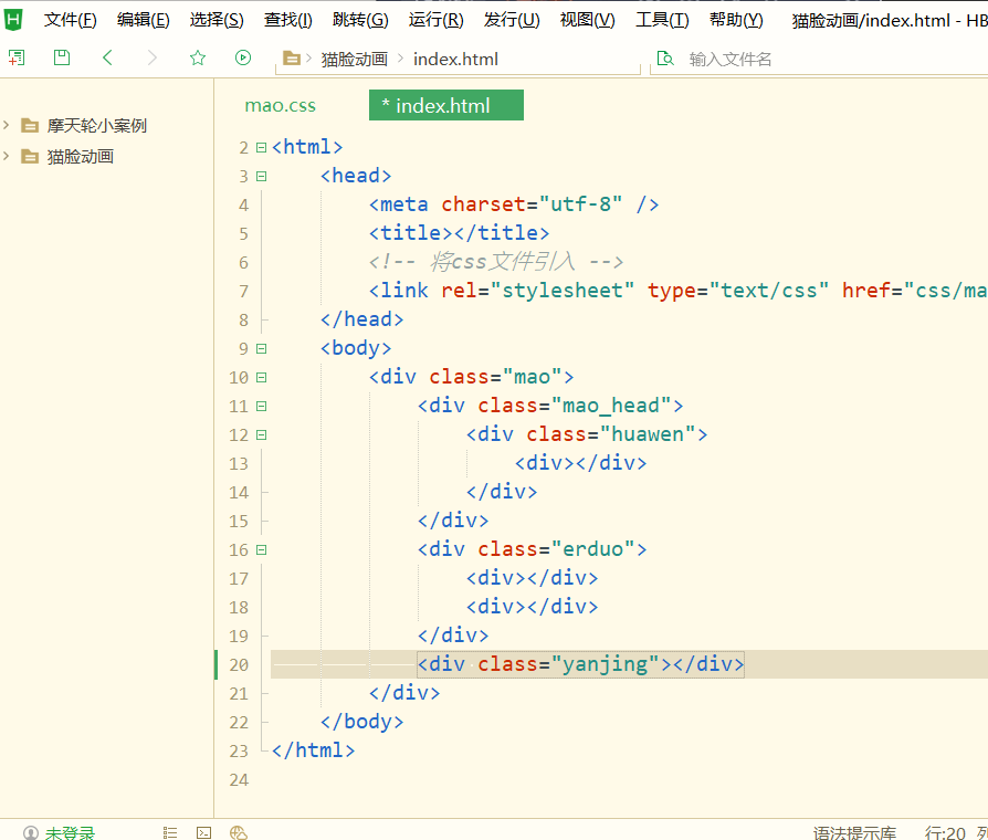
眼睛也是先划分出一个区域,再添加眼睛部分的操作
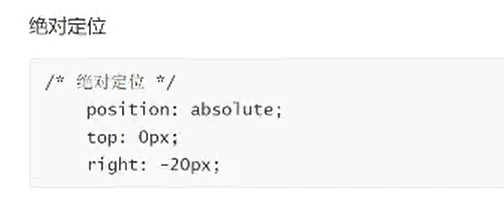
知识点:子绝父相
相对定位、绝对定位
相对于头部甚至的眼睛位置
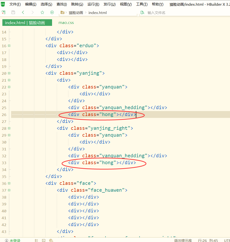
注意层级问题
先写左眼
右眼和左眼是一样的,写完左眼复制就好了,像图里的一样
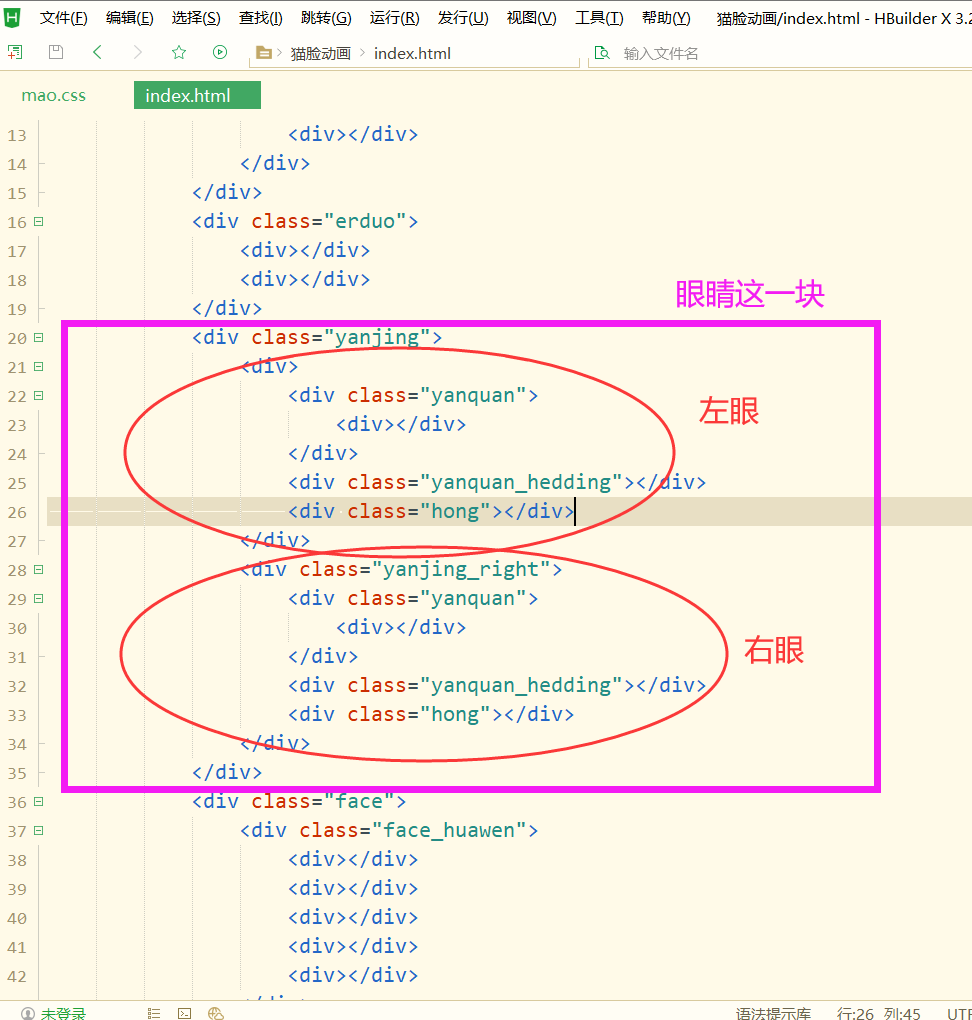
html里右眼代码可以和左眼一样,复制过来稍微改改,css里加下面这几行就够了
这里涉及到的知识点:子代选择器
复习:子代选择器、伪类选择器
眼睛溢出隐藏
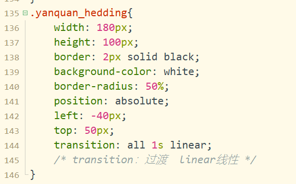
眼睛下眼皮静态效果
和眼圈是同级的
左右眼的下眼皮:
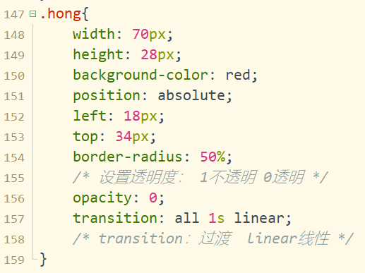
腮红:
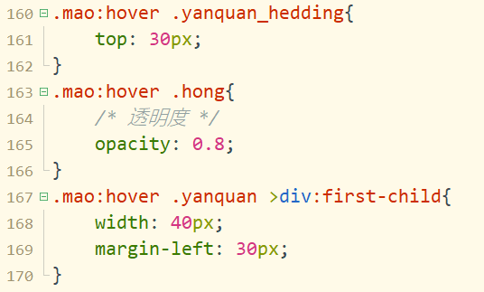
设置对应的动画效果
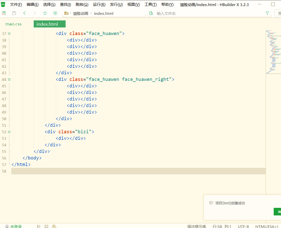
下眼皮变化;腮红变化,设置透明度腮红的渐现;眼瞳宽度变宽了;
下眼皮:去掉眼睛部分的溢出隐藏
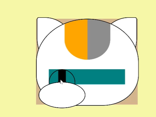
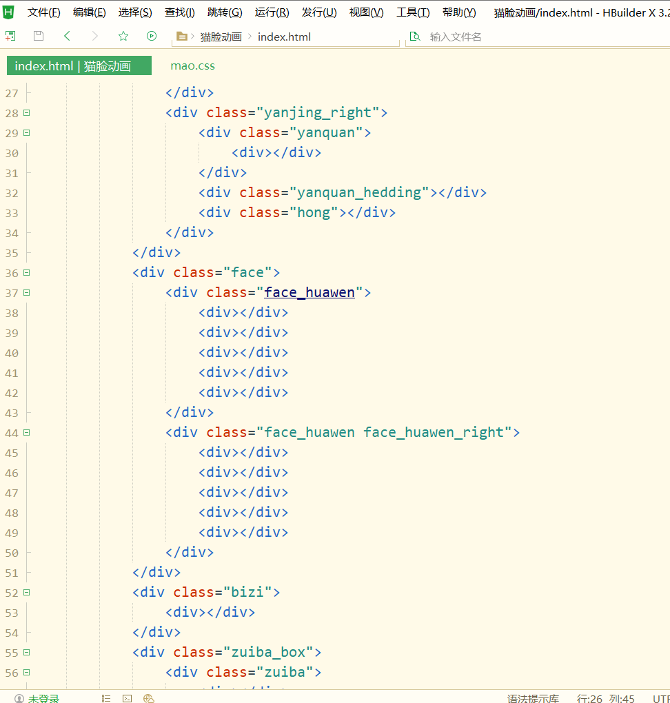
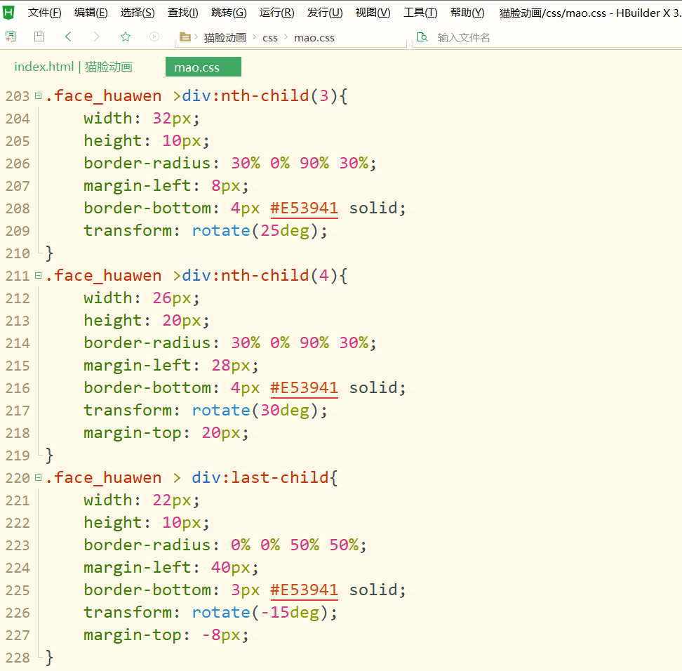
左右脸颊的花纹:
也是先写左侧
左侧的脸颊花纹有5个点
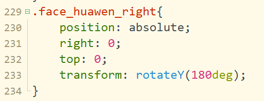
右侧将左侧的脸颊花纹进行以y轴为中心翻转:
这样两边脸颊的花纹就画好了
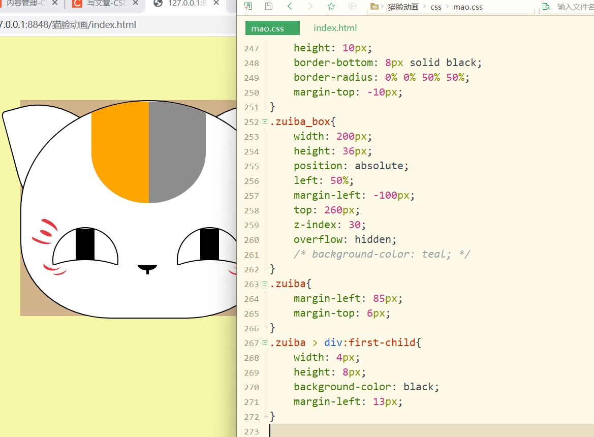
鼻子:
和之前一样先划分出鼻子的区域:
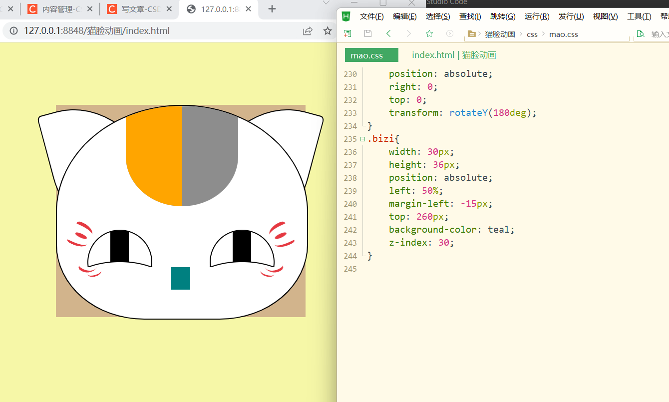
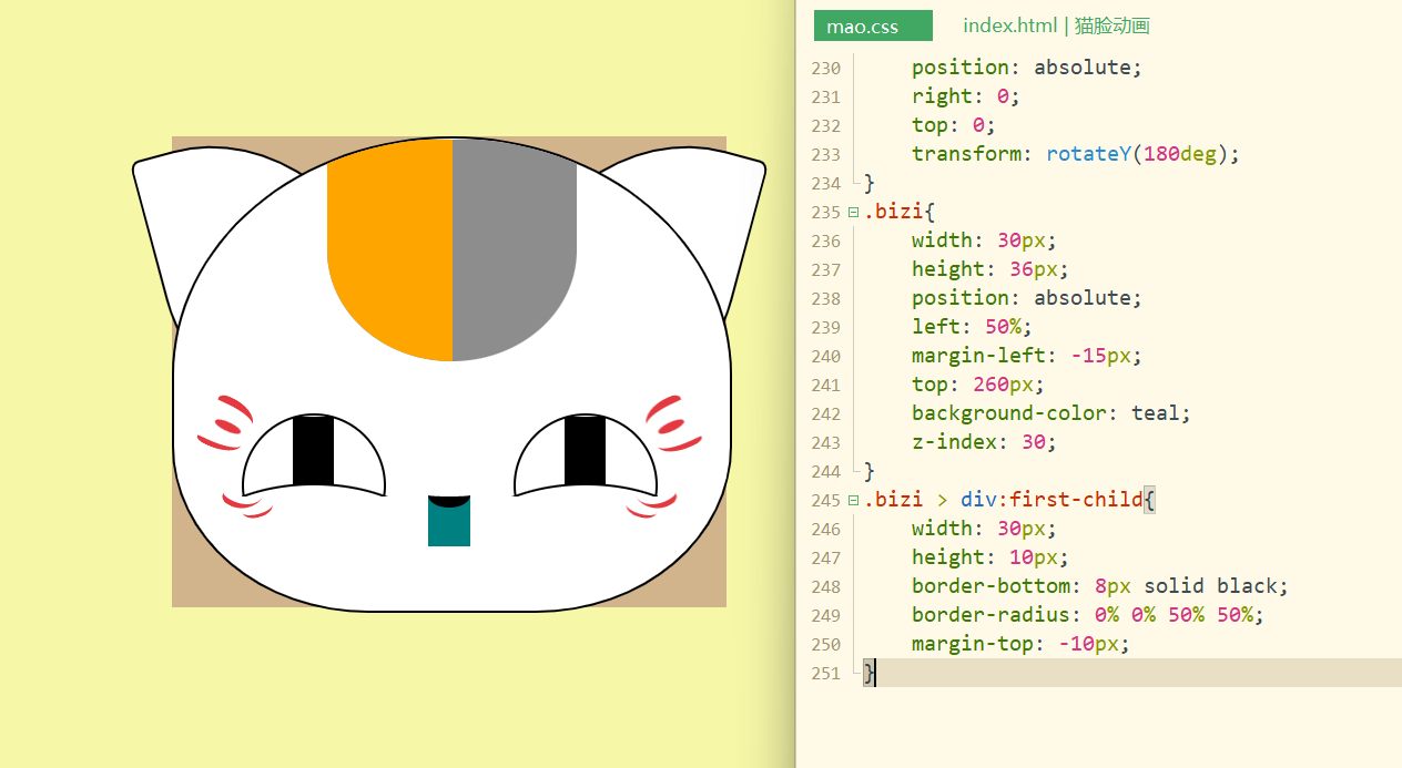
记得把鼻子的区域去掉
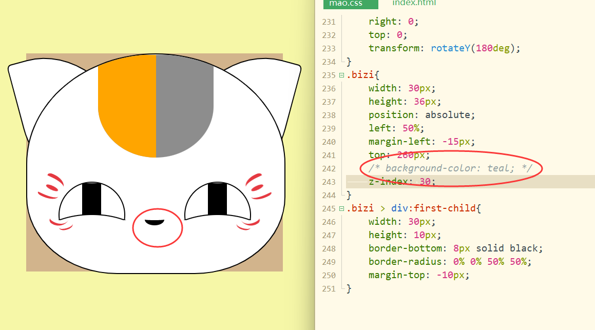
嘴巴:
分成三部分,竖线,嘴左边,嘴右边
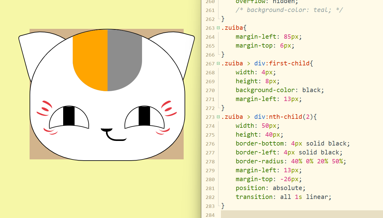
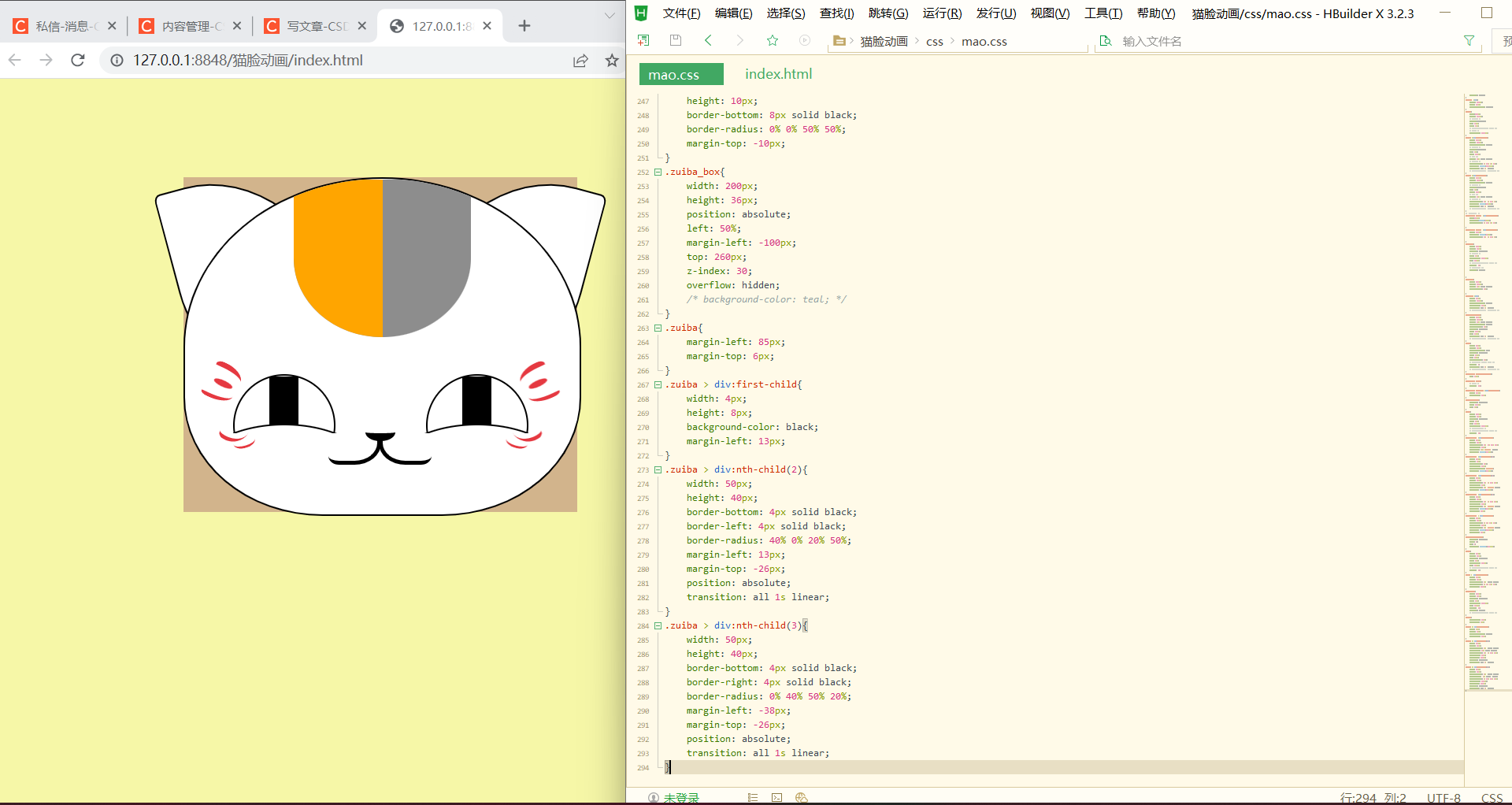
设置嘴巴微笑的动态效果:
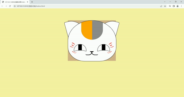
完成!
效果:鼠标放上去会微笑,拿下来停止微笑
整体代码:
html:
DOCTYPE html>
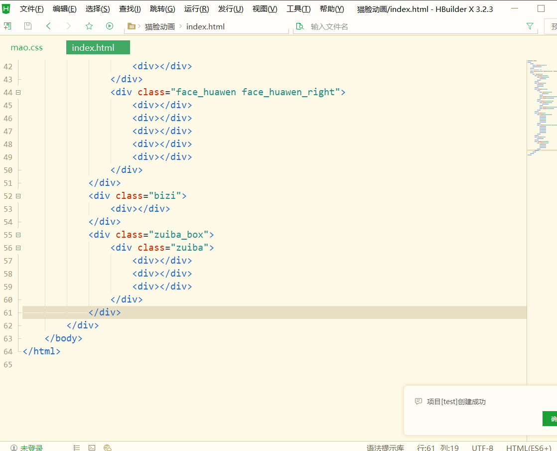
<html><head><meta charset="utf-8" /><title>title>head><link rel="stylesheet" type="text/css" href="css/mao.css" /><body><div class="mao"><div class="mao_head"><div class="huawen"><div>div>div>div><div class="erduo"><div>div><div>div>div><div class="yanjing"><div><div class="yanquan"><div>div>div><div class="yanquan_hedding">div><div class="hong">div>div><div class="yanjing_right"><div class="yanquan"><div>div>div><div class="yanquan_hedding">div><div class="hong">div>div>div><div class="face"><div class="face_huawen"><div>div><div>div><div>div><div>div><div>div>div><div class="face_huawen face_huawen_right"><div>div><div>div><div>div><div>div><div>div>div>div><div class="bizi"><div>div>div><div class="zuiba_box"><div class="zuiba"><div>div><div>div><div>div>div>div>div>body>
html>css代码:
*{margin: 0;padding: 0;
}
body{background-color: #F6F7A7;
}
/* class选择器 */
.mao{width: 400px;height: 340px;background-color: tan;margin: 100px auto;/* 上100px auto左右居中 *//* 相对定位 */position: relative;
}
.mao_head{width: 400px;height: 340px;background-color: white;/* 设置圆角 */border-radius: 50% 50% 35% 35%;/* 边框 */border: 2px solid black;/* 相对定位 */position: relative;/* 设置溢出隐藏 */overflow: hidden;z-index: 10;
}
.huawen{width: 180px;height: 160px;/* 绝对定位 */position:absolute;left: 110px;background-color: #8D8D8D;/* 设置圆角 */border-radius: 0% 0% 50% 50%;/* 设置溢出隐藏 */overflow: hidden;
}
.huawen >div{height: 160px;width: 90px;background-color: orange;
}
.erduo{width:374px;height: 120px;/* 绝对定位 */position:absolute;top: -6px;left: 50%;/* background-color: teal; *//* 左边距 */margin-left: -187px;
}
.erduo >div:first-child{width: 160px;height: 200px;background-color: white;/* 绝对定位 */position:absolute;top: 0px;left: -20px;/* 边框 */border: 2px solid black;/* 设置圆角 */border-radius: 4% 80% 0% 50%;transform: rotate(-15deg);transition: all 1s linear;/* transition:过渡 linear线性 */
}
.erduo >div:last-child{width: 160px;height: 200px;background-color: white;/* 绝对定位 */position:absolute;top: 0px;right: -20px;/* 边框 */border: 2px solid black;/* 设置圆角 */border-radius: 80% 4% 50% 0%;transform: rotate(15deg);transition: all 1s linear;/* transition:过渡 linear线性 */
}
/* 悬停过度效果 */
.mao:hover .erduo >div:first-child{left:-10px;transform:rotate(0deg);border-radius: 4% 80% 0% 60%;}
.mao:hover .erduo >div:last-child{right: -10px;transform: rotate(0deg);border-radius: 80% 4% 60% 0%;}
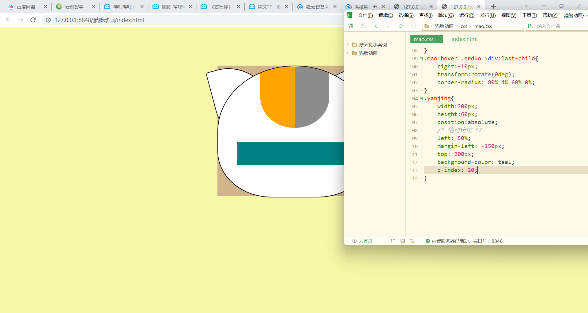
.yanjing{width: 300px;height: 60px;position: absolute;/* 绝对定位 */left: 50%;margin-left: -150px;top: 200px;/* background-color: teal; */z-index: 20;/* 设置溢出隐藏 */overflow: hidden;}
.yanquan{width: 100px;height: 100px;border: 2px solid black;border-radius: 50%;}
.yanquan >div{width: 30px;height: 100px;background-color: black;margin-left: 35px;transition: all 1s linear;/* transition:过渡 linear线性 */
}
.yanquan_hedding{width: 180px;height: 100px;border: 2px solid black;background-color: white;border-radius: 50%;position: absolute;left: -40px;top: 50px;transition: all 1s linear;/* transition:过渡 linear线性 */
}
.hong{width: 70px;height: 28px;background-color: red;position: absolute;left: 18px;top: 34px;border-radius: 50%;/* 设置透明度: 1不透明 0透明 */opacity: 0;transition: all 1s linear;/* transition:过渡 linear线性 */
}
.mao:hover .yanquan_hedding{top: 30px;
}
.mao:hover .hong{/* 透明度 */opacity: 0.8;
}
.mao:hover .yanquan >div:first-child{width: 40px;margin-left: 30px;
}
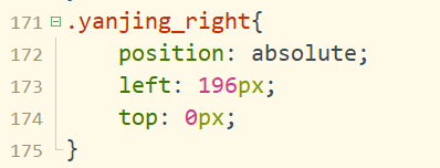
.yanjing_right{position: absolute;left: 196px;top: 0px;
}
.face{width: 380px;height: 80px;position: absolute;left: 50%;top: 190px;margin-left: -190px;/* 划分脸部花纹区域 *//* background-color: pink; */z-index: 20;
}
.face_huawen >div:first-child{width: 30px;height: 10px;border-radius: 30% 80% 20% 50%;margin-left: 20px;border-top: 6px #E53941 solid;transform: rotate(25deg);
}
.face_huawen >div:nth-child(2){width: 20px;height: 6px;border-radius: 50%;margin-left: 20px;background-color: #E53941;transform: rotate(25deg);
}
.face_huawen >div:nth-child(3){width: 32px;height: 10px;border-radius: 30% 0% 90% 30%;margin-left: 8px;border-bottom: 4px #E53941 solid;transform: rotate(25deg);
}
.face_huawen >div:nth-child(4){width: 26px;height: 20px;border-radius: 30% 0% 90% 30%;margin-left: 28px;border-bottom: 4px #E53941 solid;transform: rotate(30deg);margin-top: 20px;
}
.face_huawen > div:last-child{width: 22px;height: 10px;border-radius: 0% 0% 50% 50%;margin-left: 40px;border-bottom: 3px #E53941 solid;transform: rotate(-15deg);margin-top: -8px;
}
.face_huawen_right{position: absolute;right: 0;top: 0;transform: rotateY(180deg);
}
.bizi{width: 30px;height: 36px;position: absolute;left: 50%;margin-left: -15px;top: 260px;/* background-color: teal; */z-index: 30;
}
.bizi > div:first-child{width: 30px;height: 10px;border-bottom: 8px solid black;border-radius: 0% 0% 50% 50%;margin-top: -10px;
}
.zuiba_box{width: 200px;height: 36px;position: absolute;left: 50%;margin-left: -100px;top: 260px;z-index: 30;overflow: hidden;/* background-color: teal; */
}
.zuiba{margin-left: 85px;margin-top: 6px;
}
.zuiba > div:first-child{width: 4px;height: 8px;background-color: black;margin-left: 13px;
}
.zuiba > div:nth-child(2){width: 50px;height: 40px;border-bottom: 4px solid black;border-left: 4px solid black;border-radius: 40% 0% 20% 50%;margin-left: 13px;margin-top: -26px;position: absolute;transition: all 1s linear;
}
.zuiba > div:nth-child(3){width: 50px;height: 40px;border-bottom: 4px solid black;border-right: 4px solid black;border-radius: 0% 40% 50% 20%;margin-left: -38px;margin-top: -26px;position: absolute;transition: all 1s linear;
}
.mao:hover .zuiba>div:nth-child(2){border-radius: 50%;width: 40px;
}
.mao:hover .zuiba>div:nth-child(3){border-radius: 50%;width: 40px;margin-left: -30px;
}
本文来自互联网用户投稿,文章观点仅代表作者本人,不代表本站立场,不承担相关法律责任。如若转载,请注明出处。 如若内容造成侵权/违法违规/事实不符,请点击【内容举报】进行投诉反馈!