html打造动画交互界面(一)
使用方式
1 使用svg
2 png图片
3 css3 动画
4 使用webgl
5 canvas
6 使用glsl
发现很多东西本身html 里面已经有了,关键是要熟悉和使用。现在先做基本的东西,等基本的创造好了,就可以打造科技界面了。读者请耐心等待
1 svg 圆
<svg width="300" height="180"><circle cx="30" cy="50" r="10" /><circle cx="90" cy="50" r="10" class="red" /><circle cx="150" cy="50" r="10" class="fancy" />svg>
先打造一个基本界面,再使用动画来动起来
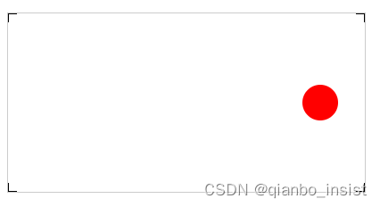
<svg width="400px" height="200px" id="testSvg"><line x1="0" y1="0" x2="10" y2="0" style="stroke:rgb(0,0,0);stroke-width:2" /><line x1="0" y1="0" x2="0" y2="10" style="stroke:rgb(0,0,0);stroke-width:2" /><line x1="400" y1="0" x2="400" y2="10" style="stroke:rgb(0,0,0);stroke-width:2" /><line x1="390" y1="0" x2="400" y2="0" style="stroke:rgb(0,0,0);stroke-width:2" /><line x1="0" y1="200" x2="0" y2="190" style="stroke:rgb(0,0,0);stroke-width:2" /><line x1="0" y1="200" x2="10" y2="200" style="stroke:rgb(0,0,0);stroke-width:2" /><line x1="400" y1="200" x2="400" y2="190" style="stroke:rgb(0,0,0);stroke-width:2" /><line x1="400" y1="200" x2="390" y2="200" style="stroke:rgb(0,0,0);stroke-width:2" /><circle cx="350" cy="100" r="20" fill="red" id="testCircle" class="text text-1">circle>svg>
制作动画
1 、关键帧动画
围绕圆圈开始亮点旋转
.text {font-size: 64px;font-weight: bold;text-transform: uppercase;fill: none;stroke-width: 2px;stroke-dasharray: 90 310;animation: stroke 6s infinite linear;}.text-1 {stroke: #3498db;text-shadow: 0 0 5px #3498db;animation-delay: -1.5s;}@keyframes stroke {100% {stroke-dashoffset: -400;}}
线条开始围绕圆圈动画
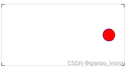
2、 交互点击
<script type="text/javascript">var circle = document.getElementById("testCircle");circle.addEventListener("click", function (e) {console.log("Click circle ...");circle.setAttribute("r", 25);circle.setAttribute("fill","blue");}, false);
</script>
点击以后圆的半径放大到25
code
DOCTYPE html>
<html><head><title>webrtc sfutitle><style>video {border: 1px solid black;width: 640px;height: 360px;}.local {border: 1px solid red;width: 640px;height: 360px;}.red {fill: red;}.fancy {fill: none;stroke: black;stroke-width: 3pt;}#testSvg {border: 1px solid #ccc;}.testSvg {border: 1px solid #ccc;}#testSvg circle {fill: red;stroke: blue;stroke-width: 1;}#svgBox{width:100%;margin:100px auto;}.text {font-size: 64px;font-weight: bold;text-transform: uppercase;fill: none;stroke-width: 2px;stroke-dasharray: 90 310;animation: stroke 6s infinite linear;}.text-1 {stroke: #3498db;text-shadow: 0 0 5px #3498db;animation-delay: -1.5s;}.text-2{
stroke: #f39c12;
text-shadow: 0 0 5px #f39c12;
animation-delay: -3s;
}
.text-3{
stroke: #e74c3c;
text-shadow: 0 0 5px #e74c3c;
animation-delay: -4.5s;
}
.text-4{
stroke: #9b59b6;
text-shadow: 0 0 5px #9b59b6;
animation-delay: -6s;
}@keyframes stroke {
100% {
stroke-dashoffset: -400;
}
} style>
head><body><svg width="300" height="180"><circle cx="30" cy="50" r="10" /><circle cx="90" cy="50" r="10" class="red" /><circle cx="150" cy="50" r="10" class="fancy" />svg><div id="svgBox"><svg  height="100"><text text-anchor="middle" x="50%" y="50%" class="text text-1">观沧海text><text text-anchor="middle" x="50%" y="50%" class="text text-2">观沧海text><text text-anchor="middle" x="50%" y="50%" class="text text-3">观沧海text><text text-anchor="middle" x="50%" y="50%" class="text text-4">观沧海text>  svg>div><svg width="400px" height="200px" id="testSvg"><line x1="0" y1="0" x2="10" y2="0" style="stroke:rgb(0,0,0);stroke-width:2" /><line x1="0" y1="0" x2="0" y2="10" style="stroke:rgb(0,0,0);stroke-width:2" /><line x1="400" y1="0" x2="400" y2="10" style="stroke:rgb(0,0,0);stroke-width:2" /><line x1="390" y1="0" x2="400" y2="0" style="stroke:rgb(0,0,0);stroke-width:2" /><line x1="0" y1="200" x2="0" y2="190" style="stroke:rgb(0,0,0);stroke-width:2" /><line x1="0" y1="200" x2="10" y2="200" style="stroke:rgb(0,0,0);stroke-width:2" /><line x1="400" y1="200" x2="400" y2="190" style="stroke:rgb(0,0,0);stroke-width:2" /><line x1="400" y1="200" x2="390" y2="200" style="stroke:rgb(0,0,0);stroke-width:2" /><circle cx="350" cy="100" r="20" fill="red" id="testCircle" class="text text-1">circle>svg><br />
body><script type="text/javascript">var circle = document.getElementById("testCircle");circle.addEventListener("click", function (e) {console.log("Click circle ...");circle.setAttribute("r", 25);circle.setAttribute("fill","blue");}, false);
script>
html>
其他
可以使用transform 来制作动画,具体下一节讲吧
#testCircle:hover{
transform:scale(1.5)
/* transform:translate(-50%,-50%) scale(1.5) */
}
本文来自互联网用户投稿,文章观点仅代表作者本人,不代表本站立场,不承担相关法律责任。如若转载,请注明出处。 如若内容造成侵权/违法违规/事实不符,请点击【内容举报】进行投诉反馈!