Python做的交互式动态大图,真漂亮!
前言
本文的文字及图片来源于网络,仅供学习、交流使用,不具有任何商业用途,如有问题请及时联系我们以作处理。
PS:如有需要Python学习资料的小伙伴可以加点击下方链接自行获取
python免费学习资料以及群交流解答点击即可加入
今天给大家分享1个pyecharts交互式动态可视化案例,通过先拆分、后组合的方式,一步步教你如何实现,具体成果如下。

一、绘制基本图形
用pandas读取数据,通过整合数据格式,分别用pyecharts绘制地图、柱状图、饼图,具体内容如下:
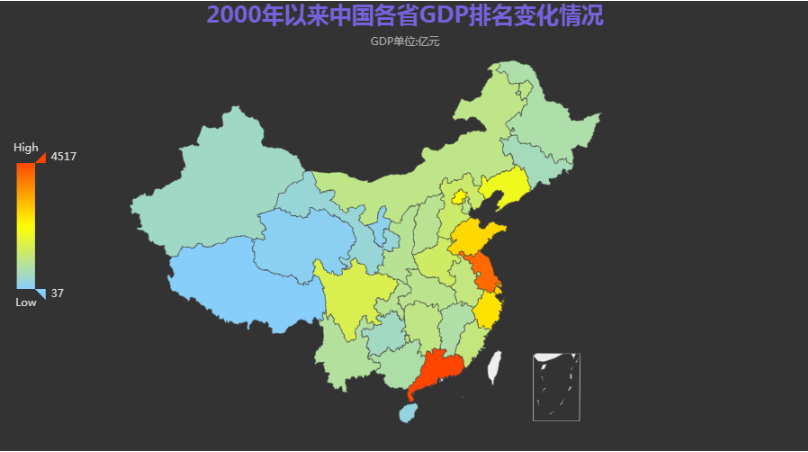
1.绘制地图
import pyecharts.options as opts
from pyecharts.globals import ThemeType
from pyecharts.commons.utils import JsCode
from pyecharts.charts import Timeline, Grid, Bar, Map, Pie
import pandas as pd
data = pd.read_excel('全国各省财政收入.xlsx',index_col=0)
years=list(data.keys()) #获取列名
citys=list(data.index)    #获取索引行名
citys=[city.replace('省','').replace('市','').replace('自治区','') for city in citys]
datas=[]
for y in years:dict_year={}dict_year['time']=ydata_list=[[i,j] for i,j in zip(citys,list(data[y]))]dict_year['data']=sorted(data_list, key=(lambda x: x[1]),reverse=True)datas.append(dict_year)
map_data = [i["data"] for i in datas if i["time"]==2010][0]
min_data, max_data = (min([d[1] for d in map_data]),max([d[1] for d in map_data]),)
map_chart = (Map(init_opts=opts.InitOpts(theme=ThemeType.DARK)).add(series_name="",data_pair=map_data,label_opts=opts.LabelOpts(is_show=False),is_map_symbol_show=False,).set_global_opts(title_opts=opts.TitleOpts(title="2000年以来中国各省GDP排名变化情况",subtitle="GDP单位:亿元",pos_left="center",pos_top="top",title_textstyle_opts=opts.TextStyleOpts(font_size=25, color="rgba(123,104,238, 0.9)"),),visualmap_opts=opts.VisualMapOpts(is_calculable=True,dimension=0,pos_left="10",pos_top="center",range_text=["High", "Low"],range_color=["lightskyblue", "yellow", "orangered"],textstyle_opts=opts.TextStyleOpts(color="#ddd"),min_=min_data,max_=max_data,),))
map_chart.render_notebook()
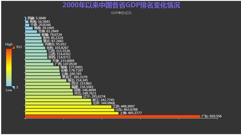
2.绘制柱状图
map_data = [i["data"] for i in datas if i["time"]==y][0]
min_data, max_data = (min([d[1] for d in map_data]),max([d[1] for d in map_data]),
)
bar_x_data = [x[0] for x in map_data]
bar_y_data = [x[1] for x in map_data]
bar = (Bar(init_opts=opts.InitOpts(theme=ThemeType.DARK)).add_xaxis(xaxis_data=bar_x_data).add_yaxis(series_name="",yaxis_data=bar_y_data,label_opts=opts.LabelOpts(is_show=True, position="right", formatter="{b}: {c}"),).reversal_axis().set_global_opts(title_opts=opts.TitleOpts(title="2000年以来中国各省GDP排名变化情况",subtitle="GDP单位:亿元",pos_left="center",pos_top="top",title_textstyle_opts=opts.TextStyleOpts(font_size=25, color="rgba(123,104,238, 0.9)"),),xaxis_opts=opts.AxisOpts(axislabel_opts=opts.LabelOpts(is_show=False)),yaxis_opts=opts.AxisOpts(axislabel_opts=opts.LabelOpts(is_show=False)),tooltip_opts=opts.TooltipOpts(is_show=False),visualmap_opts=opts.VisualMapOpts(is_calculable=True,dimension=0,pos_left="10",pos_top="center",range_text=["High", "Low"],range_color=["lightskyblue", "yellow", "orangered"],textstyle_opts=opts.TextStyleOpts(color="#ddd"),min_=min_data,max_=max_data,),))
bar.render_notebook()
3.绘制饼图
pie_data = [[x[0], x[1]] for x in map_data]
percent_sum = sum([x[1] for x in map_data])
rest_value = 0
for d in map_data:rest_percent = 100.0rest_percent = rest_percent - percent_sumrest_value = d[1] * (rest_percent / d[1])
pie = (Pie(init_opts=opts.InitOpts(theme=ThemeType.DARK)).add(series_name="",data_pair=pie_data,radius=["12%", "20%"],center=["50%", "50%"],itemstyle_opts=opts.ItemStyleOpts(border_width=1, border_color="rgba(0,0,0,0.3)"),).set_global_opts(title_opts=opts.TitleOpts(title="2000年以来中国各省GDP排名变化情况",subtitle="GDP单位:亿元",pos_left="center",pos_top="top",title_textstyle_opts=opts.TextStyleOpts(font_size=25, color="rgba(123,104,238, 0.9)"),),tooltip_opts=opts.TooltipOpts(is_show=True, formatter="{b} {d}%"),legend_opts=opts.LegendOpts(is_show=False),)
)
pie.render_notebook()

二、绘制动图
在基本图形的基础上,引入timeline函数,绘制相应动态图形:
1.绘制动态地图
def get_year_chart(year: int):map_data = [i["data"] for i in datas if i["time"]==year][0]min_data, max_data = (min([d[1] for d in map_data]),max([d[1] for d in map_data]),)map_chart = (Map(init_opts=opts.InitOpts(theme=ThemeType.DARK)).add(series_name="",data_pair=map_data,label_opts=opts.LabelOpts(is_show=False),is_map_symbol_show=False,).set_global_opts(title_opts=opts.TitleOpts(title="{}年以来中国各省GDP排名情况".format(year),subtitle="GDP单位:亿元",pos_left="center",pos_top="top",title_textstyle_opts=opts.TextStyleOpts(font_size=25, color="rgba(123,104,238, 0.9)"),),visualmap_opts=opts.VisualMapOpts(is_calculable=True,dimension=0,pos_left="10",pos_top="center",range_text=["High", "Low"],range_color=["lightskyblue", "yellow", "orangered"],textstyle_opts=opts.TextStyleOpts(color="#ddd"),min_=min_data,max_=max_data,),))return map_chart
time_list = list(range(2000,2020))
timeline = Timeline(init_opts=opts.InitOpts(width="1000px", height="800px", theme=ThemeType.DARK)
)
for y in time_list:g = get_year_chart(year=y)timeline.add(g, time_point=str(y))timeline.add_schema(orient="vertical",is_auto_play=True,is_inverse=True,play_interval=500,pos_left="null",pos_right="5",pos_top="20",pos_bottom="20",width="50",label_opts=opts.LabelOpts(is_show=True, color="#fff"),
)
timeline.render_notebook()

2.绘制动态柱状图
def get_year_chart(year: int):map_data = [i["data"] for i in datas if i["time"]==year][0]min_data, max_data = (min([d[1] for d in map_data]),max([d[1] for d in map_data]),)bar_x_data = [x[0] for x in map_data]bar_y_data = [x[1] for x in map_data]bar = (Bar(init_opts=opts.InitOpts(theme=ThemeType.DARK)).add_xaxis(xaxis_data=bar_x_data).add_yaxis(series_name="",yaxis_data=bar_y_data,label_opts=opts.LabelOpts(is_show=True, position="right", formatter="{b}: {c}"),).reversal_axis().set_global_opts(title_opts=opts.TitleOpts(title="2000年以来中国各省GDP排名变化情况",subtitle="GDP单位:亿元",pos_left="center",pos_top="top",title_textstyle_opts=opts.TextStyleOpts(font_size=25, color="rgba(123,104,238, 0.9)"),),xaxis_opts=opts.AxisOpts(axislabel_opts=opts.LabelOpts(is_show=False)),yaxis_opts=opts.AxisOpts(axislabel_opts=opts.LabelOpts(is_show=False)),tooltip_opts=opts.TooltipOpts(is_show=False),visualmap_opts=opts.VisualMapOpts(is_calculable=True,dimension=0,pos_left="10",pos_top="center",range_text=["High", "Low"],range_color=["lightskyblue", "yellow", "orangered"],textstyle_opts=opts.TextStyleOpts(color="#ddd"),min_=min_data,max_=max_data,),))return bar
time_list = list(range(2000,2020))
timeline = Timeline(init_opts=opts.InitOpts(width="1000px", height="800px", theme=ThemeType.DARK)
)
for y in time_list:g = get_year_chart(year=y)timeline.add(g, time_point=str(y))timeline.add_schema(orient="vertical",is_auto_play=True,is_inverse=True,play_interval=500,pos_left="null",pos_right="5",pos_top="20",pos_bottom="20",width="50",label_opts=opts.LabelOpts(is_show=True, color="#fff"),
)
timeline.render_notebook()
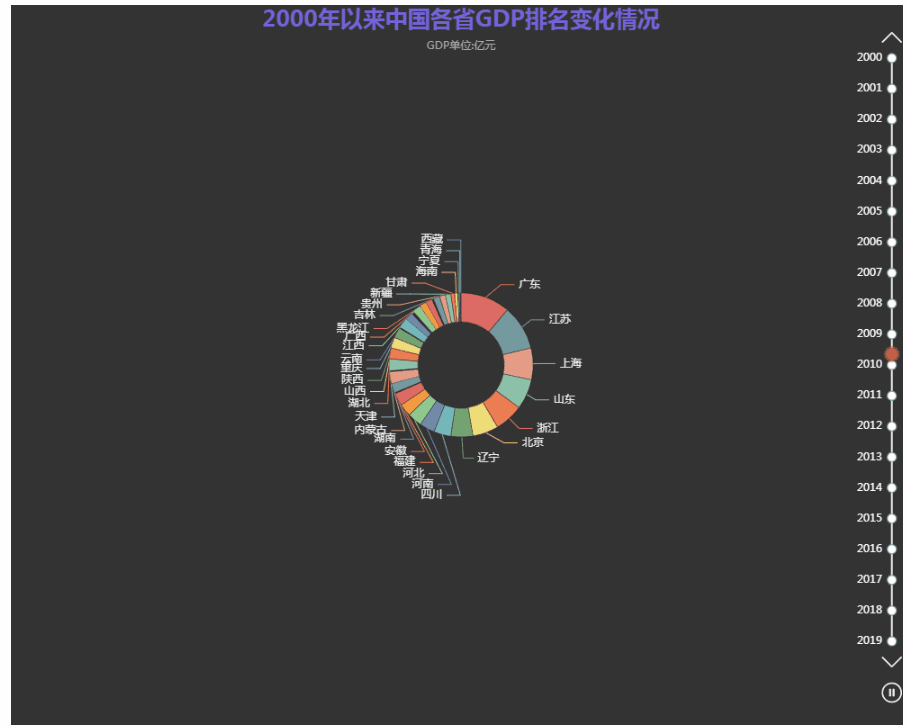
3.绘制动态饼图
def get_year_chart(year: int):map_data = [i["data"] for i in datas if i["time"]==year][0]min_data, max_data = (min([d[1] for d in map_data]),max([d[1] for d in map_data]),)pie_data = [[x[0], x[1]] for x in map_data]percent_sum = sum([x[1] for x in map_data])rest_value = 0for d in map_data:rest_percent = 100.0rest_percent = rest_percent - percent_sumrest_value = d[1] * (rest_percent / d[1])pie = (Pie(init_opts=opts.InitOpts(theme=ThemeType.DARK)).add(series_name="",data_pair=pie_data,radius=["12%", "20%"],center=["50%", "50%"],itemstyle_opts=opts.ItemStyleOpts(border_width=1, border_color="rgba(0,0,0,0.3)"),).set_global_opts(title_opts=opts.TitleOpts(title="2000年以来中国各省GDP排名变化情况",subtitle="GDP单位:亿元",pos_left="center",pos_top="top",title_textstyle_opts=opts.TextStyleOpts(font_size=25, color="rgba(123,104,238, 0.9)"),),tooltip_opts=opts.TooltipOpts(is_show=True, formatter="{b} {d}%"),legend_opts=opts.LegendOpts(is_show=False),))return pie
time_list = list(range(2000,2020))
timeline = Timeline(init_opts=opts.InitOpts(width="1000px", height="800px", theme=ThemeType.DARK)
)
for y in time_list:g = get_year_chart(year=y)timeline.add(g, time_point=str(y))timeline.add_schema(orient="vertical",is_auto_play=True,is_inverse=True,play_interval=500,pos_left="null",pos_right="5",pos_top="20",pos_bottom="20",width="50",label_opts=opts.LabelOpts(is_show=True, color="#fff"),
)
timeline.render_notebook()
三、合并动图
最后,通过grid模块将三个图形合并到一起:
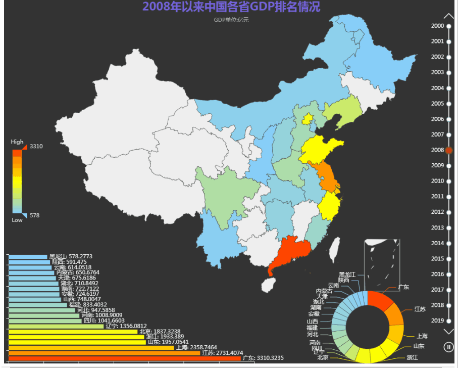
交互式动态图到此就做好了,你学废了吗?
本文来自互联网用户投稿,文章观点仅代表作者本人,不代表本站立场,不承担相关法律责任。如若转载,请注明出处。 如若内容造成侵权/违法违规/事实不符,请点击【内容举报】进行投诉反馈!