仪表盘动画
仪表盘动画
小程序中使用到了仪表盘动画,在小程序上使用方式是采用canvas 去绘制的,canvas 绘制是需要一定时间, 并且绘制出来的图在华为p30 p40 上有很大概览的适配性问题,后期需要使用h5 开发相同功能 , 果断抛弃了canvas 采用了css 来实现了仪表盘动画
效果图

实现思路
1、让ui给一张底部为透明的刻度图片, 绝对定位 , 设置z-index 值
2、准备个盒子相同与刻度图片相同宽高的绝对定位叠到刻度图片上
3、通过css3的旋转属性,旋转以便达到变色的效果
4、计算旋转角度, 公式为:180/100 , 其中180表示半圆, 100表示的是总分100分, 这个就可以根据公司需求来做了
附上代码片段
<div class="indicator"><div class="keduimg"><img src="~assets/images/aKeyMatch/bg_data.png" alt=""></div><div class="score" :style="{color: scoreStyle}">{{detailMessage.score}}</div><!-- 大刻度 --><div class="rotate" :style="{'transform': 'rotateZ('+(180/100)*detailMessage.score+'deg)', 'backgroundColor': scoreStyle}"></div><!-- 小刻度(处理小刻度不变色) --><div class="smallrotate"></div></div>样式
.indicator {position: relative;margin: 0 auto;width: 538px;height: 276px;overflow: hidden;background: #d8dde4;border-right: 4px solid #fff;.keduimg {position: absolute;width:100%;height: 100%;left: 0;top: 0;z-index: 20;img {width: 535px;height: 276px;}}.score {position: absolute;bottom: 0;left: 50%;z-index: 30;transform: translateX(-50%);font-size: 150px;font-weight: 500;font-family:'DIN-Bold', 'Arial';}.rotate {width: 560px;height: 285px;position: absolute;left: 0;top:100%;z-index: 10;// border-radius: 0 0 270px 270px;transform-origin: top center;}.smallrotate {width: 470px;height: 238px;border-radius: 238px 238px 0 0;position: absolute;bottom: 0px;left: 45%;transform: translateX(-45%);z-index: 19;background: #d8dde4;}}
根据色值变化的代码
let color = '#E4364D',score = this.detailMessage.scoreif (score <= 29) {color = '#E4364D'} else if (score > 30 && score <= 49) {color = '#512FC7'} else if (score >50 && score <= 69) {color = '#E8A200'} else{color = '#72CD3D'}return color
以上就已经能实现一个仪表盘了, 但是有点生硬 加上动画会更完美,主要使用了countUp.js 实现了数字滚动和旋转角度颜色变色过程
附上countUp.js的gitHub地址:http://inorganik.github.io/countUp.js/
不知道怎么治住gif 上传 就看下效果图吧
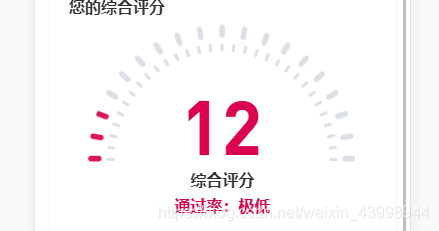
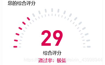
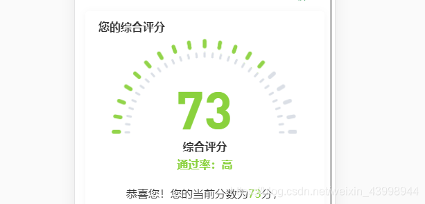
由0开始的灰色色值动画过渡到12, 再到29 最后到73, 随着分数颜色不断变化
本文来自互联网用户投稿,文章观点仅代表作者本人,不代表本站立场,不承担相关法律责任。如若转载,请注明出处。 如若内容造成侵权/违法违规/事实不符,请点击【内容举报】进行投诉反馈!