Tushare介绍和入门级实践——使用tushare接口获取数据绘制指标趋势图
#Tushare ID:490587
Tushare是一个免费、开源的python财经数据接口包。主要实现对股票等金融数据从数据采集、清洗加工 到 数据存储的过程,能够为金融分析人员提供快速、整洁、和多样的便于分析的数据,为他们在数据获取方面极大地减轻工作量,使他们更加专注于策略和模型的研究与实现上。考虑到Python pandas包在金融量化分析中体现出的优势,Tushare返回的绝大部分的数据格式都是pandas DataFrame类型,非常便于用pandas/NumPy/Matplotlib进行数据分析和可视化。当然,如果您习惯了用Excel或者关系型数据库做分析,您也可以通过Tushare的数据存储功能,将数据全部保存到本地后进行分析。应一些用户的请求,从0.2.5版本开始,Tushare同时兼容Python 2.x和Python 3.x,对部分代码进行了重构,并优化了一些算法,确保数据获取的高效和稳定。
本文是使用Tushare进行股票指标图的绘制。利用matplotlib,绘制指标MA和MACD的趋势图。下面以601319这只股票进行展示:
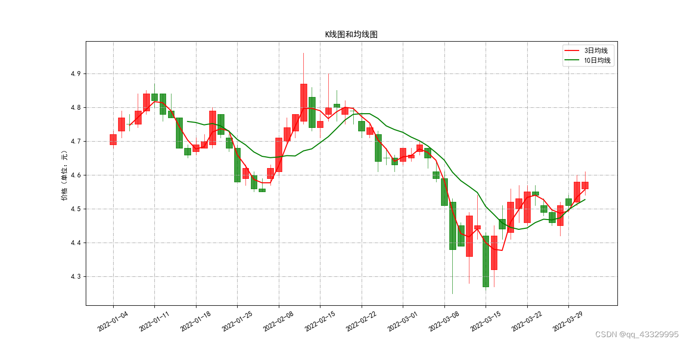
MA的绘制:
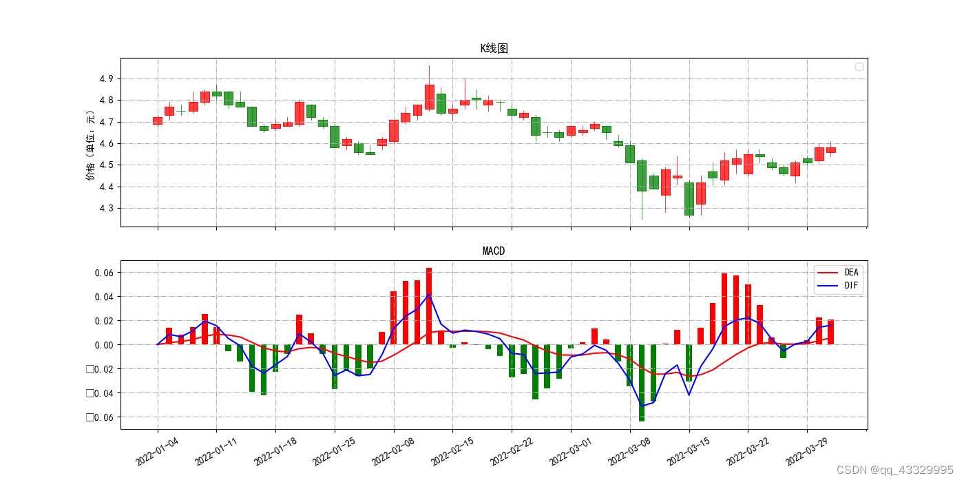
MACD的绘制:
爬取数据代码如下:
# 从网站爬取数据,并插入到对应的数据表中
def insertStockData(code,startDate,endDate):try:filename='路径'+code+startDate+endDate+'.csv'stock = pro.daily(ts_code=code + '.SH', start_date=startDate, end_date=endDate)if (len(stock) < 1):stock = pro.daily(ts_code=code + '.SZ', start_date=startDate, end_date=endDate)stock.index = pd.to_datetime(stock.trade_date)df = stock.sort_index()# 在本地留份csvdf.to_csv(filename)df = pd.read_csv(filename,encoding='gbk')# 把df存储到sql中engine_ts = create_engine('mysql+pymysql://root:123456@localhost/pythonstock')# 将dataframe用to_sql函数存储到数据库中# 参数依次为df储存到sql里面的表名、用户名和密码、不设置索引、如果存在此表就将其连接起来、每5000条分块df.to_sql('stock_' + code + '_'+startDate+ '_'+ endDate, engine_ts, index=False,chunksize=5000)except Exception as e:print('Error when inserting the data of:' + code)print(repr(e))db.rollback()
MA的绘制:
# 绘制MA
def drawMALine(stockCode,startDate,endDate,short,long):insertStockData(stockCode, startDate, endDate)cursor.execute("select * from stock_" + stockCode + '_' + startDate + '_' + endDate)cols = cursor.description  # 返回列名heads = []# 依次把每个cols元素中的第一个值放入col数组for index in cols:heads.append(index[0])result = cursor.fetchall()df = pd.DataFrame(list(result))df.columns = heads# 创建子图(axPrice) = figure.subplots(1, sharex=True)# 调用方法,在axPrice子图中绘制K线图candlestick2_ochl(ax = axPrice,opens=df["open"].values, closes=df["close"].values,highs=df["high"].values, lows=df["low"].values,width=0.75, colorup='red', colordown='green')axPrice.set_title("K线图和均线图")    # 设置子图标题df['close'].rolling(window=int(short)).mean().plot(ax=axPrice,color="red",label=short+'日均线')df['close'].rolling(window=int(long)).mean().plot(ax=axPrice,color="green",label=long+'日均线')axPrice.legend(loc='best')      # 绘制图例axPrice.set_ylabel("价格(单位:元)")axPrice.grid(linestyle='-.')    # 带网格线plt.rcParams['font.sans-serif']=['SimHei']# 设置x轴坐标的标签和旋转角度major_index=df.index[df.index%5==0]major_xtics=df['trade_date'][df.index%5==0]plt.xticks(major_index,major_xtics)plt.setp(plt.gca().get_xticklabels(), rotation=30)
Tushare的介绍到这里,以后有机会再给大家介绍Tushare的进一步应用。
感谢大家看完这篇文章!希望对你们学习有一点点的帮助。
最后贴上tushare的官网,更多的数据接口和范例代码可以在官网上查到:
新版:https://tushare.pro/
旧版:http://tushare.org/index.html
本文来自互联网用户投稿,文章观点仅代表作者本人,不代表本站立场,不承担相关法律责任。如若转载,请注明出处。 如若内容造成侵权/违法违规/事实不符,请点击【内容举报】进行投诉反馈!