天气数据图 | CSV格式 | Matplotlib | Datetime | Pandas
绘制天气图
- 单个地区天气图绘制
- 在一个图表中呈现两个数据集
- 降雨量绘制
单个地区天气图绘制
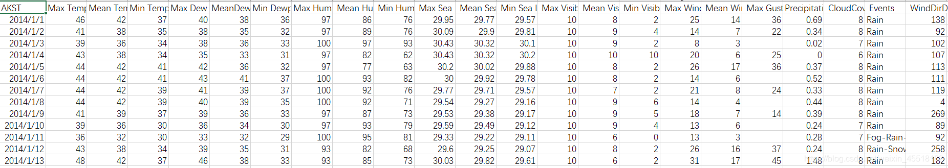
1、sitka_weather_2014.csv文件部分数据
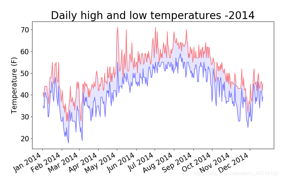
'''从csv格式文件中获取锡特卡地区2014年对应日期下的最高气温、最低气温,并作图'''
import csv
from datetime import datetime
from matplotlib import pyplot as plt
from matplotlib import dates as mdate
import pandas as pd
from pandas.plotting import register_matplotlib_converters
register_matplotlib_converters()filename='sitka_weather_2014.csv'
#打开文件
with open(filename) as f:#读取文件所有行reader=csv.reader(f)#读取文件中的一行header_row=next(reader)#从文件中获取日期,最高气温,最低气温dates,highs,lows=[],[],[]for row in reader:#读取每行数据的第1列current_date=datetime.strptime(row[0],"%Y-%m-%d")dates.append(current_date)#读取每行数据的第2列high=int(row[1])highs.append(high)#读取每行数据的第4列low=int(row[3])lows.append(low)#根据数据绘制图表
fig=plt.figure(figsize=(10,6))
plt.plot(dates,highs, c='red',alpha=0.5)
plt.plot(dates,lows,c='blue',alpha=0.5)
#为绘图区域填充颜色,为蓝色
plt.fill_between(dates,highs,lows,facecolor='blue',alpha=0.1) #alpha设置颜色透明度,默认为1,表示完全不透明
plt.title("Daily high and low temperatures -2014", fontsize=24)#在原图像位置设置一个新的图像
ax=fig.add_subplot(1,1,1)
#设置x轴的格式为[%b:月份的缩写][%Y:年份]
ax.xaxis.set_major_formatter(mdate.DateFormatter('%b %Y'))
#设置x轴范围
plt.xticks(pd.date_range('2014-01','2014-12',freq='MS'),rotation=30) #freq='MS':设置刻度格式为每月的开始(month start frequency) plt.xlabel(' ',fontsize=16)
fig.autofmt_xdate() #绘制斜的日期标签,避免彼此重叠
plt.ylabel('Temperature (F)',fontsize=16)
plt.tick_params(axis='both',which='major',labelsize=16)
plt.show()
作图如下:
x轴标签设置参考:
https://www.jianshu.com/p/2a96f0cafbf1
添加错误检查代码,解决因数据缺失引发的异常
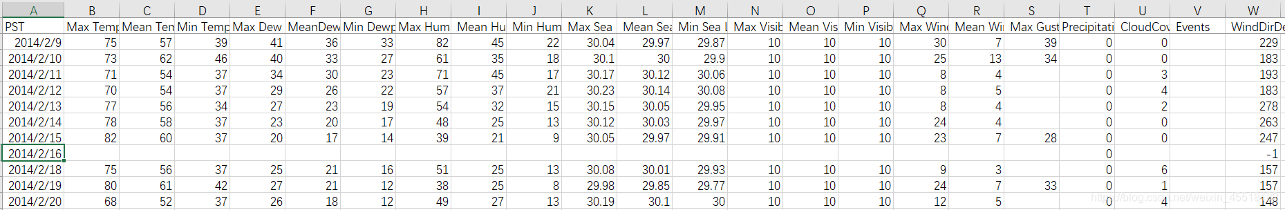
2、death_valley_2014.csv文件部分数据
import csv
from datetime import datetime
from matplotlib import pyplot as plt
from matplotlib import dates as mdate
import pandas as pd
from pandas.plotting import register_matplotlib_converters
register_matplotlib_converters()#从文件中获取日期和最高气温
filename='death_valley_2014.csv'#打开文件
with open(filename) as f:#读取文件所有行reader=csv.reader(f)#读取文件中的一行header_row=next(reader)header_row=next(reader)#从文件中获取日期,最高气温,最低气温dates,highs,lows=[],[],[]for row in reader:try:#读取每行数据的第1列current_date=datetime.strptime(row[0],"%Y-%m-%d")#读取每行数据的第2列high=int(row[1])#读取每行数据的第4列low=int(row[3])except ValueError:#打印一条错误消息,指出缺失数据的信息print(current_date,'missing data')else:dates.append(current_date)highs.append(high)lows.append(low)#根据数据绘制图表
fig=plt.figure(figsize=(10,6))
plt.plot(dates,highs, c='red',alpha=0.5)
plt.plot(dates,lows,c='blue',alpha=0.5)
#为绘图区域填充颜色,为蓝色
plt.fill_between(dates,highs,lows,facecolor='blue',alpha=0.1) #alpha设置颜色透明度,默认为1,表示完全不透明
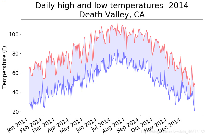
plt.title("Daily high and low temperatures -2014\nDeath Valley, CA", fontsize=24)#在原图像位置设置一个新的图像
ax=fig.add_subplot(1,1,1)
#设置x轴的格式为[%b:月份的缩写][%Y:年份]
ax.xaxis.set_major_formatter(mdate.DateFormatter('%b %Y'))
#设置x轴范围
plt.xticks(pd.date_range('2014-01','2014-12',freq='MS'),rotation=30) #freq='MS':设置刻度格式为每月的开始(month start frequency) plt.xlabel(' ',fontsize=16)
fig.autofmt_xdate() #绘制斜的日期标签,避免彼此重叠
plt.ylabel('Temperature (F)',fontsize=16)
plt.tick_params(axis='both',which='major',labelsize=16)
plt.show()
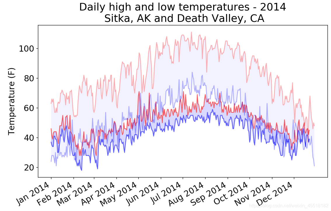
在一个图表中呈现两个数据集
import csv
from datetime import datetime
from matplotlib import pyplot as plt
from matplotlib import dates as mdate
import pandas as pd
from pandas.plotting import register_matplotlib_converters
register_matplotlib_converters()def get_weather_data(filename,dates,highs,lows):'''Get the highs and lows from a data file.'''with open(filename) as f:#读取文件所有行reader=csv.reader(f)#读取文件中的一行header_row=next(reader)for row in reader:try:#读取每行数据的第1列current_date=datetime.strptime(row[0],"%Y-%m-%d")#读取每行数据的第2列high=int(row[1])#读取每行数据的第4列low=int(row[3])except ValueError:print(current_date,'missing data')else:dates.append(current_date)highs.append(high)lows.append(low)#绘制锡特卡地区图表
dates,highs,lows=[],[],[]
get_weather_data('sitka_weather_2014.csv',dates,highs,lows)fig=plt.figure(dpi=128,figsize=(10,6))
plt.plot(dates,highs, c='red',alpha=0.6)
plt.plot(dates,lows,c='blue',alpha=0.6)
#为绘图区域填充颜色,为蓝色
plt.fill_between(dates,highs,lows,facecolor='blue',alpha=0.15) #alpha设置颜色透明度,默认为1,表示完全不透明#绘制死亡谷地区图表
dates,highs,lows=[],[],[]
get_weather_data('death_valley_2014.csv',dates,highs,lows)plt.plot(dates,highs, c='red',alpha=0.3)
plt.plot(dates,lows,c='blue',alpha=0.3)
#为绘图区域填充颜色,为蓝色
plt.fill_between(dates,highs,lows,facecolor='blue',alpha=0.05) #alpha设置颜色透明度,默认为1,表示完全不透明#format plot
title = "Daily high and low temperatures - 2014"
title += "\n Sitka, AK and Death Valley, CA"
plt.title(title, fontsize=20)
#在原图像位置设置一个新的图像
ax=fig.add_subplot(1,1,1)
#设置x轴的格式为[%b:月份的缩写][%Y:年份]
ax.xaxis.set_major_formatter(mdate.DateFormatter('%b %Y'))
#设置x轴范围
plt.xticks(pd.date_range('2014-01','2014-12',freq='MS'),rotation=30) #freq='MS':设置刻度格式为每月的开始(month start frequency) plt.xlabel(' ',fontsize=16)
fig.autofmt_xdate() #绘制斜的日期标签,避免彼此重叠
plt.ylabel('Temperature (F)',fontsize=16)
#plt.ylim(ymin=0,ymax=120)
plt.tick_params(axis='both',which='major',labelsize=16)plt.show()
作图如下:
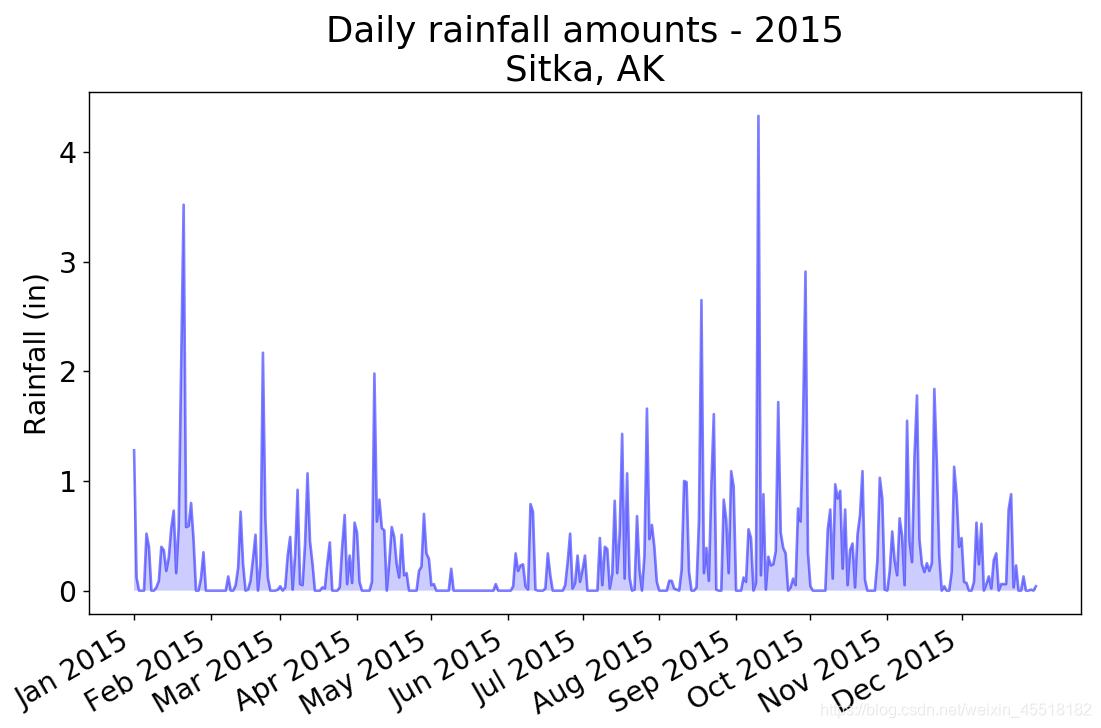
降雨量绘制
数据来源:https://github.com/ehmatthes/pcc/blob/gh-pages/resources/sitka_rainfall_2015.csv
import csv
from datetime import datetime
from matplotlib import pyplot as pltfrom matplotlib import dates as mdate
import pandas as pd
from pandas.plotting import register_matplotlib_converters
register_matplotlib_converters()# Get dates and rainfall data from data file
# raindata is in column 19filename = 'sitka_rainfall_2015.csv'
with open(filename) as f:reader=csv.reader(f)header_row=next(reader)dates, rainfalls=[],[]for row in reader:try:current_date=datetime.strptime(row[0],"%Y/%m/%d")rainfall=float(row[19])except ValueError:print(current_date,'missing data')else:dates.append(current_date)rainfalls.append(rainfall)#Plot data.
fig=plt.figure(dpi=128,figsize=(10,6))
plt.plot(dates,rainfalls,c='blue',alpha=0.5)
plt.fill_between(dates,rainfalls,facecolor='blue',alpha=0.2)#Format plot
title="Daily rainfall amounts - 2015\nSitka, AK"
plt.title(title,fontsize=20)ax=fig.add_subplot(1,1,1)
ax.xaxis.set_major_formatter(mdate.DateFormatter('%b %Y'))
plt.xticks(pd.date_range('2015-01','2015-12',freq='MS'),rotation=30) #freq='MS':设置刻度格式为每月的开始(month start frequency) plt.xlabel('',fontsize=16)
fig.autofmt_xdate()
plt.ylabel("Rainfall (in)", fontsize=16)
plt.tick_params(axis='both',which='major',labelsize=16)plt.show()
本文来自互联网用户投稿,文章观点仅代表作者本人,不代表本站立场,不承担相关法律责任。如若转载,请注明出处。 如若内容造成侵权/违法违规/事实不符,请点击【内容举报】进行投诉反馈!