CSS+js实现520浪漫动画
马上520了祝大家开心
这里是gitee地址直接克隆就可以
没有gitee的小伙伴也不需要担心 这里可以直接复制源码
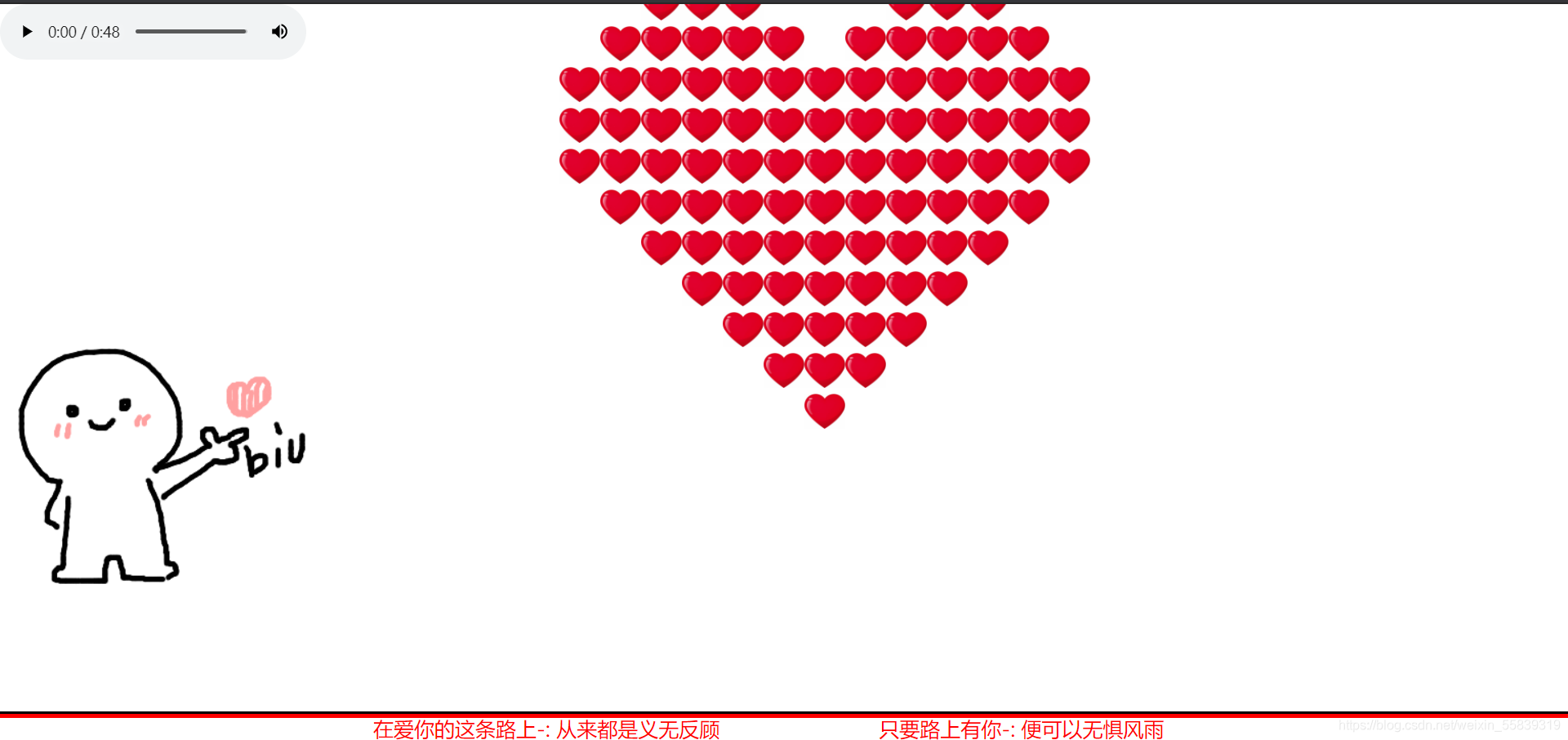
一、样式图
二、html源码
"en">"UTF-8">biu~biu~ "favicon.ico" rel="shortcut icon" class="icon-love" type="images/x-ico">"stylesheet" href="css/index.css">
"container" onselectstart="return false;" unselectable="on">"body_left"> "images/biubiubiu.gif" alt="" οndragstart='return false;'>"body_center love">"block">"div1">"div2">"div3">"div4">"footer">"border">"border-top">"border-bottom">"copyright">"version">在爱你的这条路上-: ;从来都是义无反顾"createTime">只要路上有你-: ;便可以无惧风雨
三、css源码
* {margin: 0;padding: 0;border: 0;
}
.icon-love {width: 400px;
}
html, body {width: 100%;height: 100%;
}body {overflow: hidden;
}.container {width: 100%;height: 100%;position: relative;
}.body_left {width: 300px;height: 300px;left: 0;bottom: 110px;position: absolute;z-index: 98;}.container .love {width: 520px; height: 440px;left: 50%;top: 50%;position: absolute;margin: -260px 0 0 -220px;
}.love .block {right: 0;position: absolute;visibility: hidden;background-color: yellow;
}.love .block div {width: 40px;height: 40px;position: absolute;background: url("../images/heart.png") no-repeat;background-size: contain;/*background-color: #c40908;*//*border: 1px solid silver;*/box-sizing: border-box;
}
@keyframes border {0% {width: 0;}5% {width: 5%;}10% {width: 10%;}15% {width: 15%;}20% {width: 20%;}25% {width: 25%;}30% {width: 30%;}35% {width: 35%;}40% {width: 40%;}45% {width: 45%;}50% {width: 50%;}55% {width: 55%;}60% {width: 60%;}65% {width: 65%;}70% {width: 70%;}75% {width: 75%;}80% {width: 80%;}85% {width: 85%;}90% {width: 90%;}95% {width: 95%;}100% {width: 100%;}}
.footer {bottom: 30px;position: relative;z-index: 99;
}
.footer .border .border-top {/*display: inline-block;*/border-top: 3px solid black;transform-origin: left center;-webkit-animation: border 312 linear;-o-animation: border 12s linear;animation: border 12s linear;animation-fill-mode : both;/*border-bottom: none;*/
}.footer .border .border-bottom {/*display: inline-block;*/float: right;border-top: 4px solid red;transform-origin: right center;-webkit-animation: border 7s linear 12s;-o-animation: border 7s linear 12s;animation: border 7s linear 12s;animation-fill-mode : both;/*border-bottom: none;*/
}.footer .copyright {width: 100%;height: 30px;position: absolute;bottom: -30px;text-align: center;
}.copyright div {width: 30%;line-height: 30px;display: inline-block;
}
.copyright div{font-size: 20px;color: red;
}
.copyright div span {color: red;
}
四、js源码
const blk_pitn = { //各小方块相对自身中心的位置 -- 自身中心确定为#div22的方块block1: [[0, 1],[0, 0],[-1, 0],[-1, -1]],block2: [[0, 1],[0, 0],[-1, 0],[0, -1]],block3: [[-1, 1],[0, 0],[-1, 0],[-1, -1]],block4: [[0, 1],[0, 0],[-1, 0],[-1, -1]],/* 1 */block5: [[-1, 1],[0, 0],[-1, 0],[0, -1]],block6: [[0, -1],[0, 0],[-1, 0],[1, -1]],block7: [[-1, -1],[0, 0],[-1, 0],[1, 0]],block8: [[-1, 1],[0, 0],[-1, 0],[-1, -1]],/* 3 */block9: [[0, -1],[0, 0],[-1, 0],[1, 0]],block10: [[-1, 1],[0, 0],[-1, 0],[1, 0]],block11: [[2, 0],[0, 0],[-1, 0],[1, 0]],/* — */block12: [[0, 1],[0, 0],[-1, 0],[0, -1]],/* 2 */block13: [[0, 1],[0, 0],[-1, 0],[-1, -1]],/* 1 */block14: [[1, 1],[0, 0],[-1, 0],[1, 0]],block15: [[1, -1],[0, 0],[-1, 0],[1, 0]],block16: [[-1, -1],[0, 0],[-1, 0],[1, 0]],/* 7 */block17: [[0, 1],[0, 0],[-1, 0],[0, -1]],/* 2 */block18: [[0, 1],[0, 0],[-1, 0],[-1, -1]],/* 1 */block19: [[0, -1],[0, 0],[-1, 0],[1, 0]],/* 9 */block20: [[1, -1],[0, 0],[-1, 0],[1, 0]],block21: [[0, 1],[0, 0],[-1, 0],[-1, -1]],/* 1 */block22: [[1, 1],[0, 0],[-1, 0],[1, 0]],/* 14 */block23: [[0, 2],[0, 0],[0, -1],[0, 1]] /* | */},offset_pitn = { //各方块block相对爱心中心的位置block1: [5, 3],block2: [5, 1],block3: [3, 4],block4: [3, 2],block5: [3, -1],block6: [2, 5],block7: [2, 1],block8: [1, -1],block9: [1, -3],block10: [1, 2],block11: [0, 3],block12: [0, 0],/* 爱心中心*/block13: [-1, -4],block14: [0, -2],block15: [-2, 4],block16: [-2, 2],block17: [-2, 0],block18: [-3, -2],block19: [-4, 0],block20: [-3, 5],block21: [-5, 3],block22: [-4, 1],block23: [-6, 1] /* 因动画需要移动一个方块,故y轴坐标-1*/};
let blocks = document.getElementsByClassName("block"),block = blocks[0],love = document.getElementsByClassName("love")[0],timer = null,index = 0, //记录拼接爱心的动画步骤clone_block; //用于克隆方块
block.style.top = "50%"; //1.移动方块的自身中心到爱心中心
block.style.left = "50%";
block.style.margin = "-20px 0 0 -20px";
const block_left = parseFloat(window.getComputedStyle(block, null).left.slice(0, -2)), //爱心中心 左边距离父元素的距离block_top = parseFloat(window.getComputedStyle(block, null).top.slice(0, -2)); //爱心中心 顶部距离父元素的距离
function Next() {// debuggerif (++index >= 24) {clearInterval(timer);Rise();// alert("已经是最后一个了!");return;}block.style.visibility = "visible"; //升空动画前允许可见//2.移动方块到指定的位置-即是移动自身中心到目标位置block.style.left = block_left + 40 * offset_pitn["block" + index][0] + "px";block.style.top = block_top - 40 * offset_pitn["block" + index][1] + "px";for (let i = 0; i < block.children.length; i++) {// block.children[1].innerText = index;    //编号便于调试block.children[i].style.left = blk_pitn["block" + index][i][0] * -40 + "px";/* -40 是因为逻辑坐标和浏览器的x,y轴方向不一样*/block.children[i].style.top = blk_pitn["block" + index][i][1] * -40 + "px";}//3.克隆方块—保存现在的位置clone_block = block.cloneNode(true);love.appendChild(clone_block);if (love.children.length >= 24) {blocks[blocks.length - 1].children[2].style.display = "none"; //去掉多余的小方块block.style.display = "none"; //隐藏多出的block方块}
}function Rise() {//4.爱心升高,多出的那个小方块开始掉落debuggerconsole.log("开始升空");let timer2 = null,distance = 0;/* 升高时,移动的距离*/const target = 120,/* 目标距离*/speed = 1;/*移动速度*/let love_top = parseFloat(window.getComputedStyle(love, null).top.slice(0, -2)); //爱心盒子距离屏幕顶部的距离timer2 = setInterval(() => {distance += speed;// console.log(distance);if (distance >= target) {clearInterval(timer2);console.log("升空完毕");}love.style.top = (love_top - distance) + "px";}, 22);}
window.onload = function () {setTimeout(() => {timer = setInterval(() => {Next();}, 200);}, 12000);
};
五、图片:


六、使用说明:
这个开源项目是建立在jquery.js 上面开发的哦;需要小伙伴自己下载插件然后正常引入一下就可以正常运行了
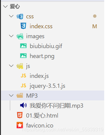
文件目录如下
本文来自互联网用户投稿,文章观点仅代表作者本人,不代表本站立场,不承担相关法律责任。如若转载,请注明出处。 如若内容造成侵权/违法违规/事实不符,请点击【内容举报】进行投诉反馈!