html颜色卡,如何用纯CSS 实现一个颜色卡的效果
这篇文章主要介绍了关于如何用纯CSS 实现一个颜色卡的效果,有着一定的参考价值,现在分享给大家,有需要的朋友可以参考一下
源代码下载
每日前端实战系列的全部源代码请从 github 下载:
https://github.com/comehope/front-end-daily-challenges
代码解读
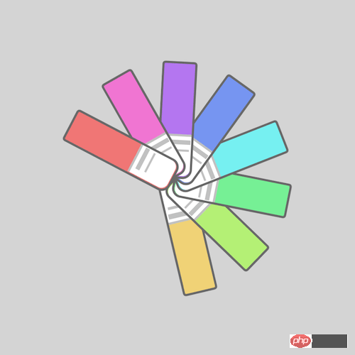
定义 dom,容器中包含 8 个元素:
居中显示:body {
margin: 0;
height: 100vh;
display: flex;
align-items: center;
justify-content: center;
background-color: lightgray;
}
重定义盒模型:.cards,
.cards > * {
box-sizing: border-box;
}
定义容器尺寸:.cards {
width: 20em;
height: 20em;
}
画出色卡:.cards span {
position: absolute;
width: 10em;
height: 3em;
background-color: lightgreen;
top: calc(50% - 3em / 2);
border: 0.2em solid dimgray;
border-radius: 0.3em 0.8em 0.8em 0.3em;
}
用伪元素画出色卡的标签:.cards span::before {
content: '';
position: absolute;
width: 35%;
height: 100%;
background-color: white;
right: 0;
border-radius: 0 0.6em 0.6em 0;
border-left: 0.2em solid silver;
}
用伪元素画出色卡标签上的文字:.cards span::after {
content: '';
position: absolute;
width: 0.4em;
height: 2em;
background-color: silver;
left: 6.5em;
top: 0.1em;
box-shadow: 0.7em 0 0 -0.1em silver;
}
为色卡设置变量:.cards span:nth-child(1) {
--n: 1;
}
.cards span:nth-child(2) {
--n: 2;
}
.cards span:nth-child(3) {
--n: 3;
}
.cards span:nth-child(4) {
--n: 4;
}
.cards span:nth-child(5) {
--n: 5;
}
.cards span:nth-child(6) {
--n: 6;
}
.cards span:nth-child(7) {
--n: 7;
}
.cards span:nth-child(8) {
--n: 8;
}
用 HSL 色彩模式为色卡上色:.cards span {
background-color: hsl(calc(360 / 8 * var(--n)), 80%, 70%);
}
定义动画效果:.cards span {
transform-origin: right;
animation: rotating 3s linear infinite;
}
@keyframes rotating {
0%, 35% {
transform: rotate(0deg);
}
90%, 100% {
transform: rotate(360deg);
}
}
最后,设置动画延时,让卡片依次旋转:.cards span {
animation-delay: calc((var(--n) - 8) * 0.15s);
}
大功告成!
以上就是本文的全部内容,希望对大家的学习有所帮助,更多相关内容请关注PHP中文网!
相关推荐:
本文来自互联网用户投稿,文章观点仅代表作者本人,不代表本站立场,不承担相关法律责任。如若转载,请注明出处。 如若内容造成侵权/违法违规/事实不符,请点击【内容举报】进行投诉反馈!