Matplotlib在figure中画矩形
当您进行数据可视化时,您可能希望通过添加一些注释来突出显示绘图的特定区域。 在这篇文章中,我们将学习如何在 Python 中使用 matplotlib 制作的绘图上添加矩形。 我们将首先添加一个具有特定颜色的简单矩形,然后学习如何用选择的颜色填充矩形。 接下来我们还将看到一个添加文本来描述添加矩形的示例。 最后我们将看到如何在 python 中的 matplotlib 绘图上添加多个矩形。
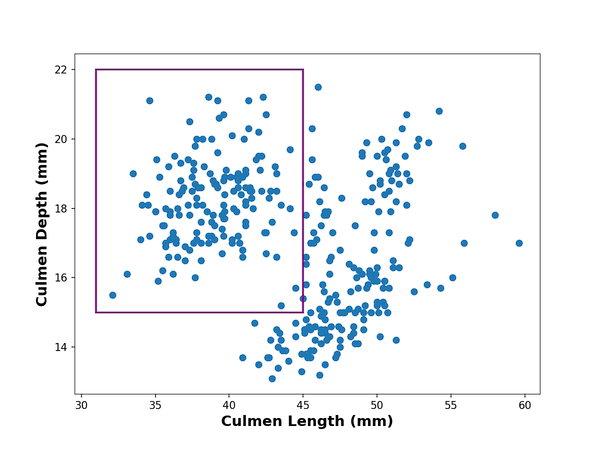
1. 在使用 matplotlib 制作的绘图上绘制矩形
matplotlib 中的 patches 模块允许我们在绘图顶部添加矩形等形状。 让我们将 patches 加载为 mpatches。
import matplotlib.pyplot as plt
import pandas as pd
import matplotlib.patches as mpatchespenguins_data="https://raw.githubusercontent.com/datavizpyr/data/master/palmer_penguin_species.tsv"
# load penguns data with Pandas read_csv
df = pd.read_csv(penguins_data, sep="\t")
df.head()plt.scatter(x=df.culmen_length_mm,y=df.culmen_depth_mm)
plt.xlabel("Culmen Length (mm)",fontweight ='bold', size=14)
plt.ylabel("Culmen Depth (mm)", fontweight ='bold',size=14)
left, bottom, width, height = (31, 15, 14, 7)
rect=mpatches.Rectangle((left,bottom),width,height, fill=False,color="purple",linewidth=2)#facecolor="red")
plt.gca().add_patch(rect)
plt.show
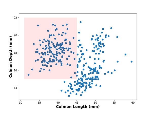
2.在使用 matplotlib 制作的绘图上绘制填充颜色的矩形
之前,我们绘制了一个简单的矩形。现在,让我们以几种不同的方式对其进行自定义。 首先,我们将用颜色填充矩形以更好地突出绘图的部分。
我们可以通过不使用 fill=False 并使用 facecolor 指定颜色来用颜色填充矩形。 在这里,我们还指定填充的透明度级别。
plt.scatter(x=df.culmen_length_mm,y=df.culmen_depth_mm)
plt.xlabel("Culmen Length (mm)",fontweight ='bold', size=14)
plt.ylabel("Culmen Depth (mm)", fontweight ='bold',size=14)
left, bottom, width, height = (31, 15, 14, 7)
rect=mpatches.Rectangle((left,bottom),width,height, #fill=False,alpha=0.1,facecolor="red")
plt.gca().add_patch(rect)
plt.show()
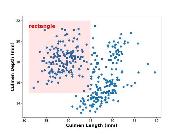
3.在使用 matplotlib 制作的绘图上为矩形添加文本注释
我们可以使用 matplotlib 中的 text() 函数添加文本来描述矩形。 在这里,我们在绘制矩形后立即添加文本注释。
plt.scatter(x=df.culmen_length_mm,y=df.culmen_depth_mm)
plt.xlabel("Culmen Length (mm)",fontweight ='bold', size=14)
plt.ylabel("Culmen Depth (mm)", fontweight ='bold',size=14)
left, bottom, width, height = (31, 15, 14, 7)
rect=mpatches.Rectangle((left,bottom),width,height, #fill=False,alpha=0.1,#color="purple",#linewidth=2,facecolor="red")
plt.gca().add_patch(rect)
# add text with text() function in matplotlib
plt.text(31, 21.3,'rectangle',fontsize=16, color="red", weight="bold")
plt.show()
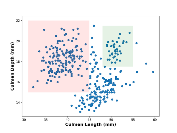
4.在使用 matplotlib 制作的绘图上绘制多个矩形
添加多个矩形以突出显示绘图的多个部分也很容易。 在这个例子中,我们两次使用相似的代码块来添加两个不同颜色的矩形。
# make scatter plot
plt.scatter(x=df.culmen_length_mm,y=df.culmen_depth_mm)
plt.xlabel("Culmen Length (mm)",fontweight ='bold', size=14)
plt.ylabel("Culmen Depth (mm)", fontweight ='bold',size=14)
# add first rectangle with patches
left, bottom, width, height = (31, 15, 14, 7)
rect=mpatches.Rectangle((left,bottom),width,height, #fill=False,alpha=0.1,#color="purple",#linewidth=2,facecolor="red")
plt.gca().add_patch(rect)# add second rectangle with patches
left, bottom, width, height = (48, 17.5, 7, 4)
rect=mpatches.Rectangle((left,bottom),width,height, #fill=False,alpha=0.1,#color="purple",#linewidth=2,facecolor="green")
plt.gca().add_patch(rect)
plt.show()
参考资源
[1] How To Draw a Rectangle on a Plot in Matplotlib?
本文来自互联网用户投稿,文章观点仅代表作者本人,不代表本站立场,不承担相关法律责任。如若转载,请注明出处。 如若内容造成侵权/违法违规/事实不符,请点击【内容举报】进行投诉反馈!