vue3+scss开启写轮眼
vue3+scss开启写轮眼
- 一、相关技术
- 二、使用步骤
- 1.安装依赖
- 2.眼球
- 3 勾玉
- 4 旋转动画
- 5 综合
一、相关技术
采用vue3+vite+scss的技术内容进行开发
二、使用步骤
1.安装依赖
代码如下:
npm install sass
2.眼球
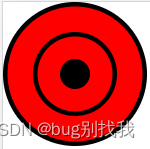
首先我们根据需要 将眼睛的基础形状描绘出来,基础形状是由外眼线、内眼线以及中间的瞳孔组成
<div class="outLine"><div class="innerLine"><div class="eyeBall">div>div>
div>
//外眼线
.outLine {width: 90px;height: 90px;border-radius: 50%;background: red;border: 3px solid #000;display: flex;justify-content: center;align-items: center;//内眼线.innerLine {width: 50px;height: 50px;position: relative;border-radius: 50%;border: 3px solid #000;display: flex;justify-content: center;align-items: center;//瞳孔.eyeBall {width: 20px;height: 20px;border-radius: 50%;background: #000;}}
}
3 勾玉
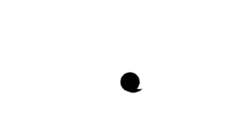
要绘制一个勾玉,先对勾玉的形状进行分析,它是由一个圆和一个勾组成,因此我们可以使用css中的伪类来实现

定义一个div,类名为gouyu
<template><div class="gouyu"></div>
</template><style lang="scss" scoped>
//默认圆
.gouyu {width: 18px;height: 18px;border-radius: 50%;background: #000;position: absolute;top: 12px;
}
//添加勾
.gouyu:before {position: absolute;content: "";width: 12px;height: 10px;left: 2px;//左偏移量top: -6px;//上偏移量border: 0 solid transparent;//取消其余边框border-top: 6px solid #000000;//上边框border-radius: 20px 0 0 0;//上边框圆角transform: rotate(77deg);//勾旋转角度
}
4 旋转动画
要实现勾玉绕瞳孔旋转的效果,我们可以使用css3中的动画实现
.gouyu {transform: rotate(0deg);//默认开始位置transform-origin: 50% 36px;//旋转中心,如不设置默认自旋转animation: 3s gouyuRotate-1850a03c linear infinite;//执行动画的时间,事件,无限次数
}
@keyframes gouyuRotate {from {transform: rotate(0deg);}to {transform: rotate(360deg);}
}
5 综合
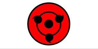
结合二者即可实现以下效果,源代码在此
本文来自互联网用户投稿,文章观点仅代表作者本人,不代表本站立场,不承担相关法律责任。如若转载,请注明出处。 如若内容造成侵权/违法违规/事实不符,请点击【内容举报】进行投诉反馈!