Flex弹性布局整理
随着移动互联网的发展,对于网页布局来说要求越来越高,而传统的布局方案对于实现特殊布局非常不方便,比如垂直居中。
2009年,W3C 提出了一种新的方案----Flex 布局,可以简便、完整、响应式地实现各种页面布局。目前,它已经得到了所有浏览器的支持,这意味着,现在就能很安全地使用这项功能。
| 写在在flex容器上 | 写在在flex子项上 |
|---|---|
| flex-direction | order |
| flex-wrap | flex-grow |
| justify-content | flex-basis |
| align-items | flex |
| align-content | align-self |
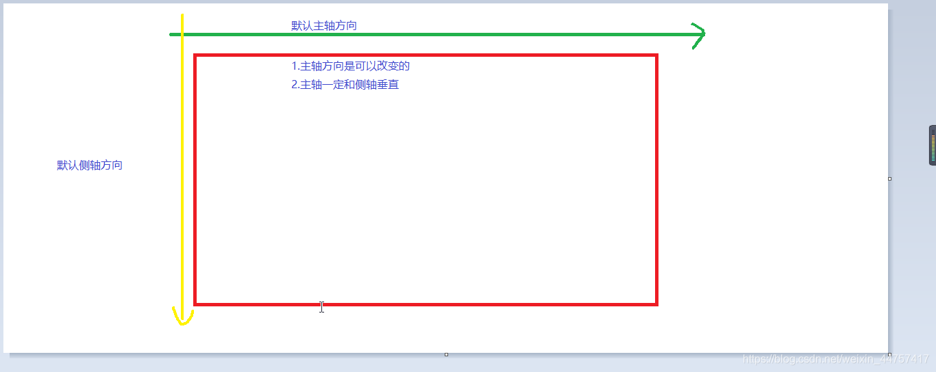
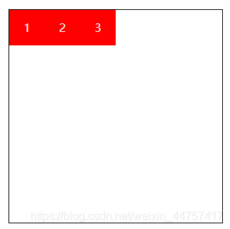
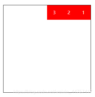
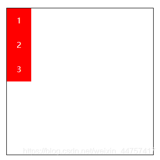
flex-direction
用来控制子项整体布局方向,是从左往右还是从上往下。
| 取值 | 含义 |
|---|---|
| row | 默认值,显示为行。方向为当前文档水平流方向,默认情况是从左往右 |
| row-reverse | 显示为行。但方向和row属性值是反的 |
| column | 显示为列 |
| column-reverse | 显示为列。但方向和column属性值是反的 |
- flex-direction:row;
- flex-direction:row-reverse;
- flex-direction:row-reverse;
- flex-direction:column-reverse;
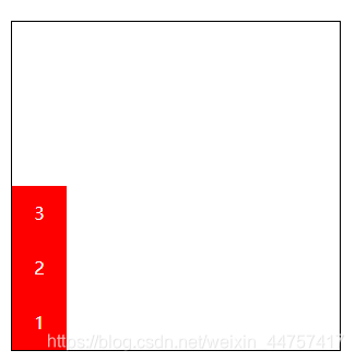
DOCTYPE html>
<html lang="en"><head><meta charset="UTF-8"><meta name="viewport" content="width=device-width, initial-scale=1.0"><title>Documenttitle><style>.box {display: flex;/* 显示为行,方向和row属性值相反 *//* flex-direction: row-reverse; *//* 显示为列 *//* flex-direction: column; *//* 反向 */flex-direction: column-reverse;width: 300px;height: 300px;border: 1px solid black;margin: 100px auto;}.box div {width: 50px;height: 50px;color: white;background-color: red;text-align: center;line-height: 50px;}style>
head><body><div class="box"><div>1div><div>2div><div>3div>div>
body>html>
flex-warp
flex-warp用来控制子项整体单行显示还是换行显示
| 取值 | 含义 |
|---|---|
| nowrap | 默认值,表示单行显示,不换行 |
| wrap | 宽度不足换行显示 |
| wrap-reverse | 宽度不足换行显示,但是还是从上往下开始,也就是原本换行在下面的子项现在跑到上面 |
- flex-wrap:nowrap;
- flex-wrap:wrap;
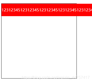
- flex-wrap:wrap-reverse;
DOCTYPE html>
<html lang="en"><head><meta charset="UTF-8"><meta name="viewport" content="width=device-width, initial-scale=1.0"><title>单行还是换行显示title><style>.box {display: flex;/* 宽度不足时换行*//* flex-wrap: wrap; *//* 默认情况 不会立即溢出,直到内容放不下才溢出 *//* flex-wrap: nowrap; *//* 反向 */flex-wrap: wrap-reverse;width: 300px;height: 300px;border: 1px solid black;margin: 100px auto;}.box div {width: 50px;height: 50px;color: white;background-color: red;text-align: center;line-height: 50px;}style>
head><body><div class="box"><div>1div><div>2div><div>3div><div>1div><div>2div><div>3div><div>4div><div>5div><div>1div><div>2div><div>3div><div>1div><div>2div><div>3div><div>4div><div>5div><div>1div><div>2div><div>3div><div>1div><div>2div><div>3div><div>4div><div>5div><div>1div><div>2div><div>3div><div>1div><div>2div><div>3div><div>4div>div>
body>html>
- flex-flow
flex-flow属性是flex-direction和flex-wrap的缩写,表示flex布局的flow流动特性。第一个值表示方向,第二个值表示换行,中间用空格隔开。
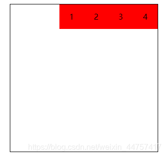
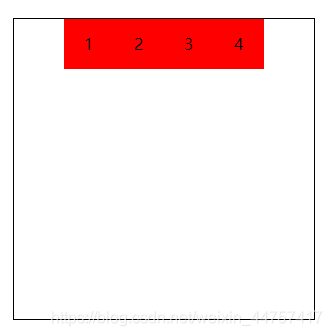
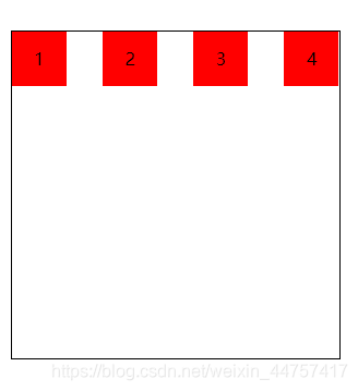
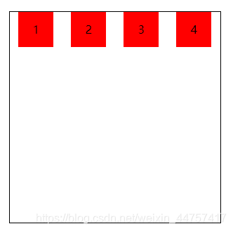
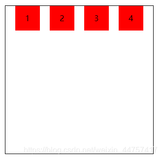
justify-content
| 取值 | 含义 |
|---|---|
| flex-start | 默认值,表现为起始位置对齐 |
| flex-end | 表现为结束位置对齐 |
| center | 表现为居中对齐 |
| space-between | 表现为两端对齐。between是中间的意思,意思是多余的空白间距只在元素中间区域分配 |
| space-around | around是环饶的意思,意思是每个flex子项两侧都环绕互不干扰的等宽的空白间距,最终视觉上边缘两侧的空白只有中间空白宽度的一半 |
| space-evenly | evenly是匀称、平等的意思。也就是视觉上,每个flex子项两侧空白间距完全相等。 |
-
justify-content:flex-start;
PS: 相当于左对齐
-
justify-content:flex-end;
PS:相当于右对齐,不改变盒子顺序
-
justify-content:center;
-
justify-content:space-between;
-
justify-content:space-around;
- justify-content:space-evenly;
DOCTYPE html>
<html lang="en"><head><meta charset="UTF-8"><meta name="viewport" content="width=device-width, initial-scale=1.0"><title>对齐和分布方式title><style>* {margin: 0;padding: 0;}.box {display: flex;/* 起始位置对齐 *//* justify-content: start; *//* 结束位置对齐 *//* justify-content: flex-end; *//* 居中对齐 *//* justify-content: center; *//* 两端对齐 *//* justify-content: space-between; *//* 环绕 *//* justify-content: space-around; *//* 匀称 */justify-content: space-evenly;width: 300px;height: 300px;margin: 100px auto;border: 1px solid black;}.box div {width: 50px;height: 50px;background-color: red;text-align: center;line-height: 50px;}style>
head><body><div class="box"><div>1div><div>2div><div>3div><div>4div>div>
body>html>
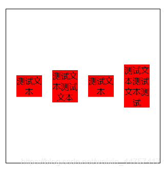
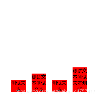
align-items
align-items中的items指的就是flex子项们,因此align-items指的就是flex子项们相对于flex容器在侧轴方向上的对齐方式
| 取值 | 含义 |
|---|---|
| stretch | 默认值,flex子项拉伸(相对于去掉子项的高,会充满整个容器) |
| flex-start | 表现为容器顶部对齐 |
| flex-end | 表现为容器底部对齐 |
| center | 表现为垂直居中对齐 |
-
align-items:stretch;
-
align-items:flex-start;
-
align-items:center;
-
align-items:flex-end;
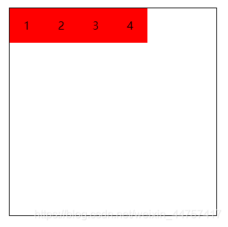
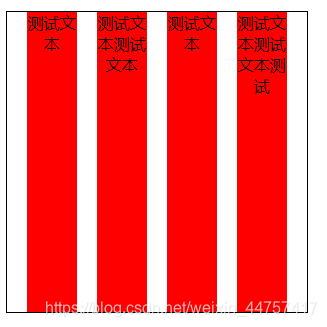
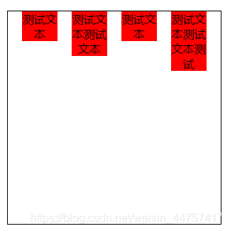
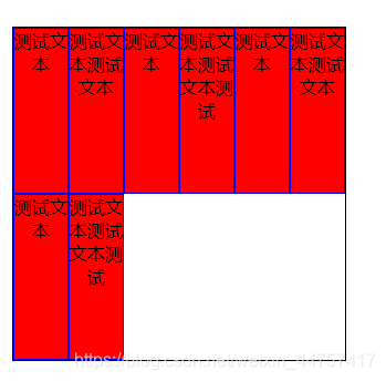
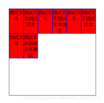
align-content
align-content可以看成和justify-content是相似且对立的属性,如果所有的flex子项只有一行,则align-content属性没有任何效果。
| 取值 | 含义 |
|---|---|
| stretch | 默认值。每行flex子元素都等比拉伸。例如,共有两行flex子元素,则每行拉伸的高度是50%。 |
| flex-start | 表现为起始位置对齐 |
| flex-end | 表现为结束位置对齐 |
| center | 表现为居中对齐 |
| space-between | 表现为两端对齐 |
| space-around | 每一行元素上下都享有独立不重叠的空白空间 |
| space-evenly | 每一行元素都完全上下等分 |
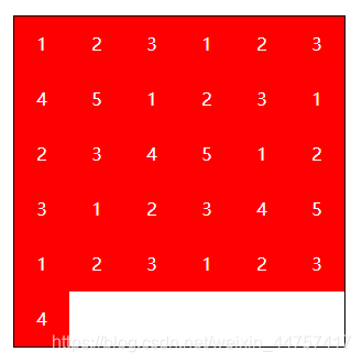
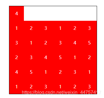
- align-content:stretch;
- align-content:flex-start;
- align-content:flex-end;
- align-content:center;

-
align-content:space-between;
-
align-content:space-around;

-
align-content:space-evenly;
DOCTYPE html>
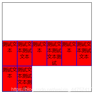
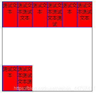
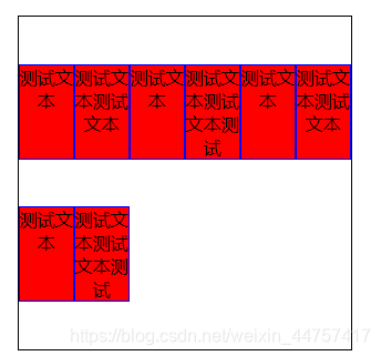
<html lang="en"><head><meta charset="UTF-8"><meta name="viewport" content="width=device-width, initial-scale=1.0"><title>多行对齐方式title><style>.box {display: flex;/* 均匀排列 *//* justify-content: space-evenly; *//* 换行 */flex-wrap: wrap;/* 容器顶部对齐 *//* align-items: flex-start; *//* 拉伸 *//* align-content: stretch; *//* 起始位置对齐 *//* align-content: flex-start; *//* 结束位置对齐 *//* align-content: flex-end; *//* 居中对齐 *//* align-content: center; *//* 两端对齐 *//* align-content: space-between; *//* 环绕 *//* align-content: space-around; *//* 匀称 */align-content: space-evenly;width: 300px;height: 300px;margin: 100px auto;border: 1px solid black;}.box div {width: 50px;border: 1px solid blue;background-color: red;text-align: center;box-sizing: border-box;}style>
head><body><div class="box"><div>测试文本div><div>测试文本测试文本div><div>测试文本div><div>测试文本测试文本测试div><div>测试文本div><div>测试文本测试文本div><div>测试文本div><div>测试文本测试文本测试div>div>
body>html>
ps:
justify-content相对于xz轴方向的排版,align-content相对于y轴的排版。
作用在flex子项的CSS属性
| 取值 | 含义 |
|---|---|
| order | 可以通过设置order改变某一个flex子项的排序位置。所有的flex子项的默认order属性值是0。 |
| flex-grow | 属性中的grow是拓展的意思,拓展的就是flex子项所占的宽度,拓展所侵占的空间就是出去元素外的剩余的空白间隙。默认值为0。 |
| flex-shrink | 属性中的shrink是收缩的意思,flex-shrink主要处理当flex容器空间不足时,单个元素收缩比例。默认值是1。 |
| flex-basis | flex-basis定义了在分配剩余空间之前元素的默认大小 |
| flex | flex属性是flex-grow,flex-shrink和flex-basis的缩写(优先级高) |
| align-self | align-self指控制单独某一个flex子项的垂直对齐方式 |
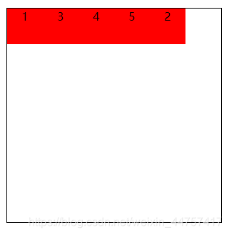
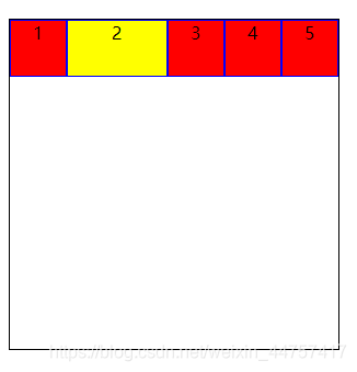
- order:1;
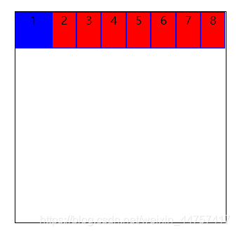
- flex-grow:1;
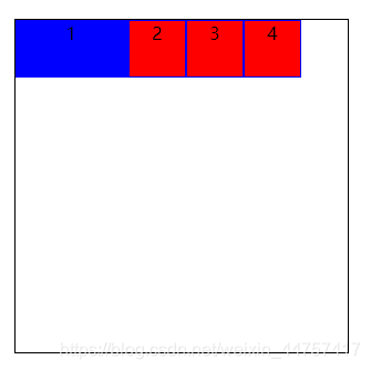
- flex-shrink:0;
- flex-basis:100px;(在有剩余空间的情况下设置)
- flex
flex属性是flex-grow,flex-shrink和flex-basis的缩写。
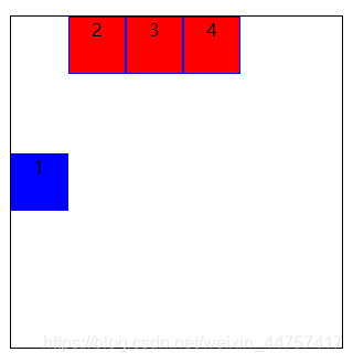
- align-self:center;(flex-start:容器头部对齐 flex-end:容器底部对齐)
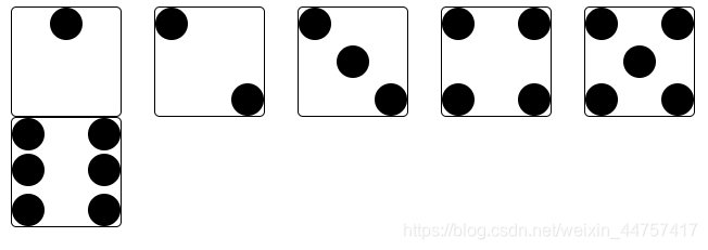
骰子点数案例
DOCTYPE html>
<html lang="en"><head><meta charset="UTF-8"><meta name="viewport" content="width=device-width, initial-scale=1.0"><title>骰子的点数title><style>.box1,.box2,.box3,.box4,.box5,.box6 {float: left;width: 100px;height: 100px;border: 1px solid black;border-radius: 5px;margin-left: 30px;}.box1 div,.box2 div,.box3 div {width: 30%;height: 30%;background-color: black;border-radius: 50%;}.box1 {/* 弹性布局 */display: flex;/* 主轴方向上子项的对齐和分布方式 */justify-content: center;}.box2 {/* 弹性布局 */display: flex;/* 两端对齐 */justify-content: space-between;}.box2 div:nth-child(2) {/* 容器底部对齐 */align-self: flex-end;}.box3 {/* 弹性布局 */display: flex;/* 两端对齐 */justify-content: space-between;}.box3 div:nth-child(2) {/* 垂直居中对齐 */align-self: center;}.box3 div:nth-child(3) {/* 容器底部对齐 */align-self: flex-end;}.box4 {display: flex;/* 折行 */flex-wrap: wrap;}.box4 div {display: flex;/* 两端对齐 */justify-content: space-between;width: 100%;}.box4 div:last-child {/* flex子项容器底部对齐 */align-items: flex-end;}.box4 div i {display: block;width: 30%;height: 60%;background-color: black;border-radius: 50%;}.box5 {display: flex;/* 折行 */flex-wrap: wrap;}.box5 div {display: flex;/* 垂直居中对齐 */justify-content: center;width: 100%;align-items: center;}.box5 div:first-child {/* flex子项容器顶部对齐 */align-items: flex-start;/* 使子项两端对齐 */justify-content: space-between;}.box5 div:last-child {/* flex子项容器底部对齐 */align-items: flex-end;/* 使子项两端对齐 */justify-content: space-between;}.box5 div i {display: block;width: 30%;height: 90%;background-color: black;border-radius: 50%;}.box6 {display: flex;/* 折行 */flex-wrap: wrap;}.box6 div {width: 100%;display: flex;/* 垂直居中对齐 */justify-content: space-between;}.box6 div:first-child {/* flex子项容器顶部对齐 */align-items: flex-start;}.box6 div:last-child {/* flex子项容器底部对齐 */align-items: flex-end;}.box6 div i {display: block;width: 30%;height: 90%;background-color: black;border-radius: 50%;}style>
head><body><div class="box1"><div>div>div><div class="box2"><div>div><div>div>div><div class="box3"><div>div><div>div><div>div>div><div class="box4"><div><i>i><i>i>div><div><i>i><i>i>div>div><div class="box5"><div><i>i><i>i>div><div><i>i>div><div><i>i><i>i>div>div><div class="box6"><div><i>i><i>i>div><div><i>i><i>i>div><div><i>i><i>i>div>div>body>html>
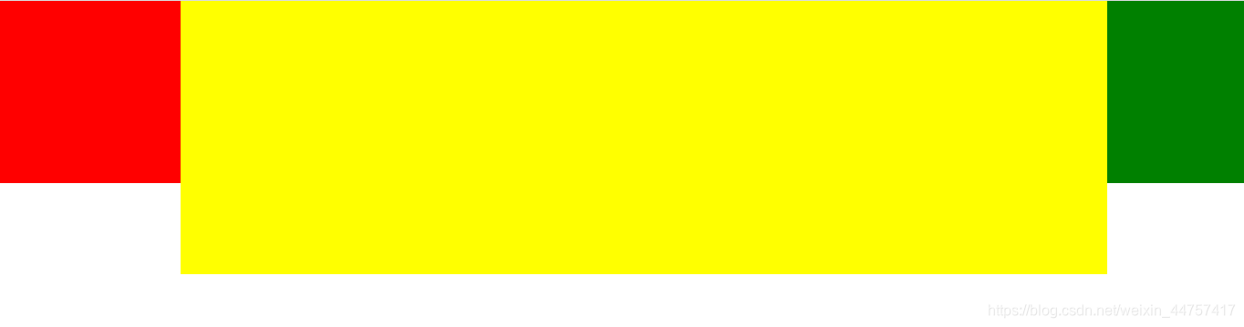
两列固定一列自适应案例
DOCTYPE html>
<html lang="en"><head><meta charset="UTF-8"><meta name="viewport" content="width=device-width, initial-scale=1.0"><title>自适应title><style>* {margin: 0;padding: 0;}.main {display: flex;}.left {width: 200px;height: 200px;background-color: red;}.center {/* 适应剩余的空间 */flex: 1;height: 300px;background-color: yellow;}.right {width: 150px;height: 200px;background-color: green;}style>
head><body><div class="main"><div class="left">div><div class="center">div><div class="right">div>div>
body>html>
本文来自互联网用户投稿,文章观点仅代表作者本人,不代表本站立场,不承担相关法律责任。如若转载,请注明出处。 如若内容造成侵权/违法违规/事实不符,请点击【内容举报】进行投诉反馈!