利用seaborn、statannotations库绘制显著性标注
目录
1、Python-Seaborn 自定义函数绘制
2、Python-statannotations库添加显著性标注
3、Python-statannotations库绘制显著性标注并自己设置标识
4、seaborn中数据的读取格式
5、seaborn.barplot参数(柱状图)
6、相关性热力图自动标记显著性
如何使用Python-SeabornSeaborn进行显著性统计图表绘制,详细内容如下:
- Python-Seaborn自定义函数绘制
- Python-statannotations库添加显著性标注
1、Python-Seaborn 自定义函数绘制
import matplotlib.pylab as plt
import numpy as np
import seaborn as sns
import scipy# ---------------------自定义P值和星号对应关系----------------------
def convert_pvalue_to_asterisks(pvalue):if pvalue <= 0.0001:return "****"elif pvalue <= 0.001:return "***"elif pvalue <= 0.01:return "**"elif pvalue <= 0.05:return "*"return "ns"# ---------------------scipy.stats 计算显著性指标----------------
iris = sns.load_dataset("iris")
data_p = iris[["sepal_length","species"]]
stat,p_value = scipy.stats.ttest_ind(data_p[data_p["species"]=="setosa"]["sepal_length"],data_p[data_p["species"]=="versicolor"]["sepal_length"],equal_var=False)# ------------------------可视化绘制---------------------------
plt.rcParams['font.family'] = ['Times New Roman']
plt.rcParams["axes.labelsize"] = 18
palette=['#0073C2FF','#EFC000FF','#868686FF']fig,ax = plt.subplots(figsize=(5,4),dpi=100,facecolor="w")
ax = sns.barplot(x="species",y="sepal_length",data=iris,palette=palette,estimator=np.mean,ci="sd", capsize=.1,errwidth=1,errcolor="k",ax=ax,**{"edgecolor":"k","linewidth":1})
# 添加P值
x1, x2 = 0, 1
y,h = data_p["sepal_length"].mean()+1,.2
#绘制横线位置
ax.plot([x1, x1, x2, x2], [y, y+h, y+h, y], lw=1, c="k")
#添加P值
ax.text((x1+x2)*.5, y+h, "T-test: {} ".format(p_value), ha='center', va='bottom', color="k")ax.tick_params(which='major',direction='in',length=3,width=1.,labelsize=14,bottom=False)
for spine in ["top","left","right"]:ax.spines[spine].set_visible(False)
ax.spines['bottom'].set_linewidth(2)
ax.grid(axis='y',ls='--',c='gray')
ax.set_axisbelow(True)
plt.show()
2、Python-statannotations库添加显著性标注
Python-statannotations库则是针对Seaborn绘图对象进行显著性标注的专用库,其可以提供柱形图、箱线图、小提琴图等统计图表的显著性标注绘制,计算P值方法基于scipy.stats方法,这里我们简单列举几个示例演示即可,更多详细内容可参看:项目地址、使用教程 or 使用教程。
样例一:
import seaborn as sns
import matplotlib.pylab as plt
from statannotations.Annotator import Annotatordf = sns.load_dataset("tips")x = "day"
y = "total_bill"
order = ['Sun', 'Thur', 'Fri', 'Sat']
fig,ax = plt.subplots(figsize=(5,4),dpi=100,facecolor="w")
ax = sns.boxplot(data=df, x=x, y=y, order=order,ax=ax)pairs=[("Thur", "Fri"), ("Thur", "Sat"), ("Fri", "Sun")]
annotator = Annotator(ax, pairs, data=df, x=x, y=y, order=order)
annotator.configure(test='Mann-Whitney', text_format='star',line_height=0.03,line_width=1)
annotator.apply_and_annotate()ax.tick_params(which='major',direction='in',length=3,width=1.,labelsize=14,bottom=False)
for spine in ["top","left","right"]:ax.spines[spine].set_visible(False)
ax.spines['bottom'].set_linewidth(2)
ax.grid(axis='y',ls='--',c='gray')
ax.set_axisbelow(True)
plt.show()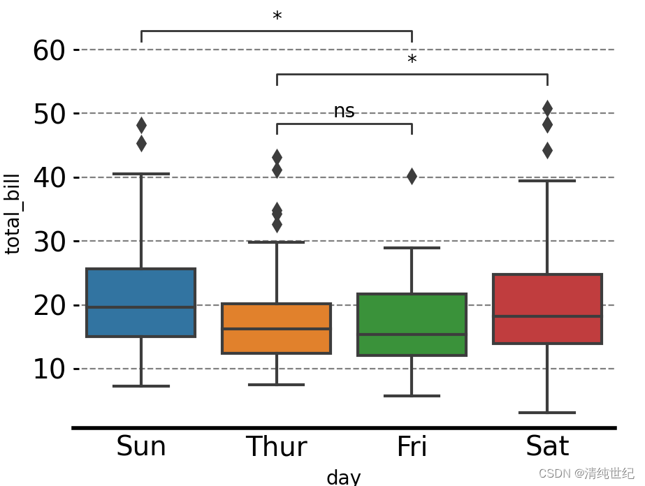
样例二:
import seaborn as sns
import matplotlib.pyplot as plt
plt.rcParams['font.family'] = ['Times New Roman']
plt.rcParams["axes.labelsize"] = 18
#palette=['#0073C2FF','#EFC000FF']
palette=['#E59F01','#56B4E8']
#palette = ["white","black"]fig,ax = plt.subplots(figsize=(5,4),dpi=100,facecolor="w")
ax = sns.barplot(x="order",y="value",hue="class",data=group_data_p,palette=palette,ci="sd",capsize=.1,errwidth=1,errcolor="k",ax=ax,**{"edgecolor":"k","linewidth":1})# 添加P值
box_pairs = [(("one","type01"),("two","type01")),(("one","type02"),("two","type02")),(("one","type01"),("three","type01")),(("one","type02"),("three","type02")),(("two","type01"),("three","type01")),(("two","type02"),("three","type02"))]annotator = Annotator(ax, data=group_data_p, x="order",y="value",hue="class",pairs=box_pairs)
annotator.configure(test='t-test_ind', text_format='star',line_height=0.03,line_width=1)
annotator.apply_and_annotate()
样例三:如果针对组间数据进行统计分析,可以设置pairs参数据如下:
box_pairs = [(("one","type01"),("one","type02")),(("two","type01"),("two","type02")),(("three","type01"),("three","type02"))]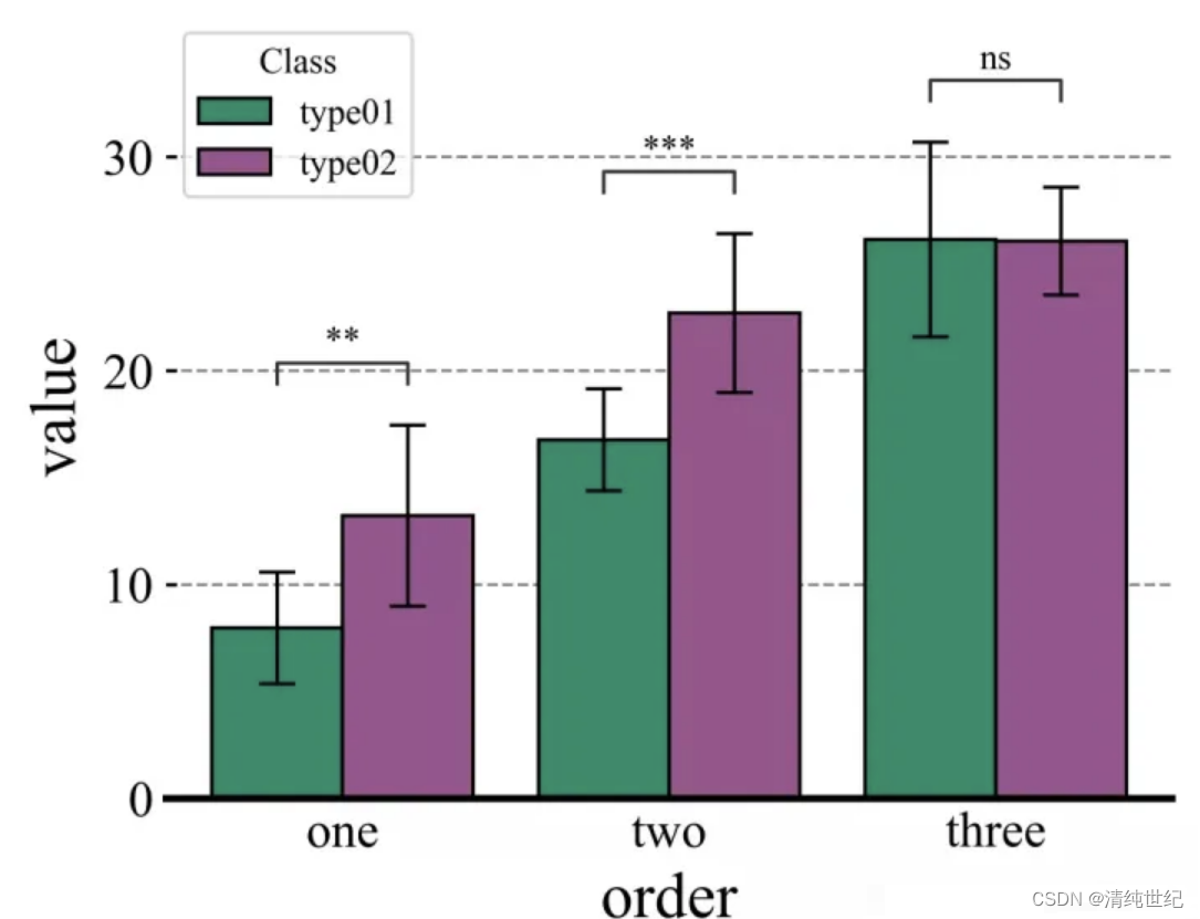
案例四:自定义显著性
import seaborn as sns
import matplotlib.pylab as plt
from statannotations.Annotator import Annotatordf = sns.load_dataset("tips")x = "day"
y = "total_bill"
order = ['Sun', 'Thur', 'Fri', 'Sat']
pairs = [("Sun", "Thur"), ("Sun", "Sat"), ("Fri", "Sun")]
ax = sns.boxplot(data=df, x=x, y=y, order=order)
annot = Annotator(ax, [("Thur", "Fri"), ("Thur", "Sat"), ("Fri", "Sun")], data=df, x=x, y=y, order=order)
annot.new_plot(ax, pairs=pairs, data=df, x=x, y=y, order=order)
annot.configure(test=None, loc='inside')
annot.set_pvalues([0.1, 0.1, 0.001])
annot.annotate()
plt.show()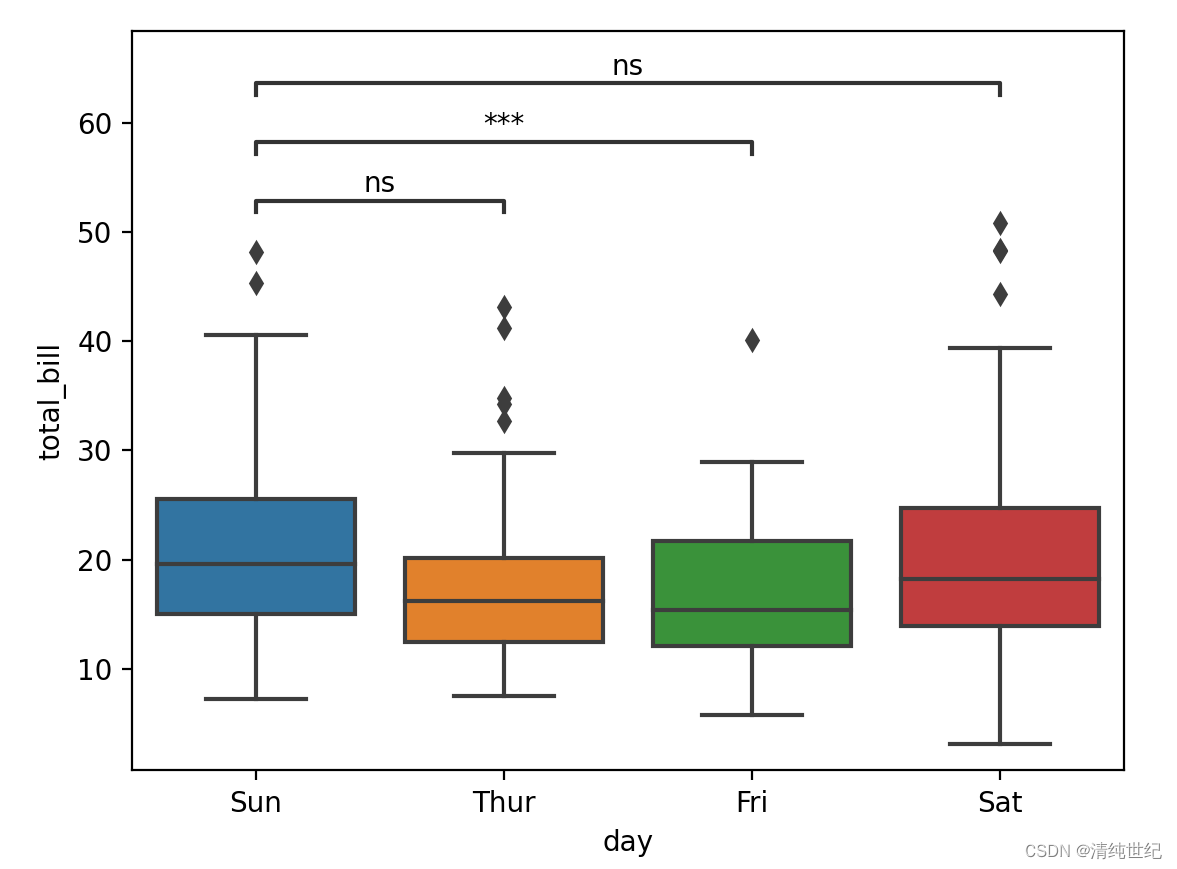
3、Python-statannotations库绘制显著性标注并自己设置标识
在安装的statannotations库文件夹下找到 PValueFormat.py文件并打开
找到下面这个函数,你可以通过修改这个函数添加自己想要的标识效果

4、seaborn中数据的读取格式
例如以 tips 为例,数据结构如下:

例一:如果设置单个柱状图,只需要修改x,y即可。
import seaborn as sns
import matplotlib.pylab as pltdf = sns.load_dataset("tips")order = ['Sun', 'Thur', 'Fri', 'Sat']
fig, ax = plt.subplots(figsize=(5, 4), dpi=100, facecolor="w")
ax = sns.barplot(data=df, x="day", y="total_bill", order=order, ax=ax,capsize=0.2)
plt.show()
例二:如果要绘制分组的柱状图,则还需要设置hue
import seaborn as sns
import matplotlib.pylab as pltdf = sns.load_dataset("tips")order = ['Sun', 'Thur', 'Fri', 'Sat']
fig, ax = plt.subplots(figsize=(5, 4), dpi=100, facecolor="w")
ax = sns.barplot(data=df, x="day", y="total_bill", order=order, ax=ax,capsize=0.2,hue="sex")
plt.show()
5、seaborn.barplot参数(柱状图)
seaborn.barplot(x=None, y=None, hue=None, data=None, order=None, hue_order=None, estimator=mean , ci=95,n_boot=1000, units=None, seed=None, orient=None, color=None, palette=None, saturation=0.75, errcolor='.26',errwidth=None, capsize=None, dodge=True, ax=None, **kwargs)- x,y:str ,dataframe中的列名
- hue:dataframe的列名,按照列名的值分类形成分类的条形图;
- data:dataframe或数组
- order,hue_order(list of strings):用于控制条形图的顺序;
- estimator:默认mean 可以修改为 median 中位数
- ci:置信区间的大小(默认95%),如果为sd,跳过引导程序并绘制观测值的标准偏差(标准差 (standard Deviation,SD)、标准误差(standard Error,SE)、置信区间表示);
- orient:绘图方向,v,h
- palette:调色板【"Set3",""】
- saturation:饱和度
- capsize:设置误差棒帽条(上下两根横线)的宽度;
- n_boot:计算代表置信区间的误差线时,默认采用bootstrap抽样方法,控制bootstrap抽样次数;
- errcolor:设置误差线颜色,默认黑色;
- errwidth:设置误差线的显示线宽;
- dodge:当使用分类参数hue时,dodge=True,不同bar显示,False 同bar不同颜色;
- ax:选择图形将显示在哪个axes对象上,默认当前Axes对象;
6、相关性热力图自动标记显著性
import pandas as pd
import seaborn as sns
import matplotlib.pyplot as plt
import numpy as np
from scipy.stats import pearsonr
import matplotlib as mpldef cm2inch(x,y):return x/2.54,y/2.54size1 = 10.5
mpl.rcParams.update(
{
'text.usetex': False,
'font.family': 'stixgeneral',
'mathtext.fontset': 'stix',
"font.family":'serif',
"font.size": size1,
"font.serif": ['Times New Roman'],
}
)
fontdict = {'weight': 'bold','size':size1,'family':'SimHei'}df_coor=np.random.random((10,10)) # 相关性结果
fig = plt.figure(figsize=(cm2inch(16,12)))
ax1 = plt.gca()#构造mask,去除重复数据显示
mask = np.zeros_like(df_coor)
mask[np.triu_indices_from(mask)] = True
mask2 = mask
mask = (np.flipud(mask)-1)*(-1)
mask = np.rot90(mask,k = -1)im1 = sns.heatmap(df_coor,annot=True,cmap="RdBu"
, mask=mask#构造mask,去除重复数据显示
,vmax=1,vmin=-1
, fmt='.2f',ax = ax1)ax1.tick_params(axis = 'both', length=0)#计算相关性显著性并显示
rlist = []
plist = []
for i in range(df_coor.shape[0]):for j in range(df_coor.shape[0]):r,p = pearsonr(df_coor[i],df_coor[j])rlist.append(r)plist.append(p)rarr = np.asarray(rlist).reshape(df_coor.shape[0],df_coor.shape[0])
parr = np.asarray(plist).reshape(df_coor.shape[0],df_coor.shape[0])
xlist = ax1.get_xticks()
ylist = ax1.get_yticks()widthx = 0
widthy = -0.15for m in ax1.get_xticks():for n in ax1.get_yticks():pv = (parr[int(m),int(n)])rv = (rarr[int(m),int(n)])if mask2[int(m),int(n)]<1.:if abs(rv) > 0.5:if  pv< 0.05 and pv>= 0.01:ax1.text(n+widthx,m+widthy,'*',ha = 'center',color = 'white')if  pv< 0.01 and pv>= 0.001:ax1.text(n+widthx,m+widthy,'**',ha = 'center',color = 'white')if  pv< 0.001:print([int(m),int(n)])ax1.text(n+widthx,m+widthy,'***',ha = 'center',color = 'white')else:if  pv< 0.05 and pv>= 0.01:ax1.text(n+widthx,m+widthy,'*',ha = 'center',color = 'k')elif  pv< 0.01 and pv>= 0.001:ax1.text(n+widthx,m+widthy,'**',ha = 'center',color = 'k')elif  pv< 0.001:ax1.text(n+widthx,m+widthy,'***',ha = 'center',color = 'k')
plt.show()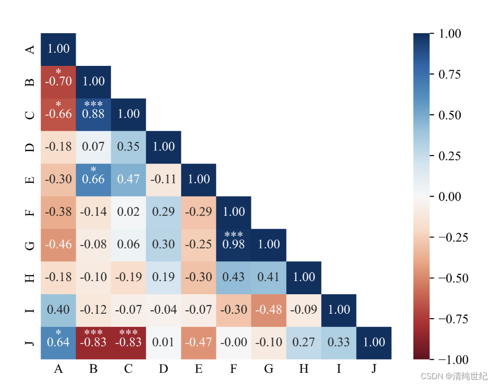
本文来自互联网用户投稿,文章观点仅代表作者本人,不代表本站立场,不承担相关法律责任。如若转载,请注明出处。 如若内容造成侵权/违法违规/事实不符,请点击【内容举报】进行投诉反馈!