详解flex布局做骰子案例
此文转载自:https://blog.csdn.net/yun_shuo/article/details/111754151
详解flex布局做骰子案例
上次案例用到了css3的3D特效,3D特效做正方体也是很常用的,所有我想到了利用css3做一个骰子,而骰子每一面的点数利用定位做起来很麻烦,利用css3的flex布局是很方便的,这次来看看如何利用flex弹性盒子的一些属性完成骰子点数的布局~
首先,建立一个3D空间元素,做成正方体,是上一篇中详细介绍过如何创建一个3D空间元素,这里就不细说了~实现一个正方体的原理是,在一个父元素中包含六个子元素,transform:rotate和translate来转变好每一个的面,在编写过程中,以下是我觉得对视觉效果有很好体验的一些细节:1、视距设置在body中,值给大一些。2、背景为黑色,骰子的每一面边框带一些圆角和内阴影。以下是我做出一个正方体的效果。
正方体创建好后,到了这次的重点–利用弹性盒子flex的一些属性来布局每一面的点数。
首先在每一面中创建对应的div个数,并给每一面的div设置display:flex;和flex-wrap:wrap;(弹性盒子中元素在必要时换行)样式点数1
第一面只有一个子div,所以只需将其中心对齐就好了。设置justify-content: center;(元素在弹性盒子主轴中心开始排列)和 align-items: center;(元素在弹性盒子交叉轴中心开始排列),就可以实现水平垂直对称了。部分代码如下
.father1{justify-content: center;align-items: center;}
点数2
第二面两个元素首先设置主轴元素两侧的间距相等排列,再将第二个元素靠交叉轴终点排列。部分代码如下
.father2{justify-content: space-around;}.father2 .son:nth-child(2){align-self:flex-end;}
点数3
第三面三个元素首先设置主轴元素两侧的间距相等排列,再将第二个元素靠交叉轴中心排列,第三个元素靠交叉轴终点排列,部分代码如下
.father3{justify-content: space-around;}.father3 .son:nth-child(2){align-self:center;}.father3 .son:nth-child(3){align-self:flex-end;}
点数4
第三面两个元素一排并且都是靠垂直居中些排列,这里我设置主轴元素两侧的间距相等排列,由于元素在一列排不下会自动换行,所以增大每个元素外边距就实现效果了,部分代码如下
.father4{justify-content:space-around;}.father4 .son{margin: 25px;}
点数5
第五面在子元素创建时分别创三个div里面分别放2、1、2div,设置主轴元素两侧的间距相等排列,设置盒子元素纵向排列,将面底下的三个div设为弹性盒子,第一、三个div设置主轴元素两侧的间距相等排列,第二个div设置主轴元素靠中心排列,部分代码如下
.father5{justify-content: space-around;flex-direction: column;}.father5>div{display: flex;}.five_1{justify-content: space-around;}.five_2{justify-content: center;}.five_3{justify-content: space-around;}
点数6
第五面在子元素创建时分别创三个div里面分别放2、1、2div,设置主轴元素两侧的间距相等排列,设置盒子元素纵向排列,将面底下的三个div设为弹性盒子设置主轴元素两侧的间距相等排列,和盒子元素横向排列,部分代码如下
.father6{flex-direction:column;justify-content: space-around;}.father6>div{display: flex;flex-direction:row;justify-content:space-around;}
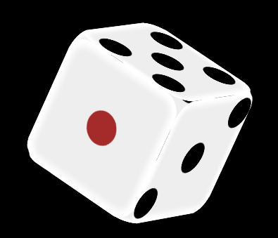
再给骰子用animation属性加一个自动旋转的效果,就更加炫酷啦,示例图和完整代码如下。
代码
<html lang="en">
<head><meta charset="UTF-8"><title>Documenttitle><style>*{margin: 0px;padding:0px;}body{perspective:8000px;background-color: black;}.big{position: relative;top: 300px;left: 400px;width: 200px;height: 200px;/* border: 1px solid red; */transform-style: preserve-3d;transform:rotateX(180deg);/* transform:rotatey(90deg); *//* transition:all 10s linear; */animation: run 10s linear 0s infinite;}/* .big:hover{transform:rotateX(180deg) rotatey(180deg) rotatez(180deg);  } */@keyframes run {0%{transform:rotateX(0deg) rotatey(0deg) rotatez(0deg);}100%{transform:rotateX(180deg) rotatey(180deg) rotatez(180deg);}}.father{position: absolute;width: 200px;height: 200px;display: flex;flex-wrap:wrap;border-radius: 30px;box-shadow: 0px 0px 10px 10px #fff inset;background-color: #EEE;/* padding: 10px; */}.son{width: 50px;height: 50px;border-radius: 25px;background-color: black;/* margin: 25px; */}/* 第一个面 */.father1{transform:rotateX(-90deg) translatez(-100px);justify-content: center;align-items: center;}.father1 .son{background-color: brown;}/* 第六个面 */.father6{transform:rotateX(-90deg) translatez(100px);flex-direction:column;justify-content: space-around;}.father6>div{display: flex;flex-direction:row;justify-content:space-around;}/* 第二个面 */.father2{transform:rotateY(-90deg) translatez(100px);justify-content: space-around;}.father2 .son:nth-child(2){/* background-color: brown; */align-self:flex-end;}/* 第五个面 */.father5{transform:rotateY(-90deg) translatez(-100px);justify-content: space-around;flex-direction: column;}.father5>div{display: flex;}.father5 .son{margin: 0px;}.five_1{justify-content: space-around;}.five_2{justify-content: center;}.five_3{justify-content: space-around;}/* 第三个面 */.father3{transform: translatez(100px);justify-content: space-around;/* align-content:space-between; */}.father3 .son{margin: 0px;}.father3 .son:nth-child(2){align-self:center;}.father3 .son:nth-child(3){align-self:flex-end;}/* 第四个面 */.father4{transform: translatez(-100px);justify-content:space-around;/* align-content:space-around; */}.father4 .son{margin: 25px;}style>
head>
<body><div class="big"><div class="father father1"><div class="son son1">div>div>  <div class="father father2"><div class="son">div><div class="son">div>div><div class="father father3"><div class="son son1">div><div class="son son1">div><div class="son son1">div>div><div class="father father4"><div class="son son1">div><div class="son son1">div><div class="son son1">div><div class="son son1">div>div><div class="father father5"><div class="five_1"><div class="son">div><div class="son">div>div><div class="five_2"><div class="son">div>   div><div class="five_3"><div class="son">div><div class="son">div>div>   div><div class="father father6"><div class="six_1"><div class="son">div><div class="son">div>div><div class="six_2"><div class="son">div><div class="son">div>div><div class="six_3"><div class="son">div><div class="son">div>div>div> div>
body>
html>
css3的flex布局做骰子效果就实现啦,对你有帮助的话点个赞支持下哦~
本文来自互联网用户投稿,文章观点仅代表作者本人,不代表本站立场,不承担相关法律责任。如若转载,请注明出处。 如若内容造成侵权/违法违规/事实不符,请点击【内容举报】进行投诉反馈!