一篇全面搞定垂直水平居中的常见11种方式(超详细)
冷静思考,举一反三
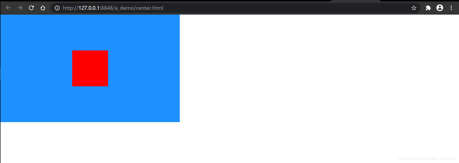
先看初始代码和初始效果,后续居中样式在此基础上面修改添加
<html><head><meta charset="utf-8"><title>title>head><style type="text/css">*{margin: 0;padding: 0;}.songtao{width: 500px;height: 300px;background-color: dodgerblue;/* 左右居中 */margin: auto;}.center{width: 100px;height: 100px;background-color: red;}style><body><div class="songtao"><div class="center">div>div>body>
html>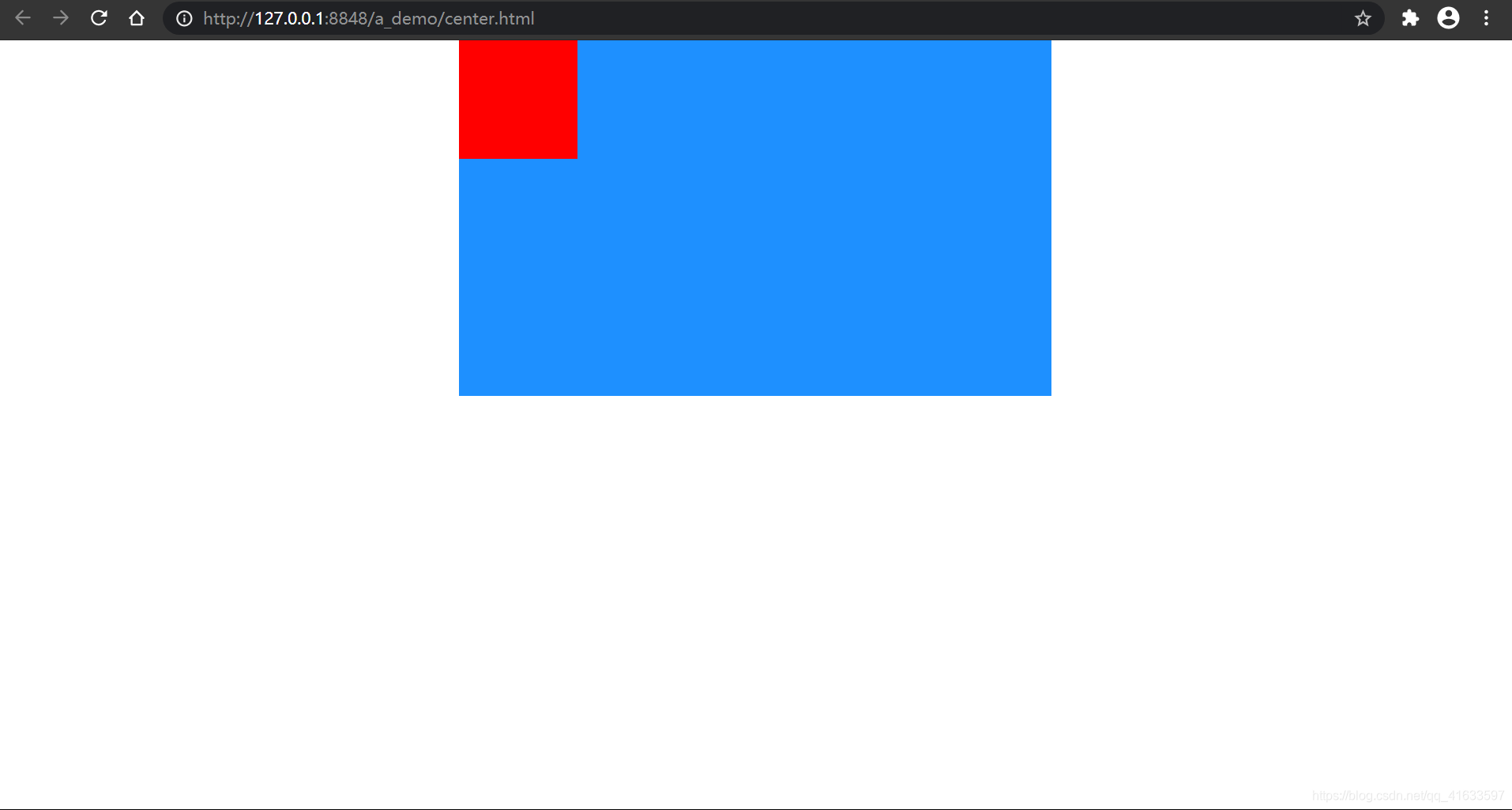
块级元素
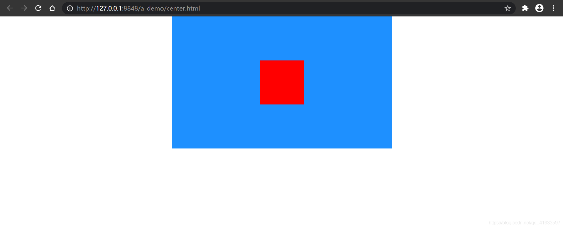
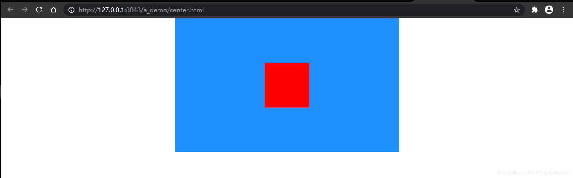
1.Flex
利用Flex来居中元素是我最喜欢的垂直水平居中方式之一,几行代码就能优雅地实现元素垂直水平完美居中,简单实用。
关键语句:display: flex;(弹性盒子)
justify-content: center;(左右居中)
align-items: center;(垂直居中)
.songtao{width: 500px;height: 300px;background-color: dodgerblue;margin: auto;/* 添加样式 */display: flex;justify-content: center;align-items: center;}
效果:
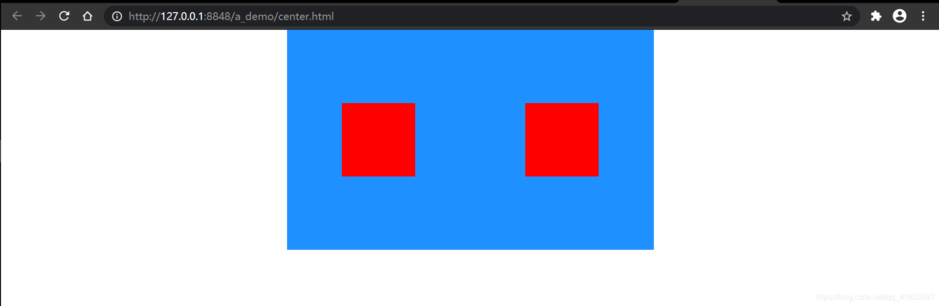
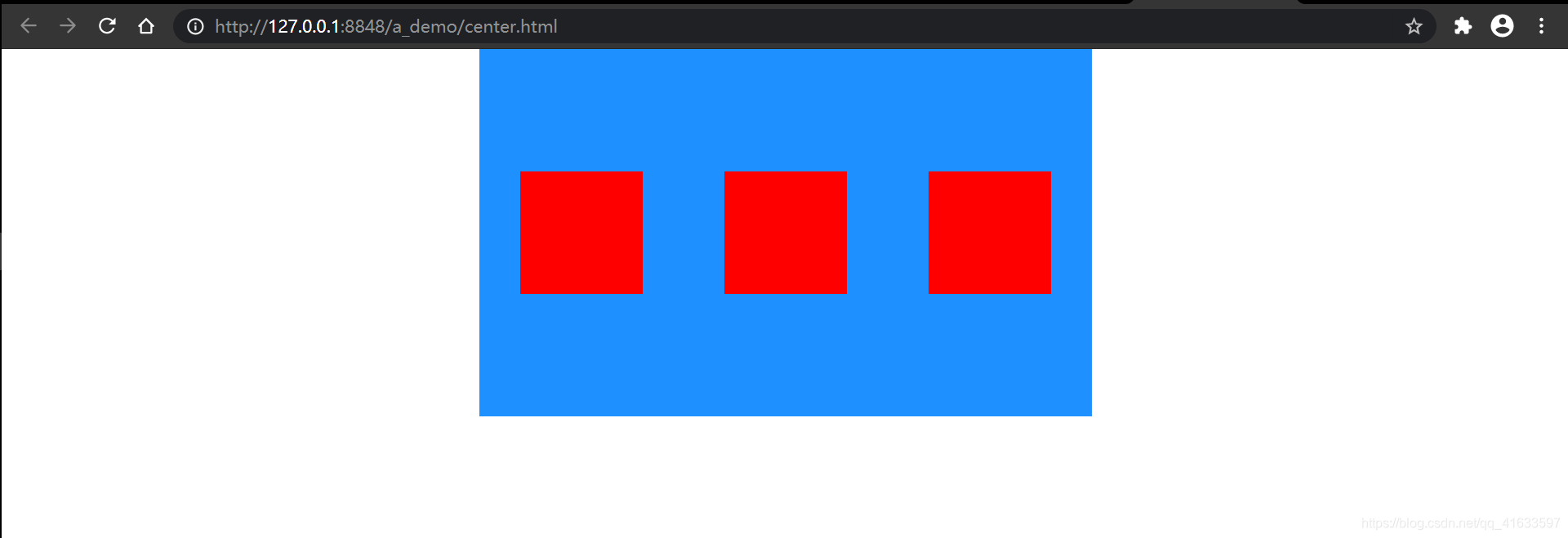
2.display + margin
关键语句:父元素display: flex;(弹性盒子)
子元素margin: auto;(上下左右居中)
.songtao{width: 500px;height: 300px;background-color: dodgerblue;margin: auto;/* 添加样式 */display: flex;}
.center{width: 100px;height: 100px;background-color: red;/* 添加样式 */margin: auto;}
效果:

注意:此方法只能完美居中一个子元素,如果子元素不止一个,则所有子元素垂直居中、左右均匀占据父容器所有空间。如下:
3.table-cell
关键语句:父元素display: table-cell;
vertical-align: middle;
子元素margin: auto;
(或)table-cell + display
关键语句:父元素display: table-cell;
vertical-align: middle;
text-align: center;
子元素display: inline-block;
.songtao{width: 500px;height: 300px;background-color: dodgerblue;margin: auto; /* 失效 *//* 添加样式 */display: table-cell;vertical-align: middle;}.center{width: 100px;height: 100px;background-color: red;/* 添加样式 */margin: auto;}
效果:
可以看到子元素依然相对于父元素完美居中
4.position + translate
关键语句:父元素position: relative;
子元素position: absolute;
top: 50%;
left: 50%;
transform: translate(-50%, -50%);
.songtao {width: 500px;height: 300px;background-color: dodgerblue;margin: auto;/* 添加样式 */position: relative;}.center {width: 100px;height: 100px;background-color: red;/* 添加样式 */position: absolute;top: 50%;left: 50%;transform: translate(-50%, -50%);}
效果:

5.position + margin
关键语句:父元素position: relative;
子元素position: absolute;
top: 0;
bottom: 0;
left: 0;
right: 0;
margin: auto;
.songtao {width: 500px;height: 300px;background-color: dodgerblue;margin: auto;/* 添加样式 */position: relative;}.center {width: 100px;height: 100px;background-color: red;/* 添加样式 */position: absolute;top: 0;bottom: 0;left: 0;right: 0;margin: auto;}
效果:

6.position+calc( )
关键语句:父元素position: relative;
子元素position: absolute;
top: calc(50% - 50px);
left: calc(50% - 50px);
.songtao {width: 500px;height: 300px;background-color: dodgerblue;margin: auto;/* 添加样式 */position: relative;}.center {width: 100px;height: 100px;background-color: red;/* 添加样式 */position: absolute;/* 不一定为50px,根据被居中元素宽、高确定,支持百分数%*/top: calc(50% - 50px);left: calc(50% - 50px);}
效果:

7.position+负margin
关键语句:父元素position: relative;
子元素position: absolute;
top:50%;
left:50%;
margin: -50px;
.songtao {width: 500px;height: 300px;background-color: dodgerblue;margin: auto;/* 添加样式 */position: relative;}.center {width: 100px;height: 100px;background-color: red;/* 添加样式 */position: absolute;top:50%;left:50%;/* 不是所有的都能简写 */margin: -50px;}
效果:

8.Grid(网格布局)
兼容性不如Flex布局
关键语句:父元素display:grid;
子元素align-self: center;
justify-self: center;
.songtao {width: 500px;height: 300px;background-color: dodgerblue;margin: auto;/* 添加样式 */display:grid;}.center {width: 100px;height: 100px;background-color: red;/* 添加样式 */align-self: center;justify-self: center;}
效果:
9.最呆的方式(我称之为“强行居中”)
“强行居中”有很多方法,把属性值写“死”的(子元素大小不是规定大小就居中不了的)、不灵活的、无自身优点的方法我都归为“强行居中”,这里举一例:
关键语句?:重要的还是得知道被居中元素宽高
父元素:width: 500px;
height: 300px;
子元素:width: 100px;
height: 100px;
.songtao {width: 500px;height: 300px;background-color: dodgerblue;margin: auto;/* 添加样式 */position: relative;}.center {width: 100px;height: 100px;background-color: red;/* 添加样式 */position: absolute;/* 300/2-100/2 */top: 100px;/* 500/2-100/2 */left: 200px;}
效果:

行级元素
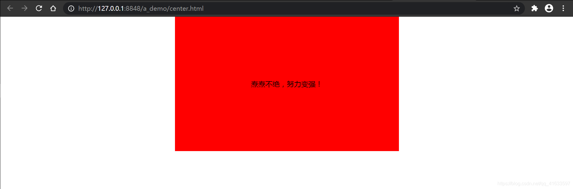
<html><head><meta charset="utf-8"><title>title>head><style type="text/css">* {margin: 0;padding: 0;}.songtao {width: 500px;height: 300px;background-color: dodgerblue;margin: auto;/* 添加样式 */position: relative;}.center {width: 100px;height: 100px;background-color: red;}style><body><div class="songtao"><span class="center">焘焘不绝,努力变强!span>div>body>
html>
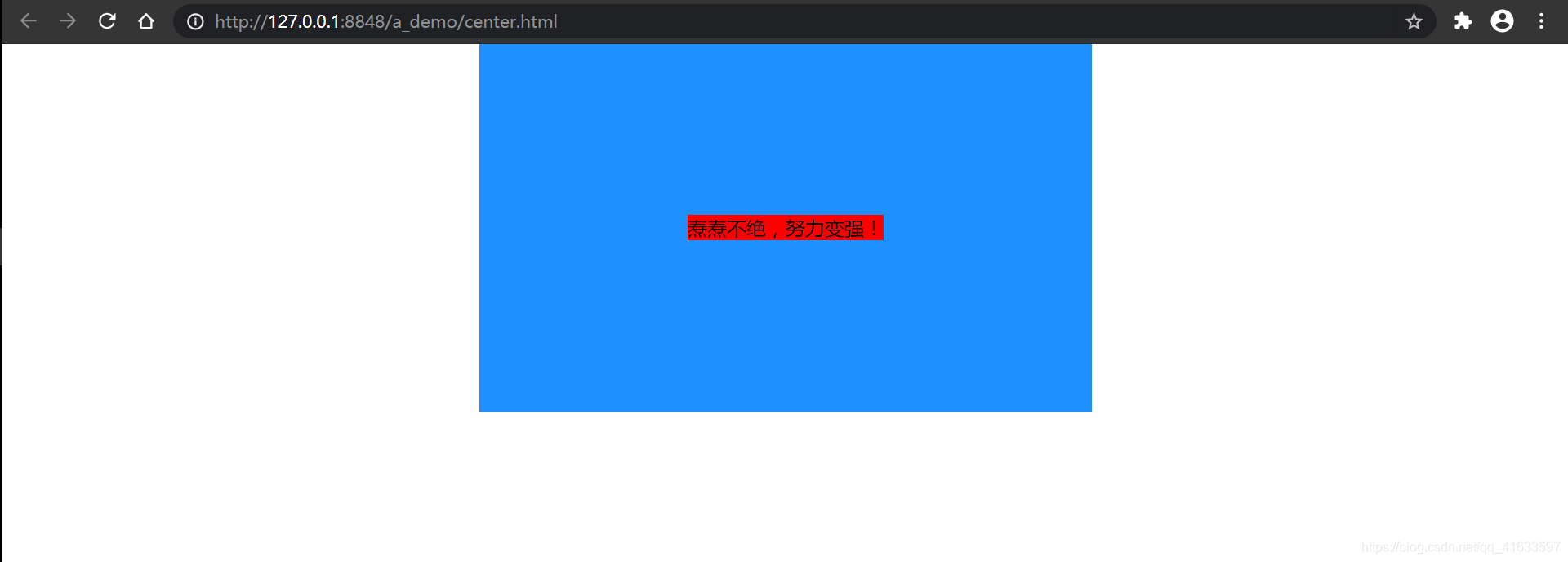
10.line-height + text-align
关键语句:父元素 text-align: center;
子元素line-height:父元素height;
.songtao {width: 500px;height: 300px;background-color: dodgerblue;margin: auto;/* 添加样式 */text-align: center;}.center {width: 100px;height: 100px;background-color: red;/* 添加样式 */line-height: 300px;}
效果:
11.display + vertical-align
关键语句:父元素 display: table;
子元素display: table-cell;
vertical-align: middle;
text-align: center;
.songtao {width: 500px;height: 300px;background-color: dodgerblue;/* 失效 */margin: auto;/* 添加样式 */display: table;}.center {width: 100px;height: 100px;background-color: red;/* 添加样式 */display: table-cell;vertical-align: middle;text-align: center;}
效果:
引申
善用弹性盒子,行内元素/行内块级元素善用vertical-align: middle;
总结:
本篇这里只讲怎么实现(块级、行级实现方式可互通,灵活用),具体原因与各个方法优缺点这里不细讲(有时间再写),各位可以尝试理解一下,当然还有一些上下左右的居中方式,但是我觉得不好的或者纯粹就是上边的有的方法的变种,所以就不写上去,各位如果还有什么好的居中方式希望在评论区不吝赐教。初写博客,写的不好(或有缺漏…),但尽量以我的能力给大家提供逻辑清晰,质量更高的博文。感谢各位朋友阅读至此!=^_^=
本文来自互联网用户投稿,文章观点仅代表作者本人,不代表本站立场,不承担相关法律责任。如若转载,请注明出处。 如若内容造成侵权/违法违规/事实不符,请点击【内容举报】进行投诉反馈!