Qt之QSS选择器
文章目录
- 前言
- 一、选择器种类
- 二、选择器使用
- 1、通用选择器 *
- 2、类型选择器
- 3、类选择器
- 4、ID选择器
- 5、属性选择器
- 6、包含选择器
- 7、子元素选择器
- 8、伪类选择器
- 9、Subcontrol 选择器
- (1)QCheckBox 、QRadioButton
- (2)QComboBox
- (3)QSpinBox、QDateEdit、QTimeEdit、QDateTimeEdit
- (4)QSlider
- (5)QProgressBar
- (6)QGroupBox
- (7)QTableView
- (8)QTreeView
- (9)QTabWidget
- (10)QScrollBar
- (11)QCalendarWidget
前言
选择器决定了style sheet作用于哪些widget,QSS支持CSS2中定义的所有选择器。
一、选择器种类
QSS的选择器有如下几种:
- 通用选择器 *
- 类型选择器
- 类选择器
- ID 选择器
- 属性选择器
- 包含选择器
- 子元素选择器
- 伪类选择器
- Subcontrol 选择器
二、选择器使用
1、通用选择器 *
*作为选择器,作用于所有的widget。
2、类型选择器
类名作为选择器,作用于它自己和它的所有子类。
QFrame {background: gray;
}
3、类选择器
.类名或.class的属性值作为选择器,作用于它自己,它的子类不受影响。这一点,与类型选择器是有区别的。举例说明:
#include 此时,window窗口和三个按钮的背景都变成灰色,如果只想window的背景为灰色,则使用.类名作为选择器:
app.setStyleSheet(".QWidget {background: gray;}")
如果设置openButton和closeButton的背景为洋红色,而saveButton的背景不受影响,则使用.class作为选择器:
app.setStyleSheet(".QWidget { background: gray; }"".RedButton { background: magenta; }");// .RedButton 将作为类选择器
openButton->setProperty("class",  "RedButton");
closeButton->setProperty("class", "RedButton");
4、ID选择器
#对象名,作为选择器,只作用于该对象。代码中创建的objectName要使用setObjectName函数设置对象名。
app.setStyleSheet(".QWidget { background: gray; }""#openButton, #closeButton { background: magenta; }");openButton->setObjectName("openButton");
closeButton->setObjectName("closeButton");
5、属性选择器
选择器[属性=“值”] 作为选择器,这个属性可用通过 object->property(propertyName) 访问的,Qt 里称为 Dynamic Properties。
app.setStyleSheet(".QWidget { background: gray; }""QPushButton[level='dangerous'] { background: magenta; }");openButton->setProperty("level",  "dangerous");
closeButton->setProperty("level", "dangerous");
QSS 会把所有 QPushButton 中属性 level 值为 dangerous 按钮的背景绘制为洋红色,其他按钮的背景色不受这个 QSS 影响。属性的值可以用单引号、双引号括起来。如果值没有空格,可以不使用引号,但不建议这么做。
注意:程序运行时属性值变化后 QSS 不会自动生效,需要调用 widget->setStyleSheet() 或者 widget->style()->polish(widget) 强制刷新 QSS 才行。
6、包含选择器
通常使用如下格式作为包含选择器:类名 类名,选择器之间用空格隔开,作用于widget中的子widget,子widget中的子widget,依次类推。
QFrame {background: gray;
}/* 设置 QFrame 中的 QPushButton 的 QSS */
QFrame QPushButton {border: 2px solid magenta;border-radius: 10px;background: white;padding: 2px 15px;
}
QFrame中的QPushButton的样式会生效,QFrame外的QPushButton不会生效。
7、子元素选择器
通常使用如下格式作为包含选择器:类名 类名,选择器之间用>隔开,作用于widget的直接子widget。
QFrame {background: gray;
}QFrame > QPushButton {border: 2px solid magenta;border-radius: 10px;background: white;padding: 2px 15px;
}
与包含选择器的区别:
作用于widget的直接子widget,直接子widget的子widget不生效。
8、伪类选择器
选择器:状态 作为选择器,支持 ! 操作符,表示 非。
QPushButton:hover { color: white }
QCheckBox:checked { color: white }
QCheckBox:!checked { color: red }
通过QSS设置按钮的悬浮、按下等效果时,一般选用这种方式进行设置。
伪类选择器支持链式规则,即选择器:状态1:状态2:状态3,状态之间使用逻辑与,同时满足条件样式才生效。
QCheckBox:hover:checked { color: white }
常见的伪类选择器如下:
- :disabled Widget 被禁用时
- :enabled Widget 可使用时
- :focus Widget 得到输入焦点
- :hover 鼠标放到 Widget 上
- :pressed 鼠标按下时
- :checked 被选中时
- :unchecked 未选中时
- :has-children Item 有子 item,例如 QTreeView 的 item 有子 item 时
- :has-siblings Item 有 兄弟,例如 QTreeView 的 item 有兄弟 item 时
- :open 打开或展开状态,例如 QTreeView 的 item 展开,QPushButton 的菜单弹出时
- :closed 关闭或者非展开状态
- :on Widget 状态是可切换的(toggle), 在 on 状态
- :off Widget 状态是可切换的(toggle), 在 off 状态
更多更详细的内容请参考 Qt 的帮助文档,搜索 Qt Style Sheets Reference,查看最下面的 List of Pseudo-States。
9、Subcontrol 选择器
选择器::subcontrol 作为选择 Subcontrol 的选择器,CSS中没有这个概念。
有些 widget 是由多个部分组合成的,可以使用 选择器::subcontrol 来设置 subcontrol 的样式。
Subcontrol 的 QSS 和大多数 widget 的差不多,也支持盒子模型,可以自定义 color, background, background-color, background-image, border, padding, margin, width, height 等,也支持 Pseudo-States。
Subcontrol 的绘制位置由 subcontrol-origin、subcontrol-position, top, left 来指定
(1)QCheckBox 、QRadioButton
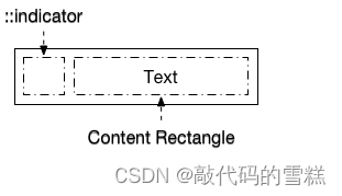
QCheckBox 和QRadioButton的QSS一样,以QCheckBox举例, QCheckBox由 icon(indicator) 和 text 组成:
下面的QSS效果:
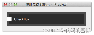
QCheckBox::indicator {subcontrol-origin: border;subcontrol-position: left center;background: white;border: 2px solid rgb(170, 170, 170);
}
QCheckBox {color: lightgray;background: rgb(44, 44, 44);border: 10px solid rgb(76, 76, 76);spacing: 10px; /* indicator 和 text 的间隔 */padding: 10px;
}
QCheckBox::indicator:checked {background: rgb(76, 76, 76);
}
此处的spacing 表示icon和text之间的间距。另外,text 总是显示在 indicator 右边,所以如果 indicator 靠右边显示的话,text 很可能就看不到了。
(2)QComboBox
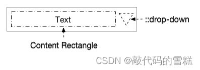
QComboBox 的 subcontrol 有 drop-down:
下面的QSS效果:
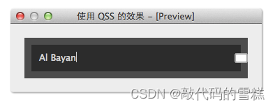
QComboBox {color: lightgray;background: rgb(44, 44, 44);border: 10px solid rgb(76, 76, 76);spacing: 10px; /* indicator 和 text 的间隔 */padding: 10px;
}QComboBox::drop-down {width: 15px;height: 10px;subcontrol-origin: border;subcontrol-position: right center;background: white;border: 2px solid rgb(170, 170, 170);border-radius: 3px;
}QComboBox::drop-down:hover {background: rgb(76, 76, 76);
}QComboBox::drop-down:on {background: black;top: 1px;left: 1px;
}
(3)QSpinBox、QDateEdit、QTimeEdit、QDateTimeEdit
QSpinBox 的 subcontrol 有 ::up-button, ::down-button, ::up-arrow, ::down-arrow。
- up-button 显示在 QSpinBox 里,它的 subcontrol-origin 是相对于 QComboBox 的
- down-button 显示在 QSpinBox 里,它的 subcontrol-origin 是相对于 QComboBox 的
- up-arrow 显示在 up-button 里,它的 subcontrol-origin 是相对于 up-button 的
- down-arrwo 显示在 down-button 里,它的 subcontrol-origin 是相对于 down-button 的
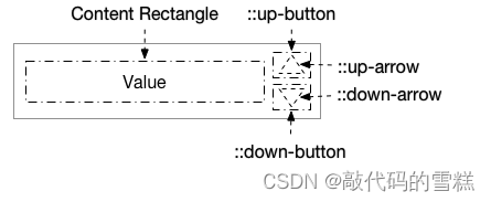
下面的QSS效果,down-button 靠左垂直居中,up-button 靠右垂直居中:
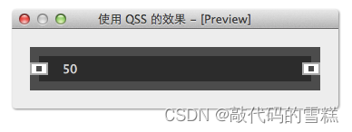
QSpinBox {color: lightgray;background: rgb(44, 44, 44);border: 10px solid rgb(76, 76, 76);padding: 5px;
}QSpinBox::down-button, QSpinBox::up-button {subcontrol-origin: border;width: 16px;height: 10px;background: white;border: 2px solid rgb(170, 170, 170);
}QSpinBox::down-button {subcontrol-position: center left;
}QSpinBox::up-button {subcontrol-position: center right;
}QSpinBox::up-arrow,  QSpinBox::down-arrow {subcontrol-origin: content;subcontrol-position: center center;width: 6px;height: 6px;background: rgb(76, 76, 76);
}
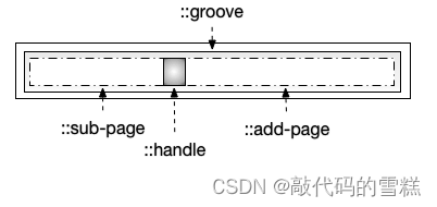
(4)QSlider
QSlider 的 subcontrol 有 ::groove(槽),::handle,::add-page 和 ::sub-page。
- groove 显示在 QSlider 里,它的 subcontrol-origin 是相对于 QSlider 的
- handle 显示在 groove 里,它的 subcontrol-origin 是相对于 groove 的
sub-page 显示在 groove 里,它的 subcontrol-origin 是相对于 groove 的 - add-page 显示在 groove 里,它的 subcontrol-origin 是相对于 groove 的
- handle, sub-page, add-page 虽然都显示在 groove 里,但是都可以把它们扩展到 groove 外
下面的QSS效果:
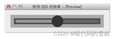
QSlider {background: rgb(170, 170, 170);padding: 2px;height: 40px;
}QSlider::groove:horizontal {subcontrol-origin: content;background: rgb(76, 76, 76);/* the groove expands to the size of the slider by default.by giving it a height, it has a fixed size */height: 20px;
}QSlider::handle:horizontal {background-color: rgb(50, 50, 50);width: 40px;border-radius: 20px;/* handle is placed by default on the contents rect of the groove.Expand outside the groove */margin: -10px 0;
}QSlider::sub-page:horizontal {background: #999;margin: 5px;border-radius: 5px;
}QSlider::add-page:horizontal {background: #666;margin: 5px;border-radius: 5px;
}
Groove 的默认高度和 QSlider content rectangle 的高度一样,给它一个高度值就可以让他有固定的高度了,把 groove 的 height 去掉试试。
Handle 的默认高度和 groove content rectangle 的高度一样,为了让起显示超出 groove,需要设置 margin 为负值,如果这个负值太小,显示超出 QSlider 的部分将看不到。Handle 的 subcontrol-position 没有作用,因为 handle 不是固定在一个地方的,而是根据 QSlider 的值动态计算显示的位置。
(5)QProgressBar
QProgressBar 的 subcontrol 有 ::chunk。
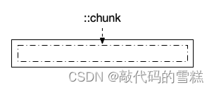
对于 QProgressBar 的 QSS,大多数都是想把 chunk 定义为圆角矩形的样子,但是当它的 value 比较小时,chunk 的圆角会变成直角,即使使用图片都不行,效果很不理想,所以如果要修改 QProgressBar 的外观的话,推荐继承 QProgressBar 自己绘制或者使用 QStyle。
(6)QGroupBox
QGroupBox 的 subcontrol 有 ::title 和 ::indicator。
- title 相对于 QGroupBox
- indicator 的 subcontrol-origin 和 subcontrol-position 自定义无效
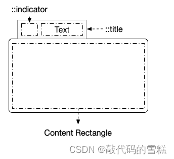
下面的QSS效果:
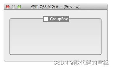
QGroupBox {background-color: qlineargradient(x1: 0, y1: 0, x2: 0, y2: 1,stop: 0 #E0E0E0, stop: 1 #EEEEEE);border: 2px solid gray;border-radius: 5px;margin-top: 10px; /* leave space at the top for the title */
}QGroupBox::title {subcontrol-origin: margin;subcontrol-position: top center; /* position at the top center */padding: 2px 3px;color: white;margin-top: 2px;background-color: gray;border-radius: 3px;spacing: 5px;
}QGroupBox::indicator {width: 13px;height: 13px;border: 1px solid black;background: white;
}QGroupBox::indicator:checked {background: yellow;
}
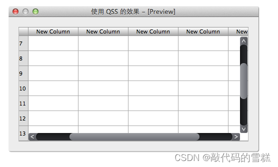
(7)QTableView
QTableView 相关的 subcontrol 有 QTableView 的 ::item,QHeaderView 的 ::section 和 左上角的 QTableCornerButton 的 ::section。QTableView 的 QSS 对于 QTableWidget 也是生效的。
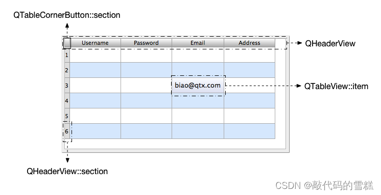
下面的QSS效果:
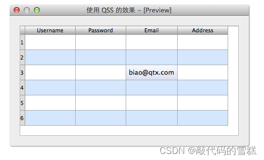
QTableView, QHeaderView, QTableView::item {background: white;
}QTableView::item:alternate {background: rgb(209, 231, 254);
}QTableView::item:selected { /*被选中的index*/color: black;background: qlineargradient(x1: 0, y1: 0, x2: 0, y2: 1,stop: 0 #FAFBFE,stop: 1 #DCDEF1);
}QHeaderView::section:horizontal, QTableCornerButton::section {background-color: qlineargradient(spread:reflect,x1:0, y1:0, x2:0, y2:1,stop:0 rgba(255, 255, 255, 255),stop:1 rgba(164, 164, 164, 255));border: 1px solid rgb(153, 153, 153);border-width: 0 1px 1px 0;
}QHeaderView::section:vertical {background: #DDD;border: 1px solid rgb(153, 153, 153);border-width: 0 1px 1px 0;
}
注意:QTableView::item 设置 padding, margin 没有的效果。
(8)QTreeView
QTreeView 相关的 subcontrol 有 QHeaderView::section(和上面 QTableView 的 header view 的 QSS 一样,其实就是一个东西),QTreeView::item 和 QTreeView::branch。QTreeView 的 QSS 对于 QTreeWidget 也是生效的。
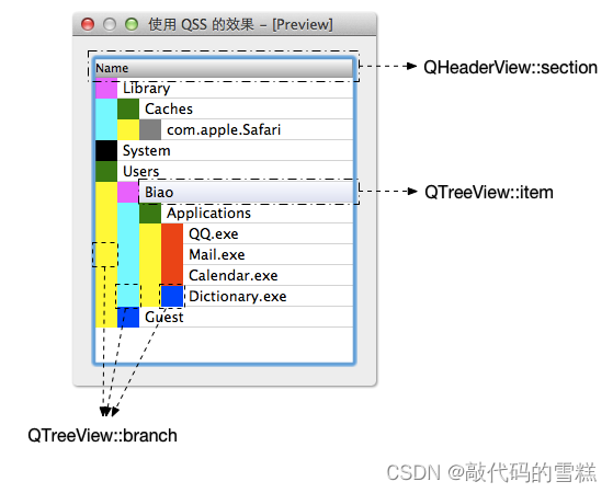
QTreeView 的 subcontrol 并不多,但是 branch 有很多种不同的状态,下面的QSS效果:
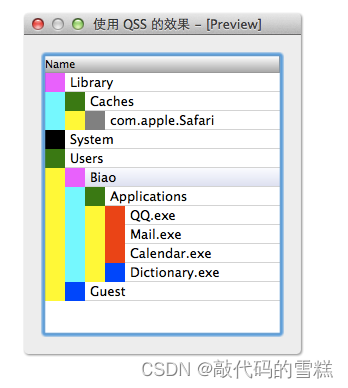
QHeaderView::section:horizontal {background-color: qlineargradient(spread:reflect,x1:0, y1:0, x2:0, y2:1,stop:0 rgba(255, 255, 255, 255),stop:1 rgba(164, 164, 164, 255));border: 1px solid rgb(153, 153, 153);border-width: 0 1px 1px 0;
}QTreeView::item {border-bottom: 1px solid lightgray;selection-color: black;
}QTreeView::item:selected { /*被选中的index*/background: qlineargradient(x1: 0, y1: 0, x2: 0, y2: 1,stop: 0 #FAFBFE,stop: 1 #DCDEF1);
}QTreeView::branch {background: yellow;
}QTreeView::branch:has-siblings:!adjoins-item {background: cyan;
}QTreeView::branch:has-siblings:adjoins-item {background: red;
}QTreeView::branch:!has-children:!has-siblings:adjoins-item {background: blue;
}QTreeView::branch:closed:has-children:has-siblings {background: black;
}QTreeView::branch:has-children:!has-siblings:closed {background: gray;
}QTreeView::branch:open:has-children:has-siblings {background: magenta;
}QTreeView::branch:open:has-children:!has-siblings {background: green;
}
Qt 的帮助文档里对 QTreeView 的 QSS 已经有一个很完善的例子,在 QtCreator 的帮助里搜索 style sheets examples,定位到 Customizing QTreeView 就可以看到这个例子了。
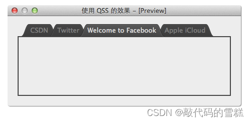
(9)QTabWidget
QTabWidget 相关的 subcontrol 有:
- QTabWidget::pane
- QTabWidget::tab-bar
- QTabBar::tab
- QTabBar::close-button
- QTabBar::tear
- QTabBar::scroller
- QTabBar QToolButton::left-arrow
- QTabBar QToolButton::right-arrow
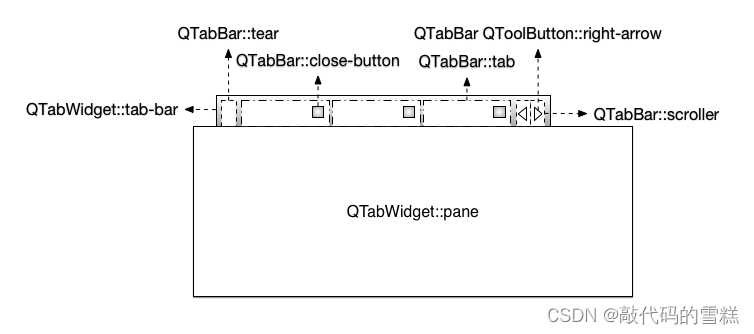
QTabWidget 还是存在一些问题的:
- QTabBar::close-button 只能定位在 tab 的左边或者右边,不能调整和文本之间的间隔
- Tab 互相遮盖的情况下,如我们的例子的样式,拖动 tab 时某些 tab 会被截断
- QTabBar::scroller 的定位也是个问题,不能自由定位到需要的位置
- QTabBar 和 QTabWidget 不一样宽
下面QSS的效果:
QTabWidget::pane { /* The tab widget frame */border: 2px solid rgb(69, 69, 69);margin-top: -2px;
}QTabWidget::tab-bar {left: 5px; /* move to the right by 5px */
}QTabBar::tab {color: gray;min-width: 40px;height: 28px;border-width: 0 18px 0 18px;border-image: url(:/img/tab-inactive.png) 0 18 0 18 stretch stretch;
}QTabBar::tab:selected {color: #DDD;height: 28px;border-width: 0 18px 0 18px;border-image: url(:/img/tab-active.png) 0 18 0 18 stretch stretch;
}QTabBar::tab:!first {margin-left: -20px;
}QTabBar::tab:hover {color: #DDD;
}
QTabWidget 的关闭按钮可如下定义样式:
QTabBar::close-button {image: url(close.png);subcontrol-position: left;
}
QTabBar::close-button:hover {image: url(close-hover.png)
}
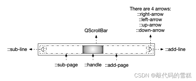
(10)QScrollBar
QScrollBar 相关的 subcontrol 挺多的,仔细观察的话,有点像 QSpinBox 和 QSlider 的合体:
- ::sub-line, ::add-line
- ::sub-page, ::add-page
- ::up-arrow, ::down-arrow
- ::left-arrow, ::right-arrow
下面的QSS效果:
QScrollBar:horizontal {height: 16px;border-width: 0px 10px 0px 10px;border-image: url(:/img/horizontal-track.png) 0 10 0 10 repeat stretch;margin-left: 6px;margin-right: 16px;padding-right: 4px;
}QScrollBar::handle:horizontal {min-width: 40px;border-width: 0 17px 0 17px;border-image: url(:/img/horizontal-handle.png) 0 17 0 17 repeat repeat;
}QScrollBar::sub-line:horizontal {width: 20px;height: 17px;subcontrol-position: left;subcontrol-origin: margin;background-image: url(:/img/horizontal-sub-line.png)
}QScrollBar::add-line:horizontal {width: 20px;height: 17px;subcontrol-position: right;subcontrol-origin: border;background-image: url(:/img/horizontal-add-line.png)
}QScrollBar:vertical {width: 16px;border-width: 10px 0px 10px 0px;border-image: url(:/img/vertical-track.png) 10 0 10 0 repeat repeat;margin-top: 6px;margin-bottom: 16px;padding-bottom: 6px;
}QScrollBar::handle:vertical {min-height: 40px;border-width: 17px 0px 17px 0px;border-image: url(:/img/vertical-handle.png) 17 0 17 0 repeat repeat;
}QScrollBar::sub-line:vertical {width: 17px;height: 22px;subcontrol-position: top left;subcontrol-origin: margin;background-image: url(:/img/vertical-sub-line.png)
}QScrollBar::add-line:vertical {width: 17px;height: 22px;subcontrol-position: bottom;subcontrol-origin: border;background-image: url(:/img/vertical-add-line.png)
}
(11)QCalendarWidget
QCalendarWidget 是一个比较复杂的 widget,由几个 QToolButton, QSpinBox, QMenu, QTableView 等组成。Qt 的帮助文档里没有其 QSS 的相关文档。
我们这里采用的方法是分析组成 QCalendarWidget 的 widget 的 className 和 objectName,然后 QSS 每个 widget,最终达到修改 QCalendarWidget 样式的目的。
MainWidget::MainWidget(QWidget *parent) : QWidget(parent), ui(new Ui::MainWidget) {ui->setupUi(this);dumpStructure(ui->calendarWidget, 0);
}MainWidget::~MainWidget() {
}void MainWidget::dumpStructure(const QObject *obj, int spaceCount) {qDebug() << QString("%1%2 : %3").arg("", spaceCount).arg(obj->metaObject()->className()).arg(obj->objectName());QObjectList list = obj->children();foreach (QObject * child, list) {dumpStructure(child, spaceCount + 4);}
}
使用函数 dumpStructure() 打印出 QCalendarWidget 的树形组成结构,分析输出的objectName,不难得出它们对应的 widget 如下图所示:
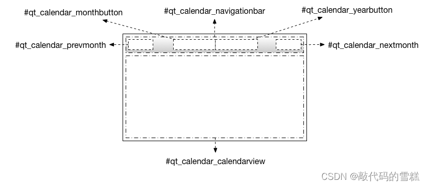
下面的QSS效果:

#qt_calendar_calendarview {background: white;
}#qt_calendar_navigationbar {background: rgba(215, 215, 215, 255);
}QToolButton {icon-size: 30px, 30px;width: 80px;height: 30px;
}QToolButton#qt_calendar_prevmonth {background: green;width: 40px;qproperty-icon: url(:/resources/tabset-left.png);
}QToolButton#qt_calendar_nextmonth {background: blue;width: 40px;qproperty-icon: url(:/resources/tabset-right.png);
}QToolButton#qt_calendar_monthbutton {background: yellow;padding-right: 20px;
}QToolButton#qt_calendar_yearbutton {background: magenta;
}QToolButton#qt_calendar_monthbutton::menu-indicator{subcontrol-origin: padding;subcontrol-position: center right;right: 3px;width: 10px;
}QAbstractItemView {color: black;selection-color: white;selection-background-color: rgb(255, 174, 0);font: 15px;
}
注意:QSS 对 QCalendar 里的 QHeaderView::section 和 QTableView::item 没有效果,但可以用 QPalette 修改其颜色和背景。
本文来自互联网用户投稿,文章观点仅代表作者本人,不代表本站立场,不承担相关法律责任。如若转载,请注明出处。 如若内容造成侵权/违法违规/事实不符,请点击【内容举报】进行投诉反馈!