go.js的基本使用(主要是vue,react同理)
一、go.js的基本使用
引言:首先写这篇文章是为了记录一下自己用到的api,以及接触到的设置方法,部分详解有摘自其他博主的文章,我主要是在vue中使用,涉及到业务方面的就不过多解释,react我也自测过,都是同一个套路,希望本篇文章能帮助到各位码友!!!
1.官方文档
- 官方api: https://gojs.net/latest/api/
- 官方例子:https://gojs.net/latest/samples/orgChartStatic.html
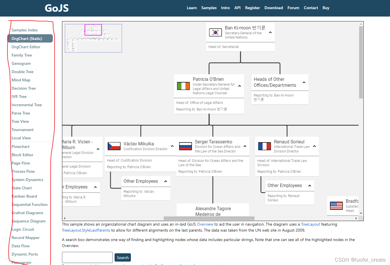
- 左边有许多例子,可以根据自己的需要挑选合适的例子使用
- 具体的设置api,比如按钮,连接线什么的:https://gojs.net/latest/intro/buttons.html
2.安装,以及去除水印的方法
npm install gojs --save
-
我目前装的应该现在最新版的 “gojs”: “^2.2.14”,
-
我在博客也搜到不少解决的方法,在这里就分享两种方法:
-
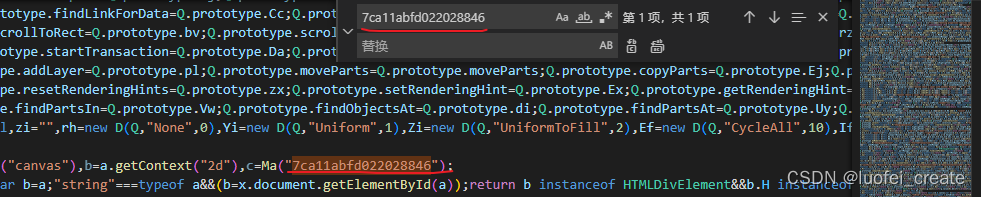
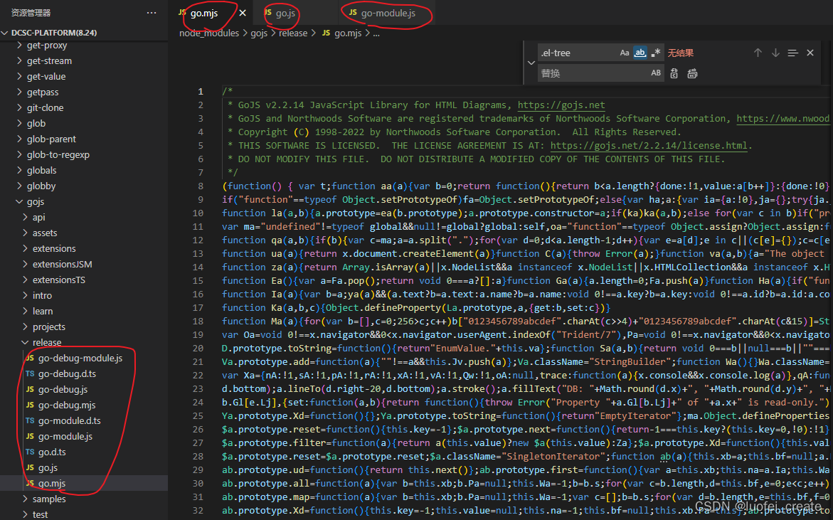
第一种: 在node_modules中找到go.js,go.mjs,go-module.js路径如下:node_modules/gojs/release/go.js,go.mjs,go-module.js (注意:最好是这三个文件都要改,有些码友说设置了没用,原因是只设置了go.js)
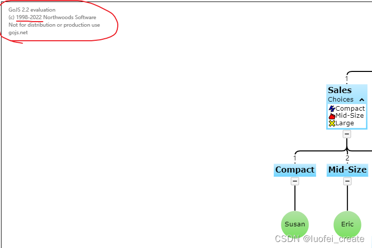
这一种也是我目前使用的方法: 在三个文件全局搜索 7ca11abfd022028846 然后将这一行的剩余部分全部删除,下面是我已经删除后的照片:记得三个文件都要删除
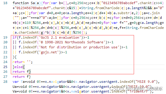
- 第二种方法:
搜索String.fromCharCode(a.charCodeAt(g)^b[(b[c]+b[d])%256]) 这段代码后面会有个return f;
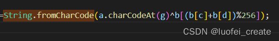
在return f 前加上以下代码
// 注意了: 如果你是2022版本的话需要,将© 1998-2021 Northwoods Software 改成 © 1998-2022 Northwoods Software
// 这个你可以在水印上查看是哪个年限以及哪个版本:
if(f.indexOf(‘GoJS 2.1 evaluation’)>-1
|| f.indexOf(‘© 1998-2021 Northwoods Software’)>-1
|| f.indexOf(‘Not for distribution or production use’)>-1
|| f.indexOf(‘gojs.net’)>-1
){
return ‘’;
}else{
return f
}
-
查看水印年限还有版本是2.1还是2.2的:
-
这个是加入后的图片(自己网上偷懒找的!)
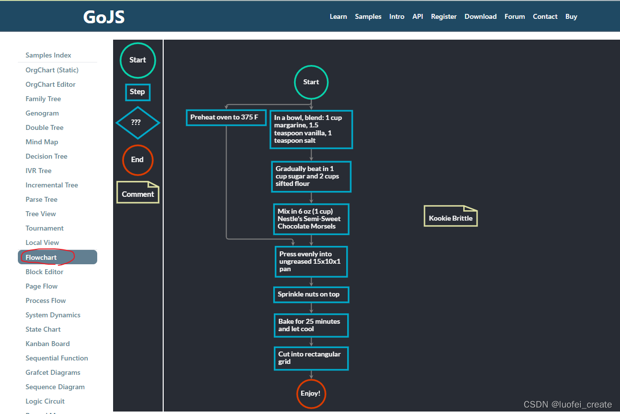
3.在vue中使用go.js
- 使用案例Flowchart
- 我们在初始化之前最好使用ref来设置 他的id属性
- 我已经将他封装成为一个组件,具体注释代码里面也有,可以直接粘贴使用
- 注意: 我改了不少原有的样式和结构,比如: Start我改成了长方形什么的,加了收缩功能
<!--@description:Flowchart drawing, dedicated to customization@date:Created in 2022/7/24 15:55@modified By:luofei-create@version: 1.0.0
-->
<template><div class="example"><div class="example-box" id="parentDiv"><!-- 主画布区域 --><div ref="diagram" class="myDiagramDiv"><canvasclass="canvas-left"tabindex="0"width="954"height="700">This text is displayed if your browser does not support the CanvasHTML element.</canvas><div class="left-box"><div class="left-box-item"></div></div></div><!-- 右边组件拖拽 --><div ref="myPaletteDiv" class="myPaletteDiv" v-show="isRight"><canvas class="canvas-right"tabindex="0"width="560"height="700"></canvas><div class="right-box"><div class="right-box-item">工具组件</div></div></div></div></div>
</template><script>
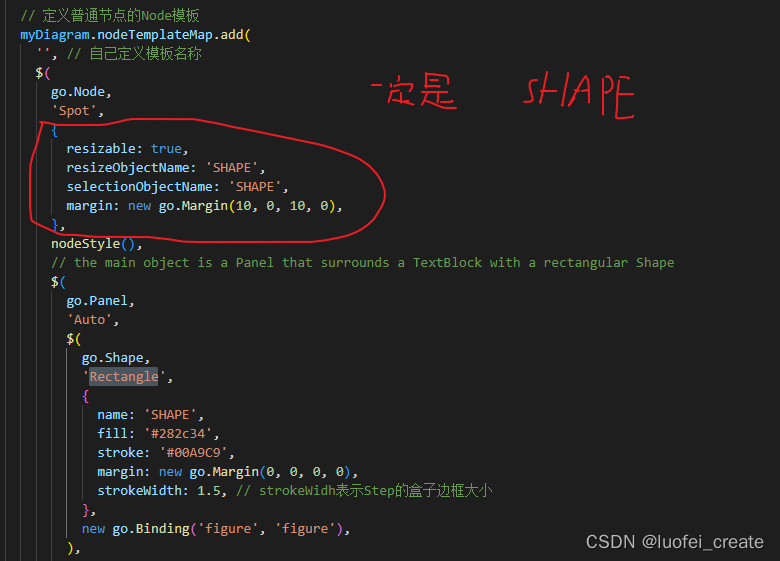
export default {name: 'example',data() {return {myDiagramRefs: null, //这个是为了将初始化的结构保存起来,可以调用go.js的方法};},props: {//父组件传过来的json数据jsonData: {type: Object,require: true,default: () => ({}),},// 是否展示右侧的工具栏isRight: {type: Boolean,default: () => true,},},watch: {//监听json数据, 再次初始化jsonData: {handler(n, o) {this.load();},},},mounted() {//调用test方法,初始化画布this.test();},methods: {test() {// 初始化go.jsconst $ = go.GraphObject.make; // 为了定义模板的简洁性const myDiagram = $(go.Diagram,this.$refs.diagram,// 'my-diagram-div', // id挂载dome节点// 这里是控制那个菱形在连线的时候出现文字的,我暂时不需要,所以注释掉{// LinkDrawn: showLinkLabel,// LinkRelinked: showLinkLabel,'draggingTool.dragsTree': true,'undoManager.isEnabled': true, //是否可以粘贴复制等,delete建删除},);this.myDiagramRefs = myDiagram;// 当修改文档时,在标题中添加一个“*”,并启用“保存”按钮myDiagram.addDiagramListener('Modified', e => {const button = document.getElementById('SaveButton');if (button) button.disabled = !myDiagram.isModified;const idx = document.title.indexOf('*');if (myDiagram.isModified) {if (idx < 0) {myDiagram.layout = $(go.TreeLayout, { angle: 90 });}} else if (idx >= 0) document.title = document.title.slice(0, idx);});// 节点模板的Helper定义function nodeStyle() {return [// 节点。 location来自于节点数据的“loc”属性,由Point转换。 解析静态方法。// 如果节点。 location发生变化时,它更新节点数据的“loc”属性,并使用Point转换回来。 stringify静态方法。new go.Binding('location', 'loc', go.Point.parse).makeTwoWay(go.Point.stringify,),{// 这个节点位置位于每个节点的中心locationSpot: go.Spot.Center,},];}// 定义一个用于创建通常是透明的“端口”的函数。function makePort(name, align, spot, output, input) {const horizontal = align.equals(go.Spot.Top) || align.equals(go.Spot.Bottom);return $(go.Shape, {fill: 'transparent',strokeWidth: 0,width: horizontal ? NaN : 8, // 如果不是水平拉伸,宽度只有8height: !horizontal ? NaN : 8, // 如果不是垂直拉伸,也就是8英尺高alignment: align, // 对齐主形状上的端口stretch: horizontal? go.GraphObject.Horizontal: go.GraphObject.Vertical,portId: name, // 将此对象声明为“端口”fromSpot: spot, // 声明此端口的链接可能连接到哪里fromLinkable: output, // 声明用户是否可以从这里绘制链接 toSpot: spot, // 声明此端口的链接可能连接到哪里toLinkable: input, // 声明用户是否可以在此绘制链接 cursor: 'pointer', // 显示不同的游标以指示潜在的链接点 mouseEnter: (e, port) => {// PORT参数将是这个Shapeif (!e.diagram.isReadOnly) port.fill = 'rgba(255,0,255,0.5)';},mouseLeave: (e, port) => (port.fill = 'transparent'),});}// 文字颜色function textStyle() {return {font: 'bold 11pt Lato, Helvetica, Arial, sans-serif',stroke: '#F8F8F8',};}//这一句是我自己加上的,目的是为了在连线的时候可以帮我自动对齐myDiagram.layout = $(go.TreeLayout, { angle: 90 });// 定义普通节点的Node模板myDiagram.nodeTemplateMap.add('', // 自己定义模板名称$(go.Node,'Spot',{resizable: true,resizeObjectName: 'SHAPE',selectionObjectName: 'SHAPE',margin: new go.Margin(10, 0, 10, 0),},nodeStyle(),// 主要对象是一个面板,它围绕着一个矩形形状的TextBlock $(go.Panel,'Auto',$(go.Shape,'Rectangle',{name: 'SHAPE',fill: '#282c34',stroke: '#00A9C9',margin: new go.Margin(0, 0, 0, 0),strokeWidth: 1.5, // strokeWidh表示Step的盒子边框大小},new go.Binding('figure', 'figure'),),$(go.TextBlock,textStyle(),{margin: 8,maxSize: new go.Size(560, NaN),wrap: go.TextBlock.WrapFit,editable: true,},new go.Binding('text').makeTwoWay(),),),//这里也是我自己加的,目的是为了可以像树一样可以收缩展开$('TreeExpanderButton',{margin: new go.Margin(0, 0, 0, 20),alignment: go.Spot.Bottom,alignmentFocus: go.Spot.Top,},{ visible: true }),// 四个命名端口,每边一个:makePort('T', go.Spot.Top, go.Spot.TopSide, false, true), //表示端口哪里可以链接,哪里不可以链接makePort('L', go.Spot.Left, go.Spot.LeftSide, true, true),makePort('R', go.Spot.Right, go.Spot.RightSide, true, true),makePort('B', go.Spot.Bottom, go.Spot.BottomSide, true, false),),);// 菱形的样式 -> 改成长方形myDiagram.nodeTemplateMap.add('Conditional',$(go.Node,'Spot',{resizable: true,resizeObjectName: 'SHAPE',selectionObjectName: 'SHAPE',},nodeStyle(),$(go.Panel,'Auto',$(go.Shape,'Rectangle',{name: 'SHAPE',fill: '#282c34',stroke: 'rgba(98, 251, 243)',strokeWidth: 1.5,},new go.Binding('figure', 'figure'),),$(go.TextBlock,textStyle(),{margin: 8,maxSize: new go.Size(560, NaN),wrap: go.TextBlock.WrapFit,editable: true,},new go.Binding('text').makeTwoWay(),),),$('TreeExpanderButton',{ alignment: go.Spot.Bottom, alignmentFocus: go.Spot.Top },{ visible: true }),// four named ports, one on each side:makePort('T', go.Spot.Top, go.Spot.TopCenter, false, true),makePort('L', go.Spot.Left, go.Spot.LeftCenter, true, true),makePort('R', go.Spot.Right, go.Spot.RightCenter, true, true),makePort('B', go.Spot.Bottom, go.Spot.BottomCenter, true, false),),);// 圆形开始myDiagram.nodeTemplateMap.add('Start',$(go.Node,'Spot',{resizable: true,resizeObjectName: 'SHAPE',selectionObjectName: 'SHAPE',},nodeStyle(),$(go.Panel,'Spot',$(go.Shape,'Rectangle', // 决定形状: Circle代表圆形,Rectangle代表正方形或者长方形,Diamond代表菱形{name: 'SHAPE',desiredSize: new go.Size(90, 40),fill: '#282c34',stroke: '#09d3ac',strokeWidth: 1.5,},),$(go.TextBlock,'Start',textStyle(),{margin: 8,maxSize: new go.Size(360, NaN),wrap: go.TextBlock.WrapFit,editable: true,},new go.Binding('text').makeTwoWay(),),),$('TreeExpanderButton',{ alignment: go.Spot.Bottom, alignmentFocus: go.Spot.Top },{ visible: true }),// three named ports, one on each side except the top, all output only:makePort('T', go.Spot.Top, go.Spot.TopCenter, false, true),makePort('L', go.Spot.Left, go.Spot.LeftCenter, true, true),makePort('R', go.Spot.Right, go.Spot.RightCenter, true, true),makePort('B', go.Spot.Bottom, go.Spot.BottomCenter, true, false),),);// 原型,结束样式myDiagram.nodeTemplateMap.add('End',$(go.Node,'Table',nodeStyle(),{resizable: true,resizeObjectName: 'SHAPE',selectionObjectName: 'SHAPE',},$(go.Panel,'Spot',$(go.Shape, 'Circle', {desiredSize: new go.Size(60, 60),fill: '#282c34',stroke: '#DC3C00',strokeWidth: 3.5,}),$(go.TextBlock, 'End', textStyle(), new go.Binding('text')),),$('TreeExpanderButton',{ alignment: go.Spot.Bottom, alignmentFocus: go.Spot.Top },{ visible: true }), // three named ports, one on each side except the bottom, all input only:makePort('T', go.Spot.Top, go.Spot.Top, false, true),makePort('L', go.Spot.Left, go.Spot.Left, false, true),makePort('R', go.Spot.Right, go.Spot.Right, false, true),),);// taken from ../extensions/Figures.js:go.Shape.defineFigureGenerator('File', (shape, w, h) => {const geo = new go.Geometry();const fig = new go.PathFigure(0, 0, true); // starting pointgeo.add(fig);fig.add(new go.PathSegment(go.PathSegment.Line, 0.75 * w, 0));fig.add(new go.PathSegment(go.PathSegment.Line, w, 0.25 * h));fig.add(new go.PathSegment(go.PathSegment.Line, w, h));fig.add(new go.PathSegment(go.PathSegment.Line, 0, h).close());const fig2 = new go.PathFigure(0.75 * w, 0, false);geo.add(fig2);// The Foldfig2.add(new go.PathSegment(go.PathSegment.Line, 0.75 * w, 0.25 * h));fig2.add(new go.PathSegment(go.PathSegment.Line, w, 0.25 * h));geo.spot1 = new go.Spot(0, 0.25);geo.spot2 = go.Spot.BottomRight;return geo;});// 定义comment文本样式myDiagram.nodeTemplateMap.add('Comment',$(go.Node,'Auto',nodeStyle(),$(go.Shape, 'File', {fill: '#282c34',stroke: '#DEE0A3',strokeWidth: 3,}),$(go.TextBlock,textStyle(),{margin: 8,maxSize: new go.Size(200, NaN),wrap: go.TextBlock.WrapFit,textAlign: 'center',editable: true,},new go.Binding('text').makeTwoWay(),),// 没有端口,因为不允许链接连接注释 ),);//替换linkTemplateMap中默认的Link模板 myDiagram.linkTemplate = $(go.Link, // the whole link panel{routing: go.Link.AvoidsNodes,curve: go.Link.JumpOver,corner: 5,toShortLength: 4,relinkableFrom: true,margin: new go.Margin(10, 0, 10, 0),relinkableTo: true,reshapable: true,resegmentable: true,// mouse-overs subtly highlight links:mouseEnter: (e, link) => (link.findObject('HIGHLIGHT').stroke = 'rgba(30,144,255,0.2)'),mouseLeave: (e, link) => (link.findObject('HIGHLIGHT').stroke = 'transparent'),selectionAdorned: false,},new go.Binding('points').makeTwoWay(),$(go.Shape, // 高光形状,通常是透明的{isPanelMain: true,strokeWidth: 8,stroke: 'transparent',name: 'HIGHLIGHT',},),$(go.Shape, // 链接路径形状,或者样式也可以设置{ isPanelMain: true, stroke: 'gray', strokeWidth: 2 },new go.Binding('stroke', 'isSelected', sel => (sel ? 'dodgerblue' : 'gray')).ofObject(),),$(go.Shape, // 箭头{ toArrow: 'standard', strokeWidth: 0, fill: 'gray' },),$(go.Panel,'Auto', //链接标签,通常不可见{visible: false,name: 'LABEL',segmentIndex: 2,segmentFraction: 0.5,},new go.Binding('visible', 'visible').makeTwoWay(),$(go.Shape,'RoundedRectangle', // 链接标签,通常不可见的标签形状 { fill: '#F8F8F8', strokeWidth: 0 },),//这里是由于我不需要菱形那个形状,有需要的可以不用注释,还有连接线上的文字 Yes// $(// go.TextBlock,// 'Yes',// {// textAlign: 'center',// font: '10pt helvetica, arial, sans-serif',// stroke: '#333333',// editable: true,// },// new go.Binding('text').makeTwoWay(),// ),),);// 如果链接来自“条件”节点,则使其可见。 // 这个监听器由“LinkDrawn”和“LinkRelinked”diagramevent调用。 function showLinkLabel(e) {const label = e.subject.findObject('LABEL');if (label !== null) label.visible = e.subject.fromNode.data.category === 'Conditional';}// LinkingTool和RelinkingTool使用的临时链接也是正交的: myDiagram.toolManager.linkingTool.temporaryLink.routing = go.Link.Orthogonal;myDiagram.toolManager.relinkingTool.temporaryLink.routing = go.Link.Orthogonal;// 调用load???????????// 人造数据// this.load(myDiagram); // 从一些JSON文本加载一个初始图//启动初始化画布数据myDiagram.model = go.Model.fromJson(this.jsonData);const myPalette = $(go.Palette,this.$refs.myPaletteDiv, // must name or refer to the DIV HTML element{// Instead of the default animation, use a custom fade-down'animationManager.initialAnimationStyle': go.AnimationManager.None,InitialAnimationStarting: animateFadeDown, // Instead, animate with this functionnodeTemplateMap: myDiagram.nodeTemplateMap, // share the templates used by myDiagrammodel: new go.GraphLinksModel([// specify the contents of the Palette{ category: 'Start', text: '开始' },{ Category: 'Assess', text: '业务组件' },{ category: 'Conditional', text: '业务组件' },{ category: 'End', text: '结束组件' },{ category: 'Comment', text: 'Comment' },]),},);// 这是默认动画的重新实现,只不过它是从向下淡入,而不是向上淡入。 function animateFadeDown(e) {const { diagram } = e;const animation = new go.Animation();animation.isViewportUnconstrained = true; // 因此,图表定位规则允许动画从屏幕外开始 animation.easing = go.Animation.EaseOutExpo;animation.duration = 900;//淡出“向下”,换句话说,从上面淡出 animation.add(diagram,'position',diagram.position.copy().offset(0, 200),diagram.position,);animation.add(diagram, 'opacity', 0, 1);animation.start();}},// 保存功能,我将数据传到父组件中save() {const data = this.myDiagramRefs.model.toJson();this.$emit('getJsonDataList', data); //导出数据this.myDiagramRefs.isModified = false;},// 初始化数据,形成画布load() {this.myDiagramRefs.model = go.Model.fromJson(this.jsonData);this.myDiagramRefs.isModified = true;},printDiagram() {const svgWindow = window.open();if (!svgWindow) return; // failure to open a new Windowconst printSize = new go.Size(700, 960);const bnds = myDiagram.documentBounds;let { x } = bnds;let { y } = bnds;while (y < bnds.bottom) {while (x < bnds.right) {const svg = myDiagram.makeSvg({scale: 1.0,position: new go.Point(x, y),size: printSize,});svgWindow.document.body.appendChild(svg);x += printSize.width;}x = bnds.x;y += printSize.height;}setTimeout(() => svgWindow.print(), 1);},},
};
</script><style scoped>
.example{margin-top: 5px;
}
.example-box{width: 100%;display: flex;justify-content: space-between;
}
.myPaletteDiv{width: 160px;background-color: rgb(24, 43, 133);position: relative;-webkit-tap-highlight-color: rgba(255, 255, 255, 0);
}
.canvas-right{position: absolute;top: 0px;left: 0px;z-index: 2;user-select: none;touch-action: none;width: 160px;height: 700px;overflow: hidden;
}
.right-box{position: absolute;width: 160px;height: 700px;overflow: hidden;z-index: 1;
}
.right-box-item{position: absolute;width: 1px;height: 1px
}
/* 主画布区域 */
.myDiagramDiv{flex-grow: 1;height: 700px;margin-right: 2px;background-color: rgb(24, 43, 133);position: relative;-webkit-tap-highlight-color: rgba(255, 255, 255, 0);cursor: auto;
}
.canvas-left{position: absolute;top: 0px;left: 0px;z-index: 2;user-select: none;touch-action: none;width: 954px;height: 700px;cursor: auto;
}
.left-box{position: absolute;width: 954px;height: 700px;z-index: 1;
}
.left-box-item{position: absolute; width: 1px; height: 1px
}
.text{color: rgba(255,0,255,0.5);background: #00A9C9;
}
</style>
二、加入的一些功能以及代码实现
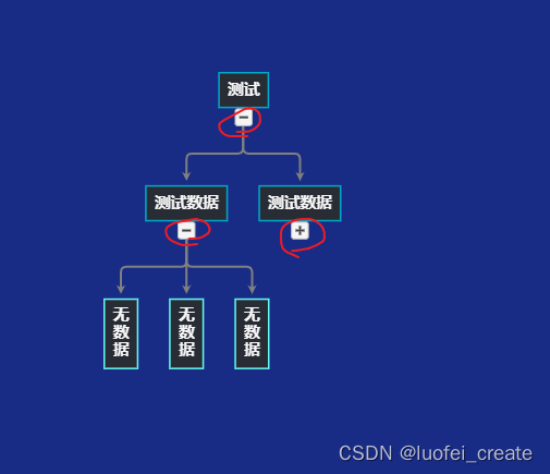
1. 加入树形收缩节点
- 代码片段
- 效果图:
2.可收缩大小
-
代码片段
-
效果图:
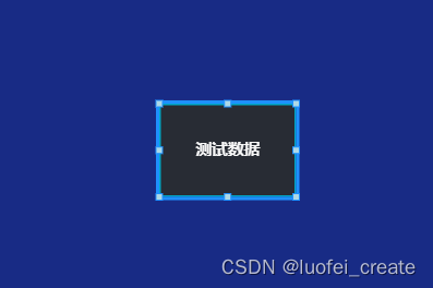
样式什么的可以自己设置
三、翻译部分文档
一.按钮
为了您的方便,我们定义了几个常用的面板。 这些按钮包括"Button"、“TreeExpanderButton”、“SubGraphExpanderButton”、“PanelExpanderButton”、“ContextMenuButton"和"CheckBoxButton”。 "ContextMenuButton"通常在"ContextMenu"面板内使用; “复选框按钮”用于实现“复选框”面板。
在调用GraphObject.make时,可以像使用面板派生类一样使用这些预定义的面板。 它们被实现为面板中GraphObjects的简单可视化树,具有预先设置的属性和事件处理程序。
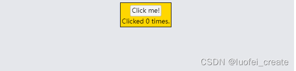
1.一般的按钮
diagram.nodeTemplate =$(go.Node, "Auto",{ locationSpot: go.Spot.Center },$(go.Shape, "Rectangle",{ fill: "gold" }),$(go.Panel, "Vertical",{ margin: 3 },$("Button",{ margin: 2,click: incrementCounter },$(go.TextBlock, "Click me!")),$(go.TextBlock,new go.Binding("text", "clickCount",function(c) { return "Clicked " + c + " times."; }))));function incrementCounter(e, obj) {var node = obj.part;var data = node.data;if (data && typeof(data.clickCount) === "number") {node.diagram.model.commit(function(m) {m.set(data, "clickCount", data.clickCount + 1);}, "clicked");}
}diagram.model = new go.GraphLinksModel([ { clickCount: 0 } ]);
- 按钮只是控制形状的面板,它将围绕着你所赋予的任何内容。 边界形状命名为“ButtonBorder”,以便您可以轻松设置或绑定其属性。
- 由所有“Button”定义的事件处理程序使用了额外的属性,这些属性没有在API中定义,但你可以在“Button”的定义中看到:Buttons.js。 这些属性参数化按钮的外观。
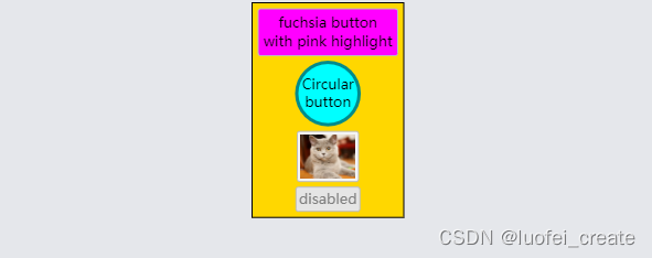
diagram.nodeTemplate =$(go.Node, "Auto",{ locationSpot: go.Spot.Center },$(go.Shape, "Rectangle",{ fill: "gold" }),$(go.Panel, "Vertical",{ margin: 3 },$("Button",{margin: 2,// 设置边框属性按钮的形状 "ButtonBorder.fill": "fuchsia",// 设置“按钮”本身事件处理程序使用的属性 "_buttonFillOver": "pink",click: function(e, button) { alert(button.findObject("ButtonBorder").fill); }},$(go.TextBlock, "fuchsia button\nwith pink highlight", { margin: 2, textAlign: "center" })),$("Button",{margin: 2,// 设置边框属性按钮的形状 "ButtonBorder.figure": "Circle","ButtonBorder.fill": "cyan","ButtonBorder.stroke": "darkcyan","ButtonBorder.strokeWidth": 3,// 设置“按钮”本身事件处理程序使用的属性 "_buttonFillOver": "white","_buttonStrokeOver": "cyan","_buttonFillPressed": "lightgray",click: function(e, button) { alert(button.findObject("ButtonBorder").stroke); }},$(go.TextBlock, "Circular\nbutton", { margin: 2, textAlign: "center" })),$("Button",{margin: 2,click: function(e, button) { alert(button.findObject("PIC").source); }},// 按钮内容可以是任何东西——它不一定是一个TextBlock $(go.Picture, "images/50x40.png", { name: "PIC", width: 50, height: 40 })),$("Button",{margin: 2,// 按钮也可以通过设置或数据绑定禁用: isEnabled: false,click: function(e, button) { alert("won't be alerted"); }},$(go.TextBlock, "disabled", { stroke: "gray" }))));diagram.model = new go.GraphLinksModel([ { } ]);
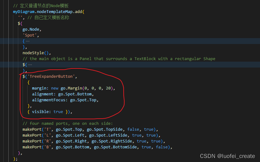
2.树扩展按钮 (TreeExpanderButtons)
这个也是我自己需要引入的按钮,上文已经介绍
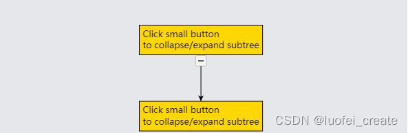
扩展和折叠子树是很常见的。 通过在节点模板中添加“TreeExpanderButton”的实例,很容易让用户控制这一点。 该按钮调用CommandHandler。 collapseTree或CommandHandler。 expandTree取决于Node.isTreeExpanded的值。 按钮图标的形状。 图随节点值的变化而变化。 isTreeExpanded变化。
diagram.nodeTemplate =$(go.Node, "Spot",$(go.Panel, "Auto",$(go.Shape, "Rectangle",{ fill: "gold" }),$(go.TextBlock, "Click small button\nto collapse/expand subtree",{ margin: 5 })),$("TreeExpanderButton",{ alignment: go.Spot.Bottom, alignmentFocus: go.Spot.Top },{ visible: true }));diagram.layout = $(go.TreeLayout, { angle: 90 });diagram.model = new go.GraphLinksModel([ { key: 1 },{ key: 2 } ],[ { from: 1, to: 2 } ] );
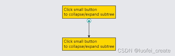
- “TreeExpanderButton”是一个“按钮”,它持有一个显示“减线”或“增线”图形的形状,这取决于Node.isTreeExpanded的值。 该形状被命名为“ButtonIcon”,因此您可以轻松地设置或绑定它的属性,以及“ButtonBorder”和“Button”本身的属性。
diagram.nodeTemplate =$(go.Node, "Spot",$(go.Panel, "Auto",$(go.Shape, "Rectangle",{ fill: "gold" }),$(go.TextBlock, "Click small button\nto collapse/expand subtree",{ margin: 5 })),$("TreeExpanderButton",{// set the two additional properties used by "TreeExpanderButton"// that control the shape depending on the value of Node.isTreeExpanded"_treeExpandedFigure": "TriangleUp","_treeCollapsedFigure": "TriangleDown",// set properties on the icon within the border"ButtonIcon.fill": "darkcyan","ButtonIcon.strokeWidth": 0,// set general "Button" properties"ButtonBorder.figure": "Circle","ButtonBorder.stroke": "darkcyan","_buttonStrokeOver": "darkcyan"},{ alignment: go.Spot.Bottom, alignmentFocus: go.Spot.Top },{ visible: true }));diagram.layout = $(go.TreeLayout, { angle: 90 });diagram.model = new go.GraphLinksModel([ { key: 1 },{ key: 2 } ],[ { from: 1, to: 2 } ] );
3.SubGraphExpanderButtons
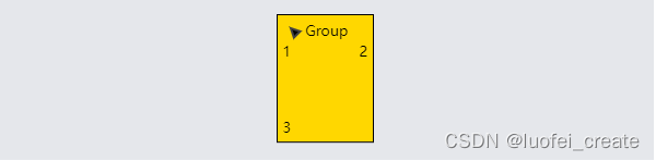
还经常需要展开和折叠包含子图的组。 您可以通过向组模板添加“SubGraphExpanderButton”的实例来让用户控制这一点。 该按钮调用CommandHandler。 collapseSubGraph或CommandHandler。 expandSubGraph取决于Group.isSubGraphExpanded的值。 按钮图标的形状。 图随Group值的变化而变化。 isSubGraphExpanded变化。
diagram.groupTemplate =$(go.Group, "Auto",$(go.Shape, "Rectangle",{ fill: "gold" }),$(go.Panel, "Vertical",{ margin: 5,defaultAlignment: go.Spot.Left },$(go.Panel, "Horizontal",$("SubGraphExpanderButton",{ margin: new go.Margin(0, 3, 5, 0) }),$(go.TextBlock, "Group")),$(go.Placeholder)));diagram.model = new go.GraphLinksModel([ { key: 0, isGroup: true },{ key: 1, group: 0 },{ key: 2, group: 0 },{ key: 3, group: 0 } ] );

“SubGraphExpanderButton”类似于“TreeExpanderButton”,因为它是一个“按钮”,其边框形状围绕图标形状。 该形状被命名为“ButtonIcon”,因此您可以轻松地设置或绑定它的属性,以及“ButtonBorder”和“Button”本身的属性。
diagram.groupTemplate =$(go.Group, "Auto",$(go.Shape, "Rectangle",{ fill: "gold" }),$(go.Panel, "Vertical",{ margin: 5,defaultAlignment: go.Spot.Left },$(go.Panel, "Horizontal",$("SubGraphExpanderButton",{// 设置"SubGraphExpanderButton"使用的两个附加属性 // 根据Group.isSubGraphExpanded的值来控制形状 "_subGraphExpandedFigure": "TriangleUp","_subGraphCollapsedFigure": "TriangleDown",// set other properties on the button icon"ButtonIcon.angle": -45,// 和按钮边框上的属性或按钮本身 "ButtonBorder.opacity": 0.0}),$(go.TextBlock, "Group")),$(go.Placeholder)));diagram.model = new go.GraphLinksModel([ { key: 0, isGroup: true },{ key: 1, group: 0 },{ key: 2, group: 0 },{ key: 3, group: 0 } ] );
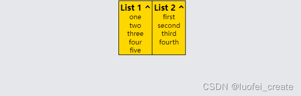
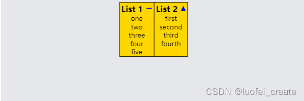
4.面板扩展按钮 (PanelExpanderButtons)
通常希望展开和折叠节点的一部分,从而显示或隐藏有时不需要的细节。 通过在节点模板中添加“PanelExpanderButton”的实例,很容易让用户控制这一点。 GraphObject的第二个参数。 make应该是一个字符串,用于命名节点中GraphObject. make的元素。 您希望按钮切换的可视属性。
diagram.nodeTemplate =$(go.Node, "Auto",$(go.Shape,{ fill: "gold" }),$(go.Panel, "Table",{ defaultAlignment: go.Spot.Top, defaultColumnSeparatorStroke: "black" },$(go.Panel, "Table",{ column: 0 },$(go.TextBlock, "List 1",{ column: 0, margin: new go.Margin(3, 3, 0, 3),font: "bold 12pt sans-serif" }),$("PanelExpanderButton", "LIST1",{ column: 1 }),$(go.Panel, "Vertical",{ name: "LIST1", row: 1, column: 0, columnSpan: 2 },new go.Binding("itemArray", "list1"))),$(go.Panel, "Table",{ column: 1 },$(go.TextBlock, "List 2",{ column: 0, margin: new go.Margin(3, 3, 0, 3),font: "bold 12pt sans-serif" }),$("PanelExpanderButton", "LIST2",{ column: 1 }),$(go.Panel, "Vertical",{ name: "LIST2", row: 1, column: 0, columnSpan: 2 },new go.Binding("itemArray", "list2")))));diagram.model = new go.GraphLinksModel([{key: 1,list1: [ "one", "two", "three", "four", "five" ],list2: [ "first", "second", "third", "fourth" ]}
]);
“PanelExpanderButton”类似于“TreeExpanderButton”或“SubGraphExpanderButton”,因为它是一个“按钮”,其边框形状围绕图标形状。 然而,此面板绑定形状。 几何字符串而不是Shape.figure。
diagram.nodeTemplate =$(go.Node, "Auto",$(go.Shape,{ fill: "gold" }),$(go.Panel, "Table",{ defaultAlignment: go.Spot.Top, defaultColumnSeparatorStroke: "black" },$(go.Panel, "Table",{ column: 0 },$(go.TextBlock, "List 1",{ column: 0, margin: new go.Margin(3, 3, 0, 3),font: "bold 12pt sans-serif" }),$("PanelExpanderButton", "LIST1",{ column: 1,// 设置"PanelExpanderButton"使用的两个附加属性 // 根据GraphObject.visible的值来控制形状 // 命名为“LIST1”的对象的"_buttonExpandedFigure": "M0 0 L10 0","_buttonCollapsedFigure": "M0 5 L10 5 M5 0 L5 10","ButtonIcon.stroke": "blue",height: 16}),$(go.Panel, "Vertical",{ name: "LIST1", row: 1, column: 0, columnSpan: 2 },new go.Binding("itemArray", "list1"))),$(go.Panel, "Table",{ column: 1 },$(go.TextBlock, "List 2",{ column: 0, margin: new go.Margin(3, 3, 0, 3),font: "bold 12pt sans-serif" }),$("PanelExpanderButton", "LIST2",{ column: 1,// 设置"PanelExpanderButton"使用的两个附加属性 // 根据GraphObject.visible的值来控制形状 //  命名为“LIST1”的对象的"_buttonExpandedFigure": "F M0 10 L5 0 10 10z","_buttonCollapsedFigure": "F M0 0 L10 0 5 10z","ButtonIcon.strokeWidth": 0,"ButtonIcon.fill": "blue"}),$(go.Panel, "Vertical",{ name: "LIST2", row: 1, column: 0, columnSpan: 2 },new go.Binding("itemArray", "list2")))));diagram.model = new go.GraphLinksModel([{key: 1,list1: [ "one", "two", "three", "four", "five" ],list2: [ "first", "second", "third", "fourth" ]}
]);
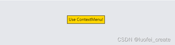
5.ContextMenuButtons和快捷菜单 (ContextMenuButtons and ContextMenus)
尽管您可以以任何您选择的方式实现上下文菜单,但通常使用预定义的“ContextMenuButton”。
diagram.nodeTemplate =$(go.Node, "Auto",$(go.Shape, "Rectangle",{ fill: "gold" }),$(go.TextBlock, "Use ContextMenu!",{ margin: 5 }));diagram.nodeTemplate.contextMenu =$("ContextMenu",$("ContextMenuButton",$(go.TextBlock, "Shift Left"),{ click: function(e, obj) { shiftNode(obj, -20); } }),$("ContextMenuButton",$(go.TextBlock, "Shift Right"),{ click: function(e, obj) { shiftNode(obj, +20); } }));function shiftNode(obj, dist) {var adorn = obj.part;var node = adorn.adornedPart;node.diagram.commit(function(d) {var pos = node.location.copy();pos.x += dist;node.location = pos;}, "Shift");
}diagram.model = new go.GraphLinksModel([ { key: 1 } ] );
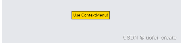
“ContextMenuButton”只是一个设置了一些属性的“按钮”。 其中一个属性是GraphObject。 它被设置为go.GraphObject.Horizontal,这样“ContextMenu”中的所有“ContextMenuButton”都将被拉伸到相同的宽度。 但是你可以在它的“ButtonBorder”形状和按钮本身上设置所有常用的属性。
diagram.nodeTemplate =$(go.Node, "Auto",$(go.Shape, "Rectangle",{ fill: "gold" }),$(go.TextBlock, "Use ContextMenu!",{ margin: 5 }));diagram.nodeTemplate.contextMenu =$("ContextMenu",$("ContextMenuButton",{"ButtonBorder.fill": "yellow","_buttonFillOver": "cyan","_buttonFillPressed": "lime"},$(go.TextBlock, "Shift Left"),{ click: function(e, obj) { shiftNode(obj, -20); } }),$("ContextMenuButton",{"ButtonBorder.fill": "yellow","_buttonFillOver": "cyan","_buttonFillPressed": "lime"},$(go.TextBlock, "Shift Right"),{ click: function(e, obj) { shiftNode(obj, +20); } }),$("ContextMenuButton",{ isEnabled: false },$(go.TextBlock, "Shift Right", { stroke: "gray" }),{ click: function(e, obj) { alert("won't be alerted"); } }));function shiftNode(obj, dist) {var adorn = obj.part;var node = adorn.adornedPart;node.diagram.commit(function(d) {var pos = node.location.copy();pos.x += dist;node.location = pos;}, "Shift");
}diagram.model = new go.GraphLinksModel([ { key: 1 } ] );
6.CheckBoxButtons和复选框(CheckBoxButtons and CheckBoxes)
- “CheckBoxButton”是一个“按钮”,它被配置为切换数据属性的布尔值。 默认情况下,当值为false时按钮是清晰的,当值为true时显示一个复选标记,但是可以进行大量的定制。
- 定义“CheckBoxButton”时的第一个参数应该是一个字符串,该字符串指定保存“CheckBoxButton”的已检查状态的数据属性。 如果不希望单击按钮来切换数据属性的值,请指定一个数据属性名称,该名称为空字符串。
- 在“CheckBox”面板的定义中使用了“CheckBoxButton”,这是一种将任何GraphObject关联为“CheckBoxButton”标签的方便方式。
- “复选框”示例中显示了许多具有各种自定义的“复选框”示例。
7.按钮的定义(Button Definitions)
- 所有预定义按钮的实现都在Extensions目录下的buttons .js中提供。 在创建自己的按钮时,您可能希望复制并改编这些定义。
- 这些定义可能不是GoJS中GraphObject.make使用的实际标准按钮实现的最新描述。
- 注意,这些按钮的定义使用了GraphObject.defineBuilder静态函数。 它扩展了GraphObject的行为。 允许通过带有可选参数的名称创建相当复杂的可视树。 你可以在整个示例和扩展中找到各种控件的定义
后续
随缘更新翻译,大家如果需要,我会抽空把所有的文档翻译下来
本文来自互联网用户投稿,文章观点仅代表作者本人,不代表本站立场,不承担相关法律责任。如若转载,请注明出处。 如若内容造成侵权/违法违规/事实不符,请点击【内容举报】进行投诉反馈!