react以及vue 移动端适配
react
vw适配
1.下载插件
npm i postcss-loader postcss-px-to-viewport --save--dev2.暴露配置文件 详情看http://t.csdn.cn/YS19H
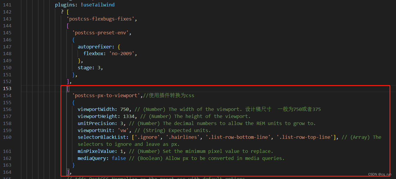
3.配置webpack.config.js文件
['postcss-px-to-viewport',//使用插件转换为css{viewportWidth: 750, // (Number) The width of the viewport. 设计稿尺寸  一般为750或者375viewportHeight: 1334, // (Number) The height of the viewport.unitPrecision: 3, // (Number) The decimal numbers to allow the REM units to grow to.viewportUnit: 'vw', // (String) Expected units.selectorBlackList: ['.ignore', '.hairlines', '.list-row-bottom-line', '.list-row-top-line'], // (Array) The selectors to ignore and leave as px.minPixelValue: 1, // (Number) Set the minimum pixel value to replace.mediaQuery: false // (Boolean) Allow px to be converted in media queries.}
],
rem适配
1.下载插件
npm i lib-flexible postcss-pxtorem -S2.暴露配置文件 详情看http://t.csdn.cn/YS19H
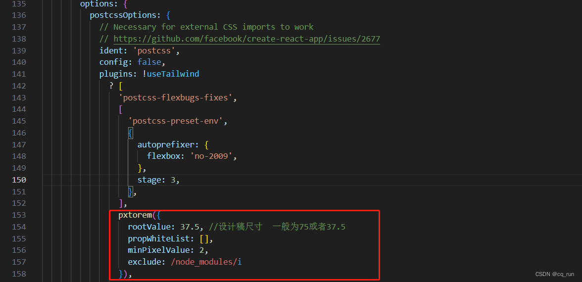
3.配置webpack.config.js文件
pxtorem({rootValue: 37.5, //设计稿尺寸  一般为75或者37.5propWhiteList: [],minPixelValue: 2,exclude: /node_modules/i
}),
4.在index.js中写入
import 'lib-flexible';vue
vw适配
1.下载插件
npm i postcss-px-to-viewport -D2.在项目根目录新建postcss.config.js文件
3.配置postcssc.config.js文件
module.exports = {plugins: {'postcss-px-to-viewport': {// 设计稿最大宽度375: 375,// 第三方UI组件单位不转vwexclude: /(\/|\\)(node_modules)(\/|\\)/ },},
};
rem适配
1.下载插件
npm i lib-flexible postcss-pxtorem -D2.在项目根目录新建postcss.config.js文件
3.配置postcssc.config.js文件
module.exports = {plugins: {'postcss-pxtorem': {// 根据设计稿的大小设置,一般都是375px或者750px(10)为全屏,除以10rootValue: 37.5,// 适配全部propList: ['*'],},},
};
4.在main.js文件中引入
import 'lib-flexible';本文来自互联网用户投稿,文章观点仅代表作者本人,不代表本站立场,不承担相关法律责任。如若转载,请注明出处。 如若内容造成侵权/违法违规/事实不符,请点击【内容举报】进行投诉反馈!