CSS/Less 绘制横向卡券、优惠券样式
一个项目需要用到优惠券,本打算切图,奈何优惠券内还有文字内容,不好适配,所以打算自己使用CSS画出这些仿淘宝、京东的优惠券样式。
radial-gradient()
使用radial-gradient径向渐变函数,可以实现一个圆形镂空的样子,在移动端,radial-gradient的兼容性也是相当完美。
CSS 语法
background: radial-gradient(shape size at position, start-color, …, last-color);
单个圆形镂空效果如下:

.base-one-circle {width: 100px;height: 100px;position: relative;background: radial-gradient(circle at 0px 50px, transparent 10px, #28A4F2 0) top
}
圆形的位置也可修改,只需要改“circle at…”后面这个两个数值即可,上,右,下的数值分别是:50px,0、100px,50px、50px,100px。
如果想要一个阴影状,带有立体感,可加上这个代码
filter: drop-shadow(3px 3px 3px rgba(0,0,0,.3))

完整的卡券样式
利用background: radial-gradient的特性,我们可以组合成更复杂、完整的优惠券样式:
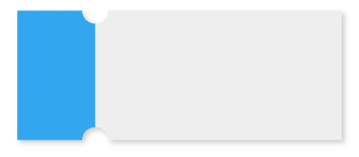
.base-coupons {width: 250px;height: 100px;position: relative;background: radial-gradient(circle at right top, transparent 10px, #28A4F2 0) top left / 60px 51% no-repeat,radial-gradient(circle at right bottom, transparent 10px, #28A4F2 0) bottom left /60px 51% no-repeat,radial-gradient(circle at left top, transparent 10px, #eeeeee 0) top right /190px 51% no-repeat,radial-gradient(circle at left bottom, transparent 10px, #eeeeee 0) bottom right /190px 51% no-repeat;filter: drop-shadow(3px 3px 3px rgba(0,0,0,.3));}
如果想要在卡券的拼接处加上虚线效果,我们可以利用伪类去实现:
.base-coupons::before {content: '';height: 80px;border: 1px dashed #fff;position: absolute;left: 60px;top: 0;bottom: 0;margin: auto;}
那么最终的优惠券样式效果:

linear-gradient()
CSS 语法
background: linear-gradient(direction, color-stop1, color-stop2, …);
linear-gradient 函数是一个线性渐变函数,我们可以使用这个线性渐变加伪类来实现一个优惠券的锯齿状效果,如下:
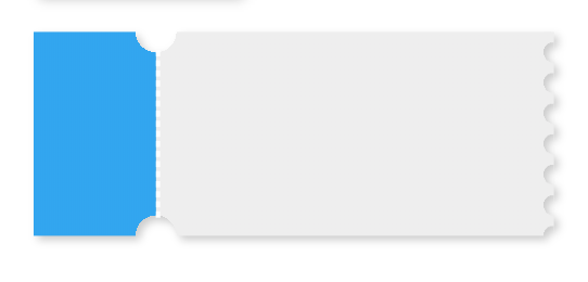
实例
设计图

笔者的设计图中还有一个颜色深点的边框,中间border为实线,为了实现border效果,在上下的圆形镂空处用了两个半圆来覆盖添加border。
less代码:
@cardW: calc(~"100vw - 48rpx"); // 卡片宽度
@cleftW: 180rpx; // 左边部分宽度
@topH: 180rpx; // 卡片高度
@circleW: 10rpx; // 圆角宽度.half-circle {border: 2rpx solid #efd4d6;width: @circleW * 2;height: @circleW;line-height: @circleW;position: absolute;z-index: 10;left: calc(~"@{cleftW} - @{circleW}");box-sizing: border-box;
}.top-circle {background-color: #fff;border-top-color: #fff;border-radius: 0 0px @circleW @circleW;top: 0;
}.bottom-circle {background-color: #F6E1E5;border-bottom-color: #F6E1E5;border-radius: @circleW @circleW 0 0px;top: calc(~"@{topH} - @{circleW}");
}.bottom-circle.white-border {background-color: #fff;border-bottom-color: #fff;
}.card-content {box-sizing: border-box;width: calc(~"100vw - 48rpx");height: @topH;position: relative;border: 2rpx solid #efd4d6;background: radial-gradient(circle at right top, transparent @circleW, #F8E9EB 0) top left / @cleftW 51% no-repeat,radial-gradient(circle at right bottom, transparent @circleW, #F8E9EB 0) bottom left /@cleftW 51% no-repeat,radial-gradient(circle at left top, transparent @circleW, #F8E9EB 0) top right /calc(~"@{cardW} - @{cleftW}") 51% no-repeat,radial-gradient(circle at left bottom, transparent @circleW, #F8E9EB 0) bottom right /calc(~"@{cardW} - @{cleftW}") 51% no-repeat;.card__left {width: @cleftW;border-right: 1px solid #efd4d6;box-sizing: border-box;background-color: #F8E9EB;}.ucc-content__right {background-color: #F8E9EB;}
}
绘制竖向优惠券的方法,传送门:https://blog.csdn.net/a1056244734/article/details/113999606
本文来自互联网用户投稿,文章观点仅代表作者本人,不代表本站立场,不承担相关法律责任。如若转载,请注明出处。 如若内容造成侵权/违法违规/事实不符,请点击【内容举报】进行投诉反馈!