Angular Components
- view
you may divide your screen into multiple views, each one of them being controlled by a separate component.
Component metadata – @Component
to mark the class ‘menu.components.ts’ to be a component.

1. selector: A CSS selector
it tells Angular to create and insert an instance of this component wherever it finds the corresponding tag (e.g. ) in template HTML

2. templateUrl: the module-relative address
- specifies the name of the template file for this particular component.
- defines the component’s host view
3. styleUrls: [’./app.component.scss’]
- means that this particular SaaS file is applied to this style.
4. providers: provides services
- array (e.g. providers: [HeroService])
- this tells Angular how to provide the HeroService instance.
Export class
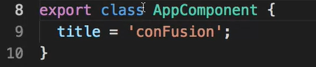
A component is JavaScript class or Type Script class, that’s why here defining a class saying AppComponent.
Then, you are exporting this class.
- Q: Why using ‘export’ here?
- A: this component can be imported into my app module.
‘title’: a local property defined inside the class
- these properties would be accessible through to my template.
Practise
Objective:
- Create a new component and add it to our Angular application.
- Update the templates of your components.
Adding a Menu Component
- First, download the images.zip file provided above and then unzip the file. Move the resulting images folder containing some PNG files to the Angular project’s src/assets folder. These image files will be useful for our exercises.
- Next, use the CLI’s ng generate command to generate a new component named menu as follows:
ng generate component menu
- This will create the necessary files for the menu component in a folder named menu, and also import this component into app.module.ts.
- Next, open app.component.html file and add the following after the toolbar:
Creating the menu
- Next, create a folder named shared under the src/app folder. To this folder, add a file named dish.ts with the following code:
export class Dish {id: string;name: string;image: string;category: string;featured: boolean;label: string;price: string;description: string;
}
- Update menu.component.ts as follows to add in the data for four menu items:
. . .
import { Dish } from '../shared/dish';
. . .export class MenuComponent implements OnInit {dishes: Dish[] = [{id: '0',name: 'Uthappizza',image: '/assets/images/uthappizza.png',category: 'mains',featured: true,label: 'Hot',price: '4.99',// tslint:disable-next-line:max-line-lengthdescription: 'A unique combination of Indian Uthappam (pancake) and Italian pizza, topped with Cerignola olives, ripe vine cherry tomatoes, Vidalia onion, Guntur chillies and Buffalo Paneer.'},{id: '1',name: 'Zucchipakoda',image: '/assets/images/zucchipakoda.png',category: 'appetizer',featured: false,label: '',price: '1.99',description: 'Deep fried Zucchini coated with mildly spiced Chickpea flour batter accompanied with a sweet-tangy tamarind sauce'},{id: '2',name: 'Vadonut',image: '/assets/images/vadonut.png',category: 'appetizer',featured: false,label: 'New',price: '1.99',description: 'A quintessential ConFusion experience, is it a vada or is it a donut?'},{id: '3',name: 'ElaiCheese Cake',image: '/assets/images/elaicheesecake.png',category: 'dessert',featured: false,label: '',price: '2.99',description: 'A delectable, semi-sweet New York Style Cheese Cake, with Graham cracker crust and spiced with Indian cardamoms'}];
. . .
}
- Next, update the menu.component.html template as follows:
 {{dish.image}} alt={{dish.name}}> {{dish.name}}
 {{dish.description}}
- Next, open app.module.ts and update it as follows:
. . .import { MatListModule } from '@angular/material/list';. . .imports: [. . .,MatListModule,. . .],. . .
- Add the following CSS class to styles.scss file:
.container {margin: 20px;display:flex;
}
- Save all changes and do a Git commit with the message “Components Part 1”.
reference:
https://angular.io/guide/architecture-components
本文来自互联网用户投稿,文章观点仅代表作者本人,不代表本站立场,不承担相关法律责任。如若转载,请注明出处。 如若内容造成侵权/违法违规/事实不符,请点击【内容举报】进行投诉反馈!