行车出险客户画像(是否出险和年龄、驾龄、性别、婚姻状态等变量之间的关系)
import os
import pandas as pd
os.chdir(r'H:\2019-2-3新华书店笔记以及资料\资料\HW4')
au=pd.read_csv(r'auto_ins.csv',encoding='gbk')
au.head() #简单查看数据
| EngSize | Age | Gender | Marital | exp | Owner | vAge | Garage | AntiTFD | import | Loss | |
|---|---|---|---|---|---|---|---|---|---|---|---|
| 0 | 2.0 | 56 | 男 | 已婚 | 20 | 公司 | 10 | 有 | 有防盗装置 | 进口 | 0.0 |
| 1 | 1.8 | 41 | 男 | 已婚 | 20 | 公司 | 9 | 有 | 无防盗装置 | 国产 | 0.0 |
| 2 | 2.0 | 44 | 男 | 未婚 | 20 | 公司 | 8 | 有 | 有防盗装置 | 国产 | 0.0 |
| 3 | 1.6 | 56 | 男 | 已婚 | 20 | 公司 | 7 | 有 | 有防盗装置 | 国产 | 0.0 |
| 4 | 1.8 | 45 | 男 | 已婚 | 20 | 公司 | 7 | 无 | 无防盗装置 | 国产 | 0.0 |
def codeMy(x): #编写函数,对数据处理
    if x>0:return 1else:return 0
au['loss_flag']=au['Loss'].apply(codeMy)
au["loss_flag1"]= au.Loss.map(lambda x: 'shi' if x >0 else 'f')
au.head() #查看数据处理后的数据| EngSize | Age | Gender | Marital | exp | Owner | vAge | Garage | AntiTFD | import | Loss | loss_flag | loss_flag1 | |
|---|---|---|---|---|---|---|---|---|---|---|---|---|---|
| 0 | 2.0 | 56 | 男 | 已婚 | 20 | 公司 | 10 | 有 | 有防盗装置 | 进口 | 0.0 | 0 | f |
| 1 | 1.8 | 41 | 男 | 已婚 | 20 | 公司 | 9 | 有 | 无防盗装置 | 国产 | 0.0 | 0 | f |
| 2 | 2.0 | 44 | 男 | 未婚 | 20 | 公司 | 8 | 有 | 有防盗装置 | 国产 | 0.0 | 0 | f |
| 3 | 1.6 | 56 | 男 | 已婚 | 20 | 公司 | 7 | 有 | 有防盗装置 | 国产 | 0.0 | 0 | f |
| 4 | 1.8 | 45 | 男 | 已婚 | 20 | 公司 | 7 | 无 | 无防盗装置 | 国产 | 0.0 | 0 | f |
#2、对loss_flag分布情况进行描述分析
au.loss_flag1.value_counts()#查看这一列的数据分布
f      3028
shi    1205
Name: loss_flag1, dtype: int64au.loss_flag1.value_counts()/au.Loss.count()
f      0.715332
shi    0.284668
Name: loss_flag1, dtype: float64
au.loss_flag1.value_counts().plot(kind='bar') #这列数据用图形展示

# 3、分析是否出险和年龄、驾龄、性别、婚姻状态等变量之间的关系
import matplotlib.pyplot as plt
import seaborn as sns
fig = plt.figure()
ax1 = fig.add_subplot(1,2,1)
ax2 = fig.add_subplot(1,2,2)
#是否出险和年龄
sns.boxplot(x = 'loss_flag1',y = 'Age',data = au, ax = ax1)
#是否出险和驾龄
sns.boxplot(x = 'loss_flag1',y = 'exp',data = au, ax = ax2)  #查看是否出险和年龄,驾龄的关系何须图

pd.crosstab(au['Gender'],au.loss_flag1).plot(kind='bar') #性别和出险的关系对比

au['Gender'].value_counts().plot(kind='bar')#男女出险的对比

#是否出险和性别
from stack2dim import *
stack2dim(au,'Gender','loss_flag1') #调用以前写的库,画出性别和出险的关系图(柱状图的粗细代表数量,纵坐标代表百分比)

#是否出险和婚姻状态
stack2dim(au,'Marital','loss_flag1')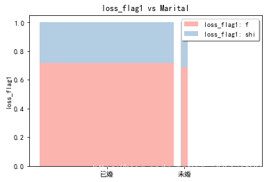
本文来自互联网用户投稿,文章观点仅代表作者本人,不代表本站立场,不承担相关法律责任。如若转载,请注明出处。 如若内容造成侵权/违法违规/事实不符,请点击【内容举报】进行投诉反馈!