简洁好看的登录页面
简洁好看的登录页面
1.看效果
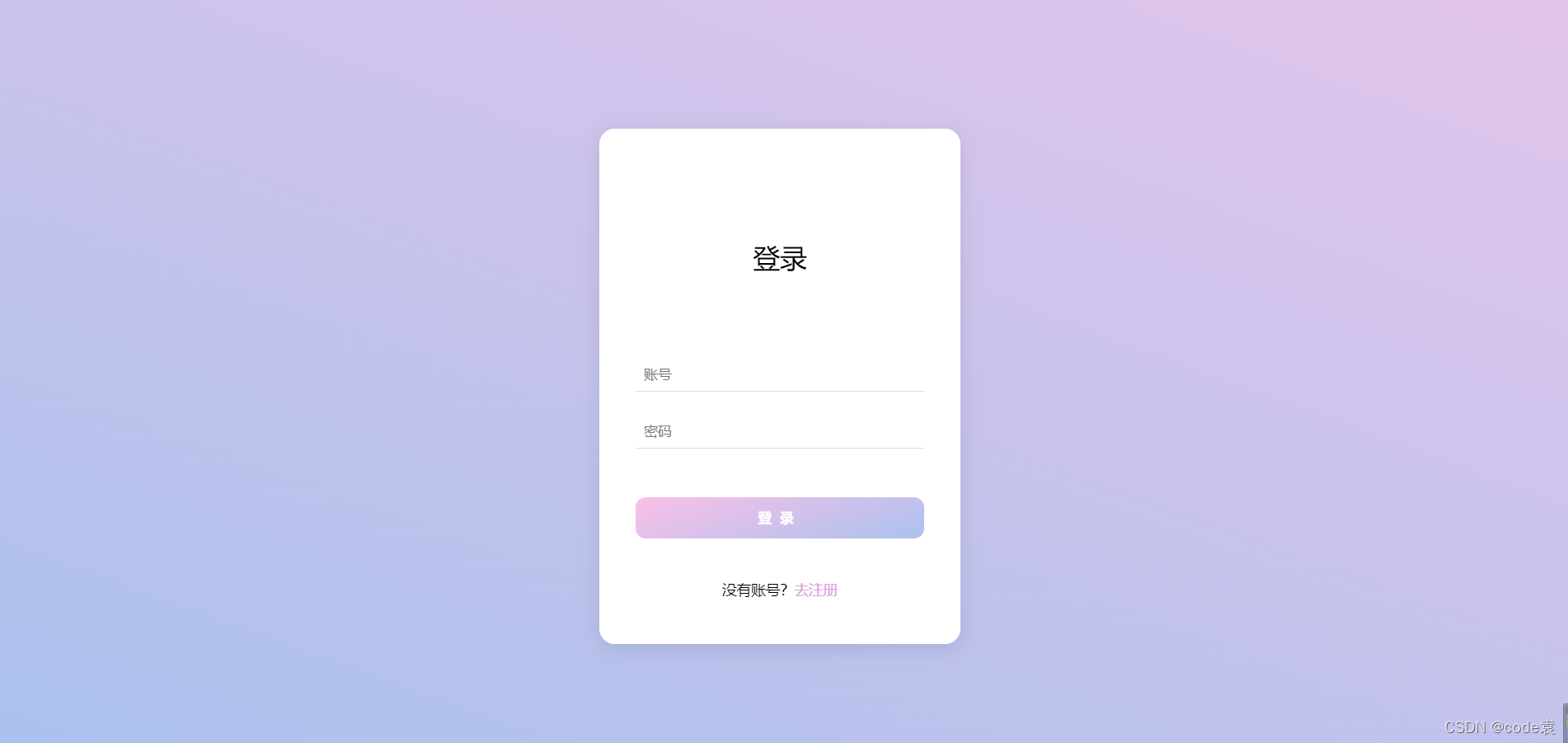
2.html
<!DOCTYPE html>
<html lang="en">
<head><meta charset="UTF-8"><title>登录界面</title><link rel="stylesheet" href="static/login.css">
</head>
<body><div class="container"><div class="tit">登录</div><input type="text" placeholder="账号"><input type="password" placeholder="密码"><button>登录</button><span>没有账号?<a href="#">去注册</a> </span></div><div class="square"><ul><li></li><li></li><li></li><li></li><li></li></ul></div><div class="circle"><ul><li></li><li></li><li></li><li></li><li></li></ul></div>
</body>
</html>
2.css
*{/*初始化*/margin: 0;padding: 0;
}
body{height: 100vh;/*弹性布局居中*/display: flex;justify-content: center;align-items: center;/*渐变背景*/background: linear-gradient(200deg,#e3c5eb,#a9c1ed);/*溢出影藏*/overflow: hidden;
}
.container{/*相对定位*/position: relative;z-index: 1;background-color: #fff;border-radius: 15px;display: flex;/*垂直配列*/flex-direction: column;justify-content: center;align-items: center;width: 350px;height: 500px;/*阴影*/box-shadow: 0 5px 20px rgba(0,0,0,0.1);
}
.container .tit{font-size: 26px;margin: 65px auto 70px auto;
}
.container input{width: 280px;height: 30px;text-indent: 8px;border: none;border-bottom: 1px solid #ddd;outline: none;margin: 12px auto;
}
.container button{width: 280px;height: 40px;margin: 35px auto 40px auto;border: none;background: linear-gradient(-200deg,#fac0e7,#aac2ee);color: #fff;font-weight: bold;letter-spacing: 8px;border-radius: 10px;cursor: pointer;/*动画过渡*/transition: 0.5s;
}
.container button:hover{background: linear-gradient(-200deg,#aac2ee,#fac0e7);background-position-x: -280px;
}
.container span{font-size: 14px;
}
.container a{color: plum;text-decoration: none;
}ul li{position: absolute;border: 1px solid #fff;background-color: #ffffff;width: 30px;height: 30px;list-style: none;opacity: 0;
}
.square li{top: 40vh;left: 60vw;animation: square 10s linear infinite;
}
.square li:nth-child(2){top: 80vh;left: 10vm;/*动画延时时间*/animation-delay: 2s;
}
.square li:nth-child(3){top: 80vh;left: 85vm;/*动画延时时间*/animation-delay: 4s;
}.square li:nth-child(4){top: 10vh;left: 70vm;/*动画延时时间*/animation-delay: 6s;
}.square li:nth-child(5){top: 10vh;left: 10vm;/*动画延时时间*/animation-delay: 8s;
}.circle li{bottom: 0;left: 15vw;animation: circle 10s linear infinite;
}
.circle li:nth-child(2){left: 35vw;animation-delay: 2s;
}
.circle li:nth-child(3){left: 55vw;animation-delay: 4s;
}
.circle li:nth-child(4){left: 75vw;animation-delay: 6s;
}
.circle li:nth-child(5){left: 90vw;animation-delay: 8s;
}@keyframes square {0%{transform: scale(0) rotate(0deg);opacity: 0;}100%{transform: scale(0) rotate(1000deg);opacity: 0;}}
@keyframes circle{0%{transform: scale(0) rotate(0deg);opacity: 1;bottom: 0;border-radius: 0;}100%{transform: scale(0) rotate(1000deg);opacity: 0;bottom: 90vh;border-radius: 50%;}}
记得点赞哦
本文来自互联网用户投稿,文章观点仅代表作者本人,不代表本站立场,不承担相关法律责任。如若转载,请注明出处。 如若内容造成侵权/违法违规/事实不符,请点击【内容举报】进行投诉反馈!