微信小程序——自定义对话框modal——活动宣传弹出框(背景透明)——action-sheet——气泡弹窗——组件形式自定义modal
微信小程序自定义对话框dialog
简介
和用户交互,提示用户,让用户选择
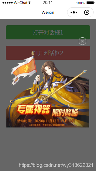
1、活动宣传弹出框
.js代码:
const app = getApp()
var that
Page({data: {showModal_one: false,showModal_two: false},onLoad: function () {that = this;},/*** 打开对话框按钮事件*/open: function () {this.setData({showModal_one: true})},/*** 点击朦胧层滑动会触发* @param {*} e */preventTouchMove: function (e) {},/*** 点击朦胧层触发* @param {*} e */clickModal(e) {console.log('==', e)this.setData({showModal_one: false})},})
.wxss代码:
.mask {width: 100%;height: 100%;position: fixed;top: 0;left: 0;background: rgb(36, 36, 36);z-index: 9000;opacity: 0.7;
}.dialog-box {width: 640rpx;height: 620rpx;position: fixed;top: 50%;left: 0;z-index: 9999;/* 距离上 -350 左右各85(85*2+580=750 总的750分成两个85一个580) */margin: -350rpx 55rpx;/* background-color: #fff; *//* 把背景设置透明 */background: rgba(0, 0, 0, 0);border-radius: 36rpx;display: flex;flex-direction: column;align-items: center;
}/* 右上角的叉图片 */
.image-exit {width: 60rpx;height: 60rpx;position: fixed;right: 80rpx;/* display: inline-block; */margin-top: -102rpx;
}/* 宣传主图 */
.image-main-xuanchuan {width: 640rpx;height: 620rpx;display: inline-block;/* margin-top: -102rpx; */
}
.wxml代码:
<!-- 第 1 种弹出框 (蒙层view中绑定的preventTouchMove函数是一个空函数,使用了catch事件,目的就是阻止touchmove这样一个冒泡事件继续向下传递。)-->
<view class="mask" catchtouchmove="preventTouchMove" wx:if="{{showModal_one}}" bindtap="clickModal"></view>
<view class="dialog-box" wx:if="{{showModal_one}}"><image class="image-exit" src="../images/image-exit.png" /><image class="image-main-xuanchuan" src="../images/xuanchuan.png" /><!-- <text>这里是对话框的内容</text><button bindtap="confirm">确定</button> -->
</view>
<button bindtap="open" style="margin:50rpx" type="primary">打开对话框1</button>
注意:透明属性:background: rgba(0, 0, 0, 0);
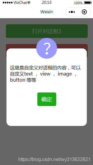
2、自定义控件弹出框
.js代码:
const app = getApp()
var that
Page({data: {showModal_one: false,showModal_two: false},onLoad: function () {that = this;},/*** 打开对话框按钮事件*/open2: function () {this.setData({showModal_two: true})},// 确定按钮confirm: function () {this.setData({showModal_two: false})},})
.wxml代码:
<!-- 第 2 种弹出框 (蒙层view中绑定的preventTouchMove函数是一个空函数,使用了catch事件,目的就是阻止touchmove这样一个冒泡事件继续向下传递。)-->
<view class="mask_2" catchtouchmove="preventTouchMove" wx:if="{{showModal_two}}" bindtap="clickModal"></view>
<view class="dialog-box_2" wx:if="{{showModal_two}}"><image class="image-top" src="../images/about1.png" /><text style="margin:30rpx">这里是自定义对话框的内容,可以自定义text , view , image , button 等等</text><button style="margin:50rpx" bindtap="confirm" type="primary">确定</button>
</view>
<button bindtap="open2" style="margin:50rpx" type="warn">打开对话框2</button>
.wxss代码:
.mask_2 {width: 100%;height: 100%;position: fixed;top: 0;left: 0;background: rgb(36, 36, 36);z-index: 9000;opacity: 0.7;
}.dialog-box_2 {width: 640rpx;height: 620rpx;position: fixed;top: 50%;left: 0;z-index: 9999;/* 距离上 -350 左右各85(85*2+580=750 总的750分成两个85一个580) */margin: -350rpx 55rpx;background-color: #fff;/* 把背景设置透明 *//* background: rgba(0, 0, 0, 0); */border-radius: 36rpx;display: flex;flex-direction: column;align-items: center;
}/* 顶上的问号图片 */
.image-top {width: 200rpx;height: 200rpx;display: inline-block;margin-top: -102rpx;
}
以上两个图片的代码下载链接为:添加链接描述
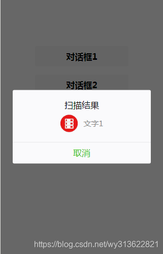
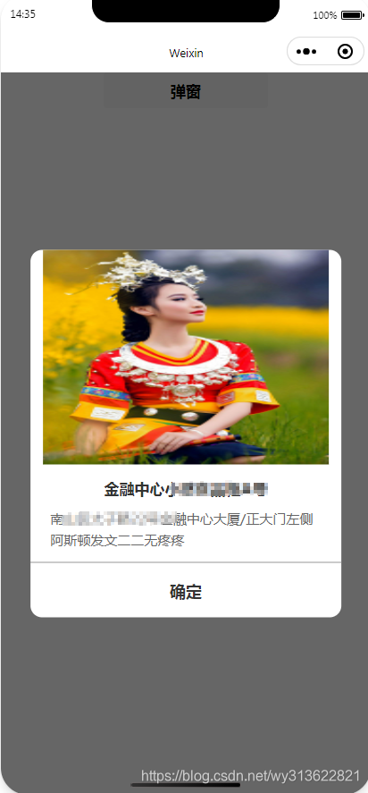
3、modal自定义对话框
界面:
.wxml代码
<button bindtap="bt1" class="button">对话框1</button>
<modal  hidden="{{!hiddenmodal}}" title="扫描结果" bindconfirm="modalCancle" no-cancel="false" confirmText="取消"><view class="modal"><image class="image" src="../images/38.png"></image><text class="text">文字1</text></view></modal>
.js代码
data: {hiddenmodal: false,},//对话框1按钮bt1: function(e) {let that = thisthat.setData({hiddenmodal: true,})},//取消1modalCancle: function (e) {let that = thisthat.setData({hiddenmodal: false,})},
.wxss代码
.modal{display: flex;align-items: center;justify-content: center;
}
.button{margin-top: 20rpx;margin-bottom: 20rpx;
}
.image{width: 80rpx;height: 80rpx
}
.text{margin-left: 30rpx;
}
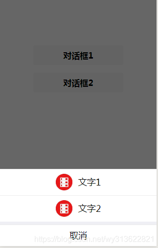
4、action-sheet自定义对话框代码
wxml
<button bindtap="bt2" class="button">对话框2</button>
<action-sheet hidden="{{!hidden_actionSheet}}" bindchange="actionSheetChange"><action-sheet-item class='item'><image class="image" src="../images/38.png"></image><text class="text">文字1</text></action-sheet-item><action-sheet-item class='item'><image class="image" src="../images/38.png"></image><text class="text">文字2</text></action-sheet-item><!-- 取消按钮可以不用 --><action-sheet-cancel class='cancel' >取消</action-sheet-cancel></action-sheet>
js
data: {hidden_actionSheet: false,},//对话框2按钮bt2: function(e) {let that = thisthat.setData({hidden_actionSheet: true,})},// 底下的取消actionSheetChange: function (e) {this.setData({hidden_actionSheet: false})},
wxss
.button{margin-top: 20rpx;margin-bottom: 20rpx;
}
.image{width: 80rpx;height: 80rpx
}
.text{margin-left: 30rpx;
}.item{display: flex;align-items: center;justify-content: center;
}
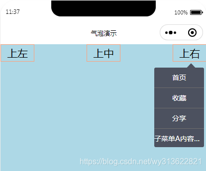
5、气泡弹窗
效果图
代码下载地址为:https://download.csdn.net/download/wy313622821/16232269
6、wifi列表放在自定义的modal里面
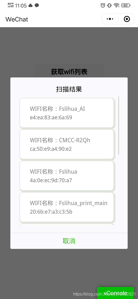
需要wifi列表的可以看链接:
https://download.csdn.net/download/wy313622821/12747197
7、组件形式自定义modal
代码地址:https://download.csdn.net/download/wy313622821/18745166
本文来自互联网用户投稿,文章观点仅代表作者本人,不代表本站立场,不承担相关法律责任。如若转载,请注明出处。 如若内容造成侵权/违法违规/事实不符,请点击【内容举报】进行投诉反馈!