拿来就能用的网页动画特效,不来看看?
写在前面
我特别喜欢收集前端好看的特效代码,前端好用的网站。今天给大家分享出来,如果觉得有帮助可以点赞收藏支持一下,如果能关注一下就再好不过了ヾ(≧▽≦*)o,之后还会分享许多干货,话不多说,上动图:
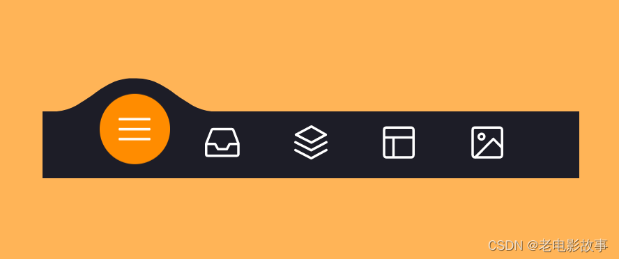
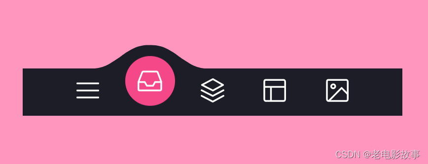
哎呀 没有动图 你还是自己跑下
不说了
上代码!!!!
HTML
DOCTYPE html>
<html lang="en">
<head><meta charset="UTF-8"><meta http-equiv="X-UA-Compatible" content="IE=edge"><meta name="viewport" content="width=device-width, initial-scale=1.0"><title>Documenttitle><link rel="stylesheet" href="./tabbar.css">
head>
<body><menu class="menu"><button class="menu__item active" style="--bgColorItem: #ff8c00;" ><svg class="icon" viewBox="0 0 24 24"><path d="M3.8,6.6h16.4"/><path d="M20.2,12.1H3.8"/><path d="M3.8,17.5h16.4"/>svg>button><button class="menu__item" style="--bgColorItem: #f54888;"><svg class="icon" viewBox="0 0 24 24"><path  d="M6.7,4.8h10.7c0.3,0,0.6,0.2,0.7,0.5l2.8,7.3c0,0.1,0,0.2,0,0.3v5.6c0,0.4-0.4,0.8-0.8,0.8H3.8C3.4,19.3,3,19,3,18.5v-5.6c0-0.1,0-0.2,0.1-0.3L6,5.3C6.1,5,6.4,4.8,6.7,4.8z"/><path  d="M3.4,12.9H8l1.6,2.8h4.9l1.5-2.8h4.6"/>svg>button><button class="menu__item" style="--bgColorItem: #4343f5;" ><svg class="icon" viewBox="0 0 24 24"><path  d="M3.4,11.9l8.8,4.4l8.4-4.4"/><path  d="M3.4,16.2l8.8,4.5l8.4-4.5"/><path  d="M3.7,7.8l8.6-4.5l8,4.5l-8,4.3L3.7,7.8z"/>button><button class="menu__item" style="--bgColorItem: #e0b115;" > <svg class="icon" viewBox="0 0 24 24" ><path  d="M5.1,3.9h13.9c0.6,0,1.2,0.5,1.2,1.2v13.9c0,0.6-0.5,1.2-1.2,1.2H5.1c-0.6,0-1.2-0.5-1.2-1.2V5.1C3.9,4.4,4.4,3.9,5.1,3.9z"/><path  d="M4.2,9.3h15.6"/><path  d="M9.1,9.5v10.3"/>button><button class="menu__item" style="--bgColorItem:#65ddb7;"><svg class="icon" viewBox="0 0 24 24" ><path  d="M5.1,3.9h13.9c0.6,0,1.2,0.5,1.2,1.2v13.9c0,0.6-0.5,1.2-1.2,1.2H5.1c-0.6,0-1.2-0.5-1.2-1.2V5.1C3.9,4.4,4.4,3.9,5.1,3.9z"/><path  d="M5.5,20l9.9-9.9l4.7,4.7"/><path  d="M10.4,8.8c0,0.9-0.7,1.6-1.6,1.6c-0.9,0-1.6-0.7-1.6-1.6C7.3,8,8,7.3,8.9,7.3C9.7,7.3,10.4,8,10.4,8.8z"/>svg>button><div class="menu__border">div>menu><div class="svg-container"><svg viewBox="0 0 202.9 45.5" ><clipPath id="menu" clipPathUnits="objectBoundingBox" transform="scale(0.0049285362247413 0.021978021978022)"><path  d="M6.7,45.5c5.7,0.1,14.1-0.4,23.3-4c5.7-2.3,9.9-5,18.1-10.5c10.7-7.1,11.8-9.2,20.6-14.3c5-2.9,9.2-5.2,15.2-7c7.1-2.1,13.3-2.3,17.6-2.1c4.2-0.2,10.5,0.1,17.6,2.1c6.1,1.8,10.2,4.1,15.2,7c8.8,5,9.9,7.1,20.6,14.3c8.3,5.5,12.4,8.2,18.1,10.5c9.2,3.6,17.6,4.2,23.3,4H6.7z"/>clipPath>svg>div><script src="./tabbar.js">script>
body>
html>
CSS
html {box-sizing: border-box;--bgColorMenu : #1d1d27;--duration: .7s;    }html *,
html *::before,
html *::after {box-sizing: inherit;}body{margin: 0;display: flex;height: 100vh;overflow: hidden;align-items: center;justify-content: center;background-color: #ffb457;-webkit-tap-highlight-color: transparent;transition: background-color var(--duration);}.menu{margin: 0;display: flex;/* Works well with 100% width  */width: 32.05em;font-size: 1.5em;padding: 0 2.85em;position: relative;align-items: center;justify-content: center;background-color: var(--bgColorMenu);}.menu__item{all: unset;flex-grow: 1;z-index: 100;display: flex;cursor: pointer;position: relative;border-radius: 50%;align-items: center;will-change: transform;justify-content: center;padding: 0.55em 0 0.85em;transition: transform var(--timeOut , var(--duration));}.menu__item::before{content: "";z-index: -1;width: 4.2em;height: 4.2em;border-radius: 50%;position: absolute;transform: scale(0);transition: background-color var(--duration), transform var(--duration);}.menu__item.active {transform: translate3d(0, -.8em , 0);}.menu__item.active::before{transform: scale(1);background-color: var(--bgColorItem);}.icon{width: 2.6em;height: 2.6em;stroke: white;fill: transparent;stroke-width: 1pt;stroke-miterlimit: 10;stroke-linecap: round;stroke-linejoin: round;stroke-dasharray: 400;}.menu__item.active .icon {animation: strok 1.5s reverse;}@keyframes strok {100% {stroke-dashoffset: 400;}}.menu__border{left: 0;bottom: 99%;width: 10.9em;height: 2.4em;position: absolute;clip-path: url(#menu);will-change: transform;background-color: var(--bgColorMenu);transition: transform var(--timeOut , var(--duration));}.svg-container {width: 0;height: 0;
}@media screen and (max-width: 50em) {.menu{font-size: .8em;}
}
JS
"use strict"; const body = document.body;
const bgColorsBody = ["#ffb457", "#ff96bd", "#9999fb", "#ffe797", "#cffff1"];
const menu = body.querySelector(".menu");
const menuItems = menu.querySelectorAll(".menu__item");
const menuBorder = menu.querySelector(".menu__border");
let activeItem = menu.querySelector(".active");function clickItem(item, index) {menu.style.removeProperty("--timeOut");if (activeItem == item) return;if (activeItem) {activeItem.classList.remove("active");}item.classList.add("active");body.style.backgroundColor = bgColorsBody[index];activeItem = item;offsetMenuBorder(activeItem, menuBorder);}function offsetMenuBorder(element, menuBorder) {const offsetActiveItem = element.getBoundingClientRect();const left = Math.floor(offsetActiveItem.left - menu.offsetLeft - (menuBorder.offsetWidth  - offsetActiveItem.width) / 2) +  "px";menuBorder.style.transform = `translate3d(${left}, 0 , 0)`;}offsetMenuBorder(activeItem, menuBorder);menuItems.forEach((item, index) => {item.addEventListener("click", () => clickItem(item, index));})window.addEventListener("resize", () => {offsetMenuBorder(activeItem, menuBorder);menu.style.setProperty("--timeOut", "none");
});
更多动态特效
https://codepen.io/trending?cursor=ZD0wJm89MCZwPTIw
codePen
上面的这个特效都是来源于此网站,需要代码的小伙伴,可以访问此网站来获取代码。
本文来自互联网用户投稿,文章观点仅代表作者本人,不代表本站立场,不承担相关法律责任。如若转载,请注明出处。 如若内容造成侵权/违法违规/事实不符,请点击【内容举报】进行投诉反馈!