庸人自扰——随机森林(Random Forest)预测最高气温(一)
庸人自扰——随机森林(Random Forest)预测最高气温(一)
随机森林最高气温预测,我分为三部分:
- 建模预测
- 特征分析
- 调参分析
此处主要对第一部分进行展开
导入相关包,并对数据进行读取,查看数据栏
# 数据读取
import pandas as pdfeatures = pd.read_csv('./datalab/62821/temps.csv')
features.head(5)
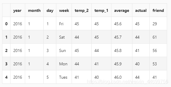
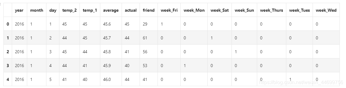
- year,moth,day,week分别表示的具体的时间
- temp_2:前天的最高温度值
- temp_1:昨天的最高温度值
- average:在历史中,每年这一天的平均最高温度值
- actual:这就是我们的标签值了,当天的真实最高温度
- friend:这一列可能是凑热闹的,你的朋友猜测的可能值,咱们不管它就好了
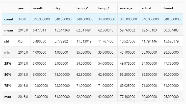
查看数据大小
print('The shape of our features is:', features.shape)
- The shape of our features is: (348, 9)
查看统计指标
# 统计指标
features.describe()
对时间数据进行处理(劝退步骤*1)
# 处理时间数据
import datetime# 分别得到年,月,日
years = features['year']
months = features['month']
days = features['day']# datetime格式
dates = [str(int(year)) + '-' + str(int(month)) + '-' + str(int(day)) for year, month, day in zip(years, months, days)]
dates = [datetime.datetime.strptime(date, '%Y-%m-%d') for date in dates]
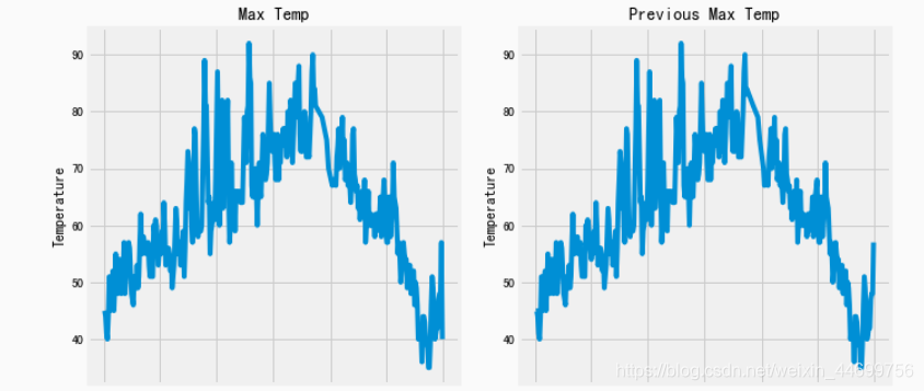
画图画图,看看长啥样
# 准备画图
import matplotlib.pyplot as plt
%matplotlib inline# 指定默认风格
plt.style.use('fivethirtyeight')# 设置布局
fig, ((ax1, ax2), (ax3, ax4)) = plt.subplots(nrows=2, ncols=2, figsize = (10,10))
fig.autofmt_xdate(rotation = 45)# 标签值
ax1.plot(dates, features['actual'])
ax1.set_xlabel(''); ax1.set_ylabel('Temperature'); ax1.set_title('Max Temp')# 昨天
ax2.plot(dates, features['temp_1'])
ax2.set_xlabel(''); ax2.set_ylabel('Temperature'); ax2.set_title('Previous Max Temp')# 前天
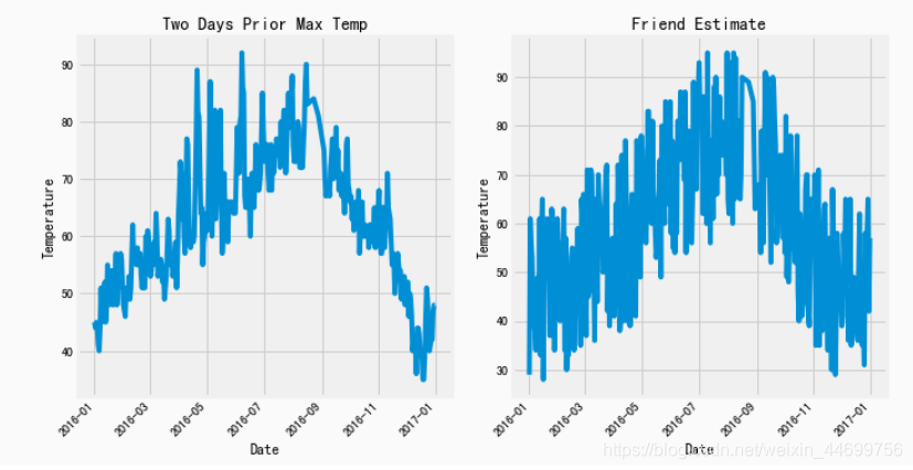
ax3.plot(dates, features['temp_2'])
ax3.set_xlabel('Date'); ax3.set_ylabel('Temperature'); ax3.set_title('Two Days Prior Max Temp')# 没有用的朋友
ax4.plot(dates, features['friend'])
ax4.set_xlabel('Date'); ax4.set_ylabel('Temperature'); ax4.set_title('Friend Estimate')#2*2布局
plt.tight_layout(pad=2)
于是它们就长成这个样子,看上去还蛮正常的
数据预处理
这里是因为,数据集有个小小的问题,他的week数据里是英文(Mon,Tue…)计算机其实是认不出来的,所以需要对其进行转换。
One-Hot Encoding(劝退步骤*2)
# 独热编码
features = pd.get_dummies(features)
features.head(5)
这个步骤呢就是把日期变成某种矩阵形式:
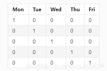
就长成这样
于是呢,我们的数据集就变成了:
然后就是转换数据格式(劝退步骤*4)
不弄这些奇奇怪怪的数据转换,会一直一直报着你看都不想看的错
# 数据与标签
import numpy as np# 标签
labels = np.array(features['actual'])# 在特征中去掉标签
features= features.drop('actual', axis = 1)# 名字单独保存一下,以备后患
feature_list = list(features.columns)# 转换成合适的格式
features = np.array(features)
分割数据集
# 数据集切分
from sklearn.model_selection import train_test_splittrain_features, test_features, train_labels, test_labels = train_test_split(features, labels, test_size = 0.25, random_state = 42)
看数据集吗?我不想看。
开始随机森林(终于)
先试试1000个树吧,这里我们不调参,用默认参数。
# 导入算法
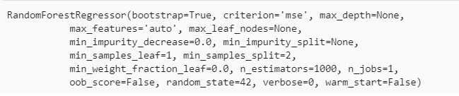
from sklearn.ensemble import RandomForestRegressor# 建模
rf = RandomForestRegressor(n_estimators= 1000, random_state=42)# 训练
rf.fit(train_features, train_labels)
很快就搞定了
测试
# 预测结果
predictions = rf.predict(test_features)# 计算误差
errors = abs(predictions - test_labels)# mean absolute percentage error (MAPE)
mape = 100 * (errors / test_labels)print ('MAPE:',np.mean(mape))
MAPE: 6.00942279601
取一颗书可视化
算了,我不想做
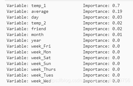
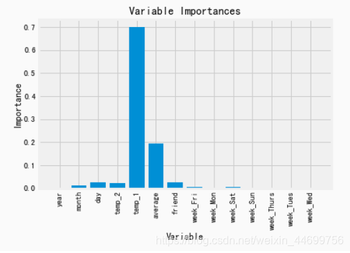
探查特征重要性
# 得到特征重要性
importances = list(rf.feature_importances_)# 转换格式
feature_importances = [(feature, round(importance, 2)) for feature, importance in zip(feature_list, importances)]# 排序
feature_importances = sorted(feature_importances, key = lambda x: x[1], reverse = True)# 对应进行打印
[print('Variable: {:20} Importance: {}'.format(*pair)) for pair in feature_importances]
用最重要的特征
# 选择最重要的那两个特征来试一试
rf_most_important = RandomForestRegressor(n_estimators= 1000, random_state=42)# 拿到这俩特征
important_indices = [feature_list.index('temp_1'), feature_list.index('average')]
train_important = train_features[:, important_indices]
test_important = test_features[:, important_indices]# 重新训练模型
rf_most_important.fit(train_important, train_labels)# 预测结果
predictions = rf_most_important.predict(test_important)
errors = abs(predictions - test_labels)# 评估结果
mape = np.mean(100 * (errors / test_labels))print('mape:', mape)
mape: 6.2035840065
画图看看
# 转换成list格式
x_values = list(range(len(importances)))# 绘图
plt.bar(x_values, importances, orientation = 'vertical')# x轴名字
plt.xticks(x_values, feature_list, rotation='vertical')# 图名
plt.ylabel('Importance'); plt.xlabel('Variable'); plt.title('Variable Importances');
预测
# 日期数据
months = features[:, feature_list.index('month')]
days = features[:, feature_list.index('day')]
years = features[:, feature_list.index('year')]# 转换日期格式
dates = [str(int(year)) + '-' + str(int(month)) + '-' + str(int(day)) for year, month, day in zip(years, months, days)]
dates = [datetime.datetime.strptime(date, '%Y-%m-%d') for date in dates]# 创建一个表格来存日期和其对应的标签数值
true_data = pd.DataFrame(data = {'date': dates, 'actual': labels})# 同理,再创建一个来存日期和其对应的模型预测值
months = test_features[:, feature_list.index('month')]
days = test_features[:, feature_list.index('day')]
years = test_features[:, feature_list.index('year')]test_dates = [str(int(year)) + '-' + str(int(month)) + '-' + str(int(day)) for year, month, day in zip(years, months, days)]test_dates = [datetime.datetime.strptime(date, '%Y-%m-%d') for date in test_dates]predictions_data = pd.DataFrame(data = {'date': test_dates, 'prediction': predictions})
画图(终于结束额)
# 真实值
plt.plot(true_data['date'], true_data['actual'], 'b-', label = 'actual')# 预测值
plt.plot(predictions_data['date'], predictions_data['prediction'], 'ro', label = 'prediction')
plt.xticks(rotation = '60');
plt.legend()# 图名
plt.xlabel('Date'); plt.ylabel('Maximum Temperature (F)'); plt.title('Actual and Predicted Values');
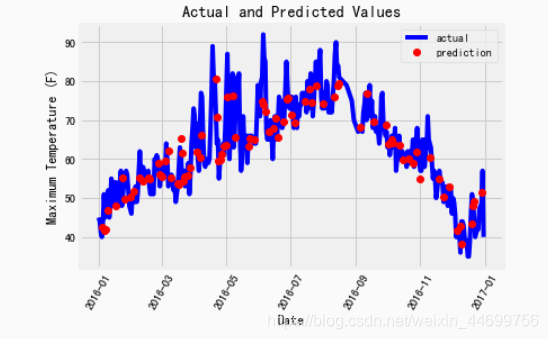
eng…还行吧,一言难尽啊,但总归做出来了
庸人自扰,大家见笑
本文来自互联网用户投稿,文章观点仅代表作者本人,不代表本站立场,不承担相关法律责任。如若转载,请注明出处。 如若内容造成侵权/违法违规/事实不符,请点击【内容举报】进行投诉反馈!