立体图形动画
在css3中新增添的动画属性(animation),可以让动画更流畅的展现,例如让一个立体图形按照设定的方向移动,在移动过程中也可加入自己的奇思妙想,让动画更好玩有趣。今天的小案例效果如下。
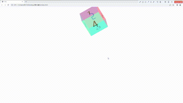
主体结构(HTML),只用ul构建主体结构,里面给六个li,写上每个面的数字。还可以用div标签,span标签都可以。代码参考。
- 1
- 2
- 3
- 4
- 5
- 6
css样式部分,写完主体结构,给每一面加上不一样的样式,为了让六个面形成立体图像,我们使用transform这个属性,给每个面在x轴和y轴和z轴平移不同的距离,来实现立体图形的样式
.ul>li:first-child{background: #ac6dff;transform: translateZ(100px);}.ul>li:nth-child(2){background: #90ff45;transform: translateX(-100px) rotateY(-90deg);}.ul>li:nth-child(3){background: #ff67c7;transform: translateX(100px) rotateY(90deg);}.ul>li:nth-child(4){background: #5affff;transform: translateY(100px) rotateX(-90deg);}.ul>li:nth-child(5){background: #ffa31f;transform: translateY(-100px) rotateX(90deg);}.ul>li:nth-child(6){transform: translateZ(-100px) rotateY(-180deg);background: #22ff84;}静态样式还可以在此基础上进行添加,加上一个鼠标移入样式,当鼠标移入后,图形分散,视觉效果更好
.ul:hover>li:first-child{background: #ac6dff;transform: translateZ(150px);}.ul:hover>li:nth-child(2){background: #90ff45;transform: translateX(-150px) rotateY(-90deg);}.ul:hover>li:nth-child(3){background: #ff67c7;transform: translateX(150px) rotateY(90deg);}.ul:hover>li:nth-child(4){background: #5affff;transform: translateY(150px) rotateX(-90deg);}.ul:hover>li:nth-child(5){background: #ffa31f;transform: translateY(-150px) rotateX(90deg);}.ul:hover>li:nth-child(6){transform: translateZ(-150px) rotateY(-180deg);background: #22ff84;}让图像按照我们预想的方式走,设置动画,动画的名字rotate,让图像沿着x轴和y轴和z轴旋转360度
@keyframes rotate {0%{transform: rotateY(0) rotateX(0) rotateZ(0);}100%{transform: rotateY(360deg) rotateX(360deg) rotateZ(360deg);}动画关键帧设置完以后要进行调用,在ul里面使用animation,设置动画的时间,运动的速度,运动的方式。
.ul{width: 200px;margin: 100px auto;position: relative;animation: rotate 5s infinite ;transform-style: preserve-3d;}.ul>li{height: 200px;width:200px;background: yellow;position: absolute;list-style:none;font-size: 100px;text-align: center;line-height: 200px;opacity: 0.5;}代码总结:
- 1
- 2
- 3
- 4
- 5
- 6
本文来自互联网用户投稿,文章观点仅代表作者本人,不代表本站立场,不承担相关法律责任。如若转载,请注明出处。 如若内容造成侵权/违法违规/事实不符,请点击【内容举报】进行投诉反馈!