this.$message的信息提示使用
1.前提条件
在总体引入文件中添加相关类
import {Message} from “element-ui”;
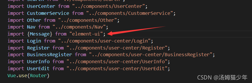
可以看到此处的Message来源:

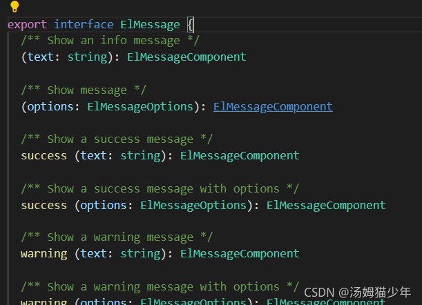
来自一个导出供使用的ELMessage接口:
文件总体:
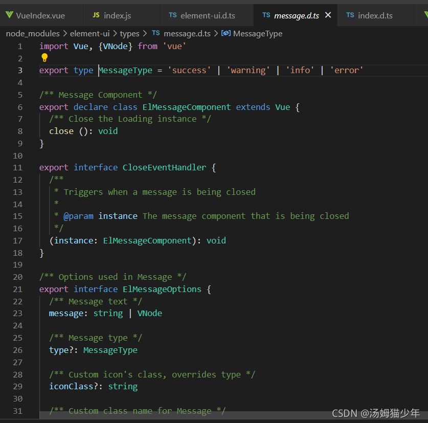
import Vue, {VNode} from 'vue'export type MessageType = 'success' | 'warning' | 'info' | 'error'/** Message Component */
export declare class ElMessageComponent extends Vue {/** Close the Loading instance */close (): void
}export interface CloseEventHandler {/*** Triggers when a message is being closed** @param instance The message component that is being closed*/(instance: ElMessageComponent): void
}/** Options used in Message */
export interface ElMessageOptions {/** Message text */message: string | VNode/** Message type */type?: MessageType/** Custom icon's class, overrides type */iconClass?: string/** Custom class name for Message */customClass?: string/** Display duration, millisecond. If set to 0, it will not turn off automatically */duration?: number/** Whether to show a close button */showClose?: boolean/** Whether to center the text */center?: boolean/** Whether message is treated as HTML string */dangerouslyUseHTMLString?: boolean/** Callback function when closed with the message instance as the parameter */onClose?: CloseEventHandler/** Set the distance to the top of viewport. Default is 20 px. */offset?: number
}export interface ElMessage {/** Show an info message */(text: string): ElMessageComponent/** Show message */(options: ElMessageOptions): ElMessageComponent/** Show a success message */success (text: string): ElMessageComponent/** Show a success message with options */success (options: ElMessageOptions): ElMessageComponent/** Show a warning message */warning (text: string): ElMessageComponent/** Show a warning message with options */warning (options: ElMessageOptions): ElMessageComponent/** Show an info message */info (text: string): ElMessageComponent/** Show an info message with options */info (options: ElMessageOptions): ElMessageComponent/** Show an error message */error (text: string): ElMessageComponent/** Show an error message with options */error (options: ElMessageOptions): ElMessageComponent
}declare module 'vue/types/vue' {interface Vue {/** Used to show feedback after an activity. The difference with Notification is that the latter is often used to show a system level passive notification. */$message: ElMessage}
}
可以观察到type有四种情况:
‘success’ | ‘warning’ | ‘info’ | ‘error’
前端应用:
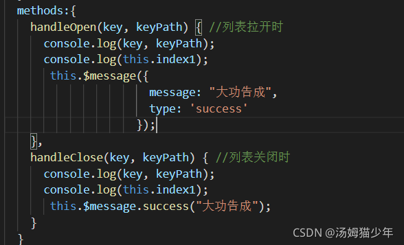
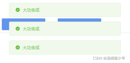
此处两种方法的效果是一致的,效果展示:
讲完:
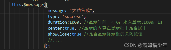
其中还有很多参数,例如
供粘贴处
this.$message({
message: “大功告成”,
type: ‘success’,
duration:1000, //显示时间 <=0:永久显示,1000:1s
center:true, //显示的内容在提示框中是否居中
showClose:true, //是否显示提示框的关闭按钮
offset:500 //距离头顶位置(px)
//…
});
总体:
/** Options used in Message */
export interface ElMessageOptions {/** Message text */message: string | VNode/** Message type */type?: MessageType/** Custom icon's class, overrides type */iconClass?: string/** Custom class name for Message */customClass?: string/** Display duration, millisecond. If set to 0, it will not turn off automatically */duration?: number/** Whether to show a close button */showClose?: boolean/** Whether to center the text */center?: boolean/** Whether message is treated as HTML string */dangerouslyUseHTMLString?: boolean/** Callback function when closed with the message instance as the parameter */onClose?: CloseEventHandler/** Set the distance to the top of viewport. Default is 20 px. */offset?: number
}
本文来自互联网用户投稿,文章观点仅代表作者本人,不代表本站立场,不承担相关法律责任。如若转载,请注明出处。 如若内容造成侵权/违法违规/事实不符,请点击【内容举报】进行投诉反馈!