CSS :has伪类
CSS :has伪类
- 1 概述
- 2 实例说明
- 2.1 表单元素前面加*
- 2.2 拖拽列表
- 2.3 多层级hover
- 2.4 评星组件
- 3 兼容性
1 概述
:has()表示满足一定条件后,就会匹配该元素。这个伪类通过把可容错相对选择器列表作为参数,提供了一种针对引用元素选择父元素或者先前的兄弟元素的方法。其语法如下:
:has()
例如,下面表示选中有元素作为子元素的元素
section:has(p) {color: red
}
再例如,下面表示选中后面紧跟着元素的元素:
h1:has(+p) {color: red;
}
:has()也可以结合CSS:not()伪类一起使用,例如,下面表示选中不含元素的元素:
li:not(:has(p)) {color: red;
}
我们还可以将多个选择器作为参数传递,下面表示选中不包含任何或元素的元素:
li:not(:has(p, span)) {color: red;
}
2 实例说明
2.1 表单元素前面加*
例如,在下面的表单元素中,用户名的设置了required,表示必填项:
<form><label>用户名label><input required><label>备注label><input>
form>

通过:has()在必填项的前面加上红色的星号,CSS如下:
label:has(+input:required)::before {content: "*";color: red;
}

选中后面紧跟着,且其为required的元素,生成它的::before伪元素。
2.2 拖拽列表
列表hover时出现拖拽手柄,点击拖拽手柄进行拖拽操作,HTML如下:
<div class="content"><div class="item">列表<span class="thumb">span>div><div class="item">列表<span class="thumb">span>div><div class="item">列表<span class="thumb">span>div>
div>
列表样式CSS如下:
.content {border: 3px solid #eee;width: 300px;
}.item {position: relative;padding: 10px 20px;background-color: #fff;border: 1px solid #eee;margin: 5px;
}

关键CSS如下:
.thumb {position: absolute;width: 30px;height: 30px;background: url("data:image/svg+xml,%3Csvg width='12' height='12' viewBox='0 0 12 12' fill='none' xmlns='http://www.w3.org/2000/svg'%3E%3Cpath d='M3.16 2.846a.75.75 0 1 0 .75-1.3.75.75 0 0 0-.75 1.3zm0 3.803a.75.75 0 1 0 .75-1.299.75.75 0 0 0-.75 1.3zm4.554-4.453a.75.75 0 1 0 1.5 0 .75.75 0 0 0-1.5 0zm0 3.804a.75.75 0 1 0 1.5 0 .75.75 0 0 0-1.5 0zm-4.553 4.453a.75.75 0 1 0 .75-1.299.75.75 0 0 0-.75 1.299zm4.553-.65a.75.75 0 1 0 1.5 0 .75.75 0 0 0-1.5 0z' fill='%23000'/%3E%3C/svg%3E") center no-repeat;right: 5px;top: 0;bottom: 0;margin: auto;cursor: pointer;opacity: 0;
}.item:hover .thumb {opacity: 1;
}.item:has(.thumb:hover) {-webkit-user-drag: element;
}
首先隐藏.thumb,当.item触发hover时,显示.thumb,接着使用:has()选中触发了.thumbhover的.item元素,使其变为可拖拽的元素。

2.3 多层级hover
有如下所示的一个多级结构:
<div class="d1"><div class="d2"><div class="d3">div>div>
div>
如果给div添加hover样式:

可以看到,当hover到里层元素时,外层元素也触发了hover样式。这有点像JS中的冒泡效果,那如何让hover的时候只触发当前的元素呢?也就是排除掉他的父级元素,:has可以很好的解决这个问题:
div:not(:has(:hover)):hover {outline: 4px dashed red;
}
:has(:hover)表示有div正处于hover,div:not(:has(:hover))表示不选择正处于hover的div,然后为其设置hover样式。

2.4 评星组件
HTML结构如下:
<star><input name="star" type="radio"><input name="star" type="radio"><input name="star" type="radio"><input name="star" type="radio"><input name="star" type="radio">
star>
CSS更改一下样子:
star {display: flex;
}star [type="radio"] {appearance: none;width: 40px;height: 40px;margin: 0;cursor: pointer;background: #ccc;transition: .3s;-webkit-mask: url("data:image/svg+xml,%3Csvg xmlns='http://www.w3.org/2000/svg' viewBox='0 0 512 512'%3E %3Cpath d='M462.3 62.6C407.5 15.9 326 24.3 275.7 76.2L256 96.5l-19.7-20.3C186.1 24.3 104.5 15.9 49.7 62.6c-62.8 53.6-66.1 149.8-9.9 207.9l193.5 199.8c12.5 12.9 32.8 12.9 45.3 0l193.5-199.8c56.3-58.1 53-154.3-9.8-207.9z'%3E%3C/path%3E %3C/svg%3E") center / 80% no-repeat;
}

当:hover或者:checked时,当前元素和当前元素之前的元素都触发选中。
star [type="radio"]:hover,
star [type="radio"]:has(~:hover),
star:not(:hover) [type="radio"]:checked,
star:not(:hover) [type="radio"]:has(~:checked) {background: orangered;
}
star [type="radio"]:hover选中当前hover的元素,star [type="radio"]:has(~:hover)选中当前hover元素之前的元素,star:not(:hover) [type="radio"]:checked选中当前点击的元素,star:not(:hover) [type="radio"]:has(~:checked)选中当前点击元素之前的元素。

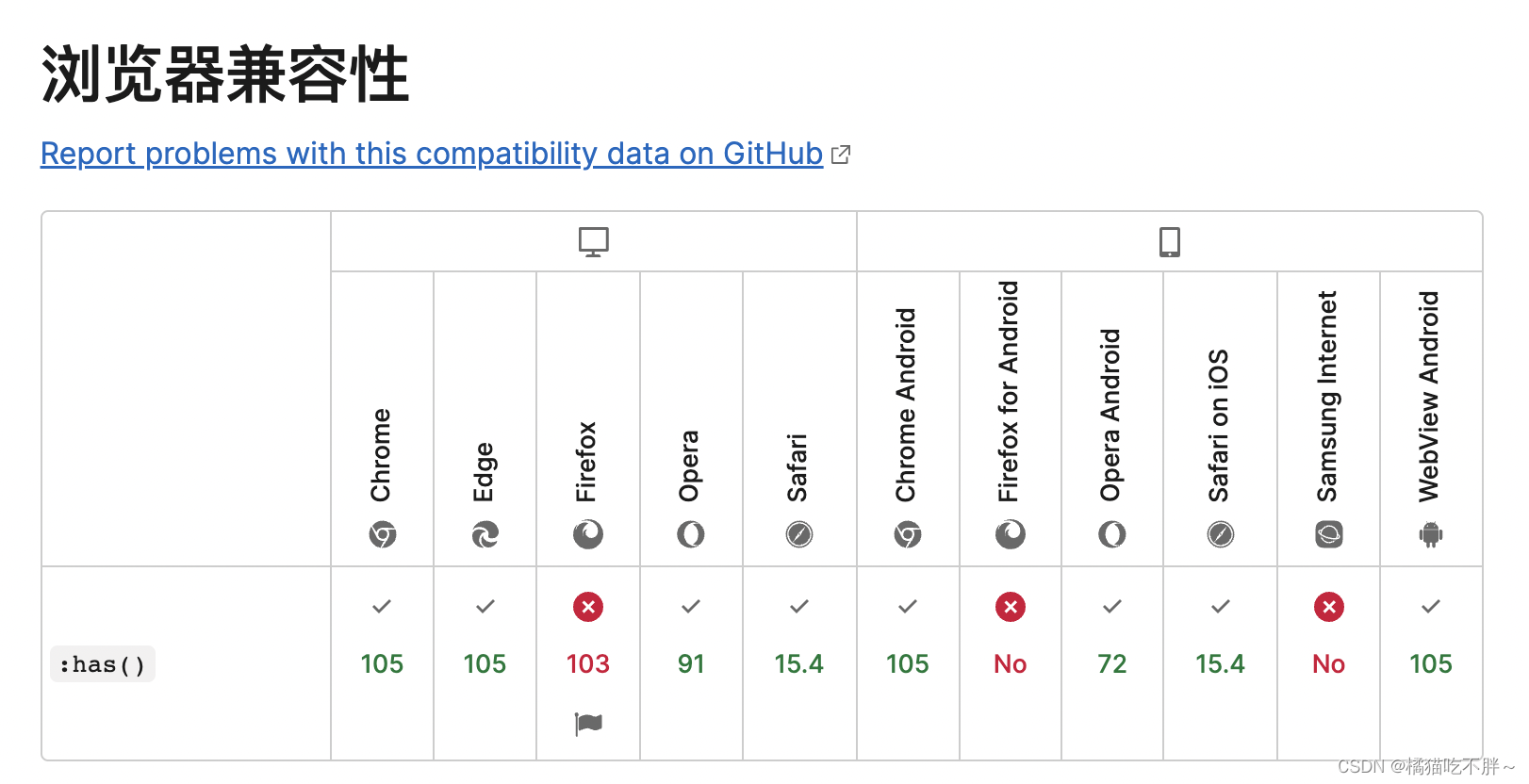
3 兼容性
MDN描述兼容性如下:
本文学习自:https://juejin.cn/post/7143121853853204516
本文来自互联网用户投稿,文章观点仅代表作者本人,不代表本站立场,不承担相关法律责任。如若转载,请注明出处。 如若内容造成侵权/违法违规/事实不符,请点击【内容举报】进行投诉反馈!