使用matplotlib让你的数据更加生动(三)
1 引言
在上一节中我们介绍了使用matplotlib进行数据可视化的几种表现方法,包括折线图、散点图、饼状图以及柱状图等, 今天我们来继续学习matplotlib的高级用法,主要包括网络图,流动图以及圆弧图,那么我们开始吧。。。
2 网络图
分散式网络: 中心化网络和分布式网络的混合体,在这种类型的网络中,少量节点的攻击会降低或破坏整个网络系统的性能.
分布式网络: 分布式网络具有抵御攻击的能力,即使在攻击后部分节点无法对网络作出贡献后,该网络仍将继续运行。这与中心化网络不同,中心化网络在中心节点受到攻击时可能会立刻破坏整个网络性能。
可视化结果:
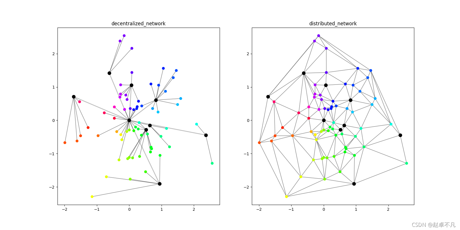
- 分散式网络:左上分散式网络图显示。
- 分布式网络:右上分布式网络图显示,通过三角剖分方法开发分布式网络显示。主要使用triplot()函数,绘制非结构化的三角形网格。
代码如下:
def test1():# datapn, cn = 64, 8px = np.random.normal(0, 1, pn)py = np.random.normal(0, 1, pn)cx = np.random.normal(0, 1, cn)cx = np.insert(cx, 0, 0)cy = np.random.normal(0, 1, cn)cy = np.insert(cy, 0, 0)angle = (np.arctan2(py, px) + np.pi) / (2 * np.pi)# paramdistrib = tri.Triangulation(np.concatenate([px, cx]),np.concatenate([py, cy]))cmapRede = cm.get_cmap('hsv')fig, (axA, axB) = plt.subplots(1, 2)# left: draw each pt to the nearest center ptfor s, t in zip(px, py):dist = ((s - cx) ** 2 + (t - cy) ** 2) ** 0.5csel = dist <= dist.min()for u, v in zip(cx[csel], cy[csel]):axA.plot([s, u], [t, v], color='black', alpha=0.5,linewidth=1, zorder=1)# left: draw each center to (0,0)for u, v in zip(cx, cy):if u or v:axA.plot([u, 0], [v, 0], color='black', alpha=0.25,linewidth=2, zorder=1)axA.scatter(px, py, c=cmapRede(angle), zorder=2)axA.scatter(cx, cy, color='black', s=64, zorder=2)axA.set_title('decentralized_network')# rightaxB.triplot(distrib, color='black', alpha=0.5, linewidth=1, zorder=1)axB.scatter(px, py, c=cmapRede(angle), zorder=2)axB.scatter(cx, cy, color='black', s=64, zorder=2)axB.set_title('distributed_network')plt.show()
triplot(*args, **kwargs)
参数:此方法接受以下描述的参数:
- x, y:这些参数是要绘制的数据的x和y坐标。
- triangulation:此参数是matplotlib.tri.Triangulation对象。
- **kwargs:此参数是文本属性,用于控制标签的外观。
3 流动图
给定路径,使用matplotlib中的Path模块,按照对应的路径上的控制点绘制相应的三次贝塞尔曲线图.
可视化结果:
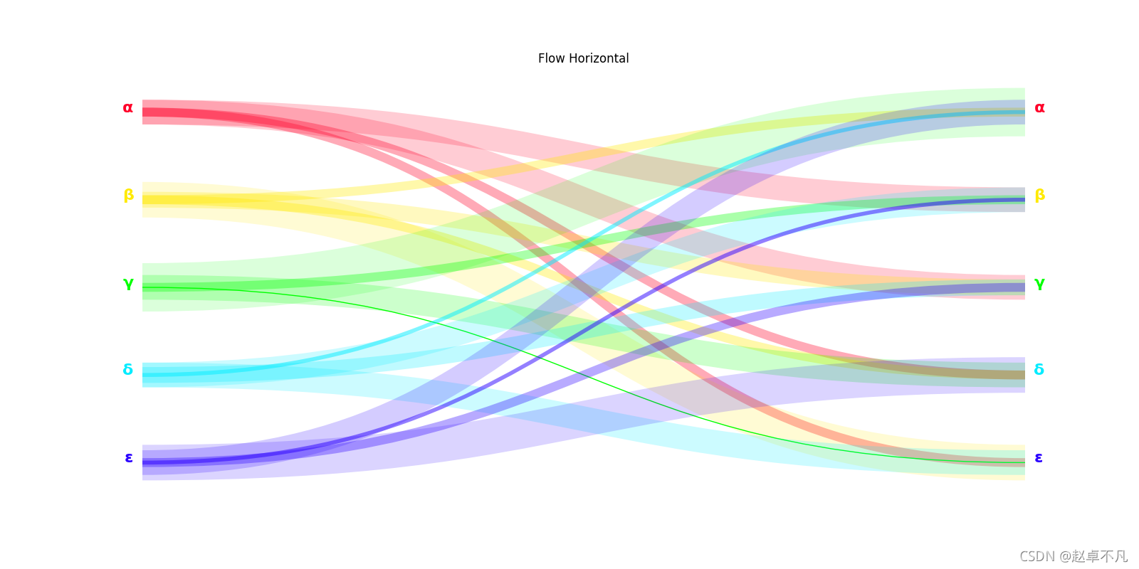
- 上图水平流向图可视化效果
代码如下:
def test2():# dataflowcolecao = np.array(list('αβγδε'))n = len(colecao)indices = np.arange(n)sel = lambda x: np.random.choice(x, 16)mapa = np.array([sel(np.delete(indices, i)) for i in indices])rede = colecao[mapa]# paramfrom matplotlib.path import Pathimport matplotlib.patches as patchespontos = [Path.MOVETO, Path.CURVE4, Path.CURVE4, Path.CURVE4]paleta = cm.get_cmap('gist_rainbow')fig, axA = plt.subplots(1, 1)# Flow horizontalgetPy = lambda x: (1 - x / n) - 0.1for i, e in enumerate(colecao):conx, cont = np.unique(rede[i], return_counts=True)yo = getPy(i)*cor, _ = paleta(i / n)axA.text(-0.01, yo, e, ha='right', color=cor,fontsize=16, fontweight='bold')axA.text(1.01, yo, e, ha='left', color=cor,fontsize=16, fontweight='bold')for cx, ct in zip(conx, cont):yi = getPy(np.where(colecao == cx)[0])verts = [(0.0, yo), (0.5, yo), (0.5, yi), (1, yi)]path = Path(verts, pontos)patch = patches.PathPatch(path, facecolor='none', edgecolor=cor,lw=ct ** 2, alpha=1 / ct)axA.add_patch(patch)axA.set_title('Flow Horizontal')axA.axis('off')plt.show()
PathPatch(path, **kwargs)
- path: 路径是 matplotlib.path.Path Object 。
- facecolor: 背景颜色
- edgecolor: 边缘颜色
- lw: linewidth 指定线的粗细
- alpha: 指定线的透明度
Path(vertices, codes=None)
- vertices: 是指的是路径path所经过的关键点的一系列坐标(x,y)
- codes指的是点与点之间到底是怎么连接的,取值如下:
– MOVETO : 拿起钢笔, 移动到给定的顶点。一般指的是 “起始点”
– LINETO : 从当前位置绘制直线到给定顶点。
– CURVE3 : 从当前位置 (用给定控制点) 绘制一个二次贝塞尔曲线到给定端点。
– CURVE4 : 从当前位置 (与给定控制点) 绘制三次贝塞尔曲线到给定端点。
– CLOSEPOLY : 将线段绘制到当前折线的起始点。
– STOP : 整个路径末尾的标记 (当前不需要和忽略)
4 圆弧图
给定圆弧路径,使用matplotlib中的Path模块,按照对应的路径绘制相应的圆弧路径图.
可视化结果:
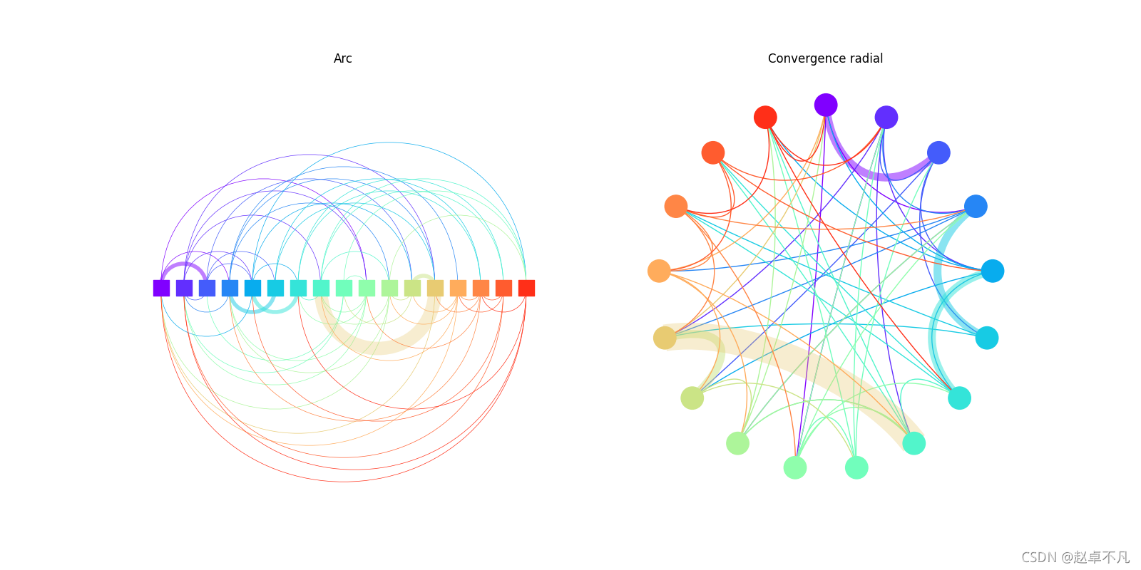
- 图弧图:左上弧图显示。
- 径向收敛图:右上径向收敛图可视化。
代码如下:
def test3():# datan = 17indices = np.arange(n)sel = lambda x: np.random.choice(x, n // 4)mapa = np.array([sel(np.delete(indices, i)) for i in indices])rede = indices[mapa]# paramcmapArco = cm.get_cmap('rainbow')fig, (axA, axB) = plt.subplots(1, 2)# ArcgetPx = lambda x: x / (n - 1)pontos = [Path.MOVETO, Path.CURVE4, Path.CURVE4, Path.CURVE4]for i, e in enumerate(indices):conx, cont = np.unique(rede[i], return_counts=True)xo = getPx(i)*cor, _ = cmapArco(i / n)for cx, ct in zip(conx, cont):xi = getPx(np.where(indices == cx)[0])yoi = (xi - xo) * 2 ** 0.5verts = [(xo, 0), (xo, yoi), (xi, yoi), (xi, 0)]path = Path(verts, pontos)patch = patches.PathPatch(path, facecolor='none', edgecolor=cor,lw=0.5 * ct ** 3, alpha=1 / ct)axA.add_patch(patch)axA.scatter(indices / (n - 1), indices * 0, color=cmapArco(indices / n),marker='s', s=256, zorder=2)axA.set_title('Arc')axA.set_xlim([-0.05, 1.05])axA.set_ylim([-1.2, 1.2])axA.axis('off')# Convergence radialgetTheta = lambda x: 2 * np.pi * x / nfor i, e in enumerate(indices):conx, cont = np.unique(rede[i], return_counts=True)thetao = getTheta(i)xo = np.sin(thetao)yo = np.cos(thetao)*cor, _ = cmapArco(i / n)for cx, ct in zip(conx, cont):thetai = getTheta(np.where(indices == cx)[0])xi = np.sin(thetai)yi = np.cos(thetai)xm = (xo + xi) * 0.5ym = (yo + yi) * 0.5verts = [(xo, yo), ((xo + xm * 0.25) * 0.5, (yo + ym * 0.25) * 0.5),((xi + xm * 0.25) * 0.5, (yi + ym * 0.25) * 0.5), (xi, yi)]path = Path(verts, pontos)patch = patches.PathPatch(path, facecolor='none', edgecolor=cor,lw=ct ** 3, alpha=1 / ct)axB.add_patch(patch)axB.scatter(np.sin(getTheta(indices)), np.cos(getTheta(indices)),color=cmapArco(indices / n), s=512, zorder=2)axB.set_title('Convergence radial')axB.set_xlim([-1.2, 1.2])axB.set_ylim([-1.2, 1.2])axB.axis('off')plt.show()
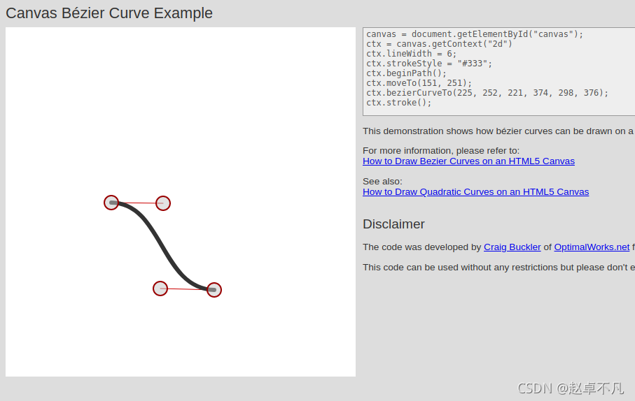
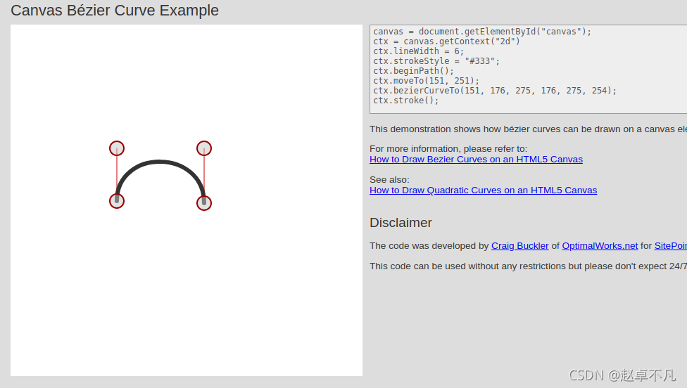
5 终极法宝
看代码是不是一脸懵,很多童鞋估计还是不太理解贝塞尔曲线中控制点的作用…
😃
没关系,给大家提供一个网址,方便大家在线查看不同控制点的效果示意图.
如下所示为第三节流动图的贝塞尔曲线示意图:
如下所示为第四节圆弧图的贝塞尔曲线示意图:
有了上述网站,你还可以根据这个网站设计多种path中的控制点的位置,来达到不同的显示效果.
Just have a try…
6 总结
本文详细地介绍了使用matplotlib画网络图、流动图和圆弧图的样例,并给出了相关可视化效果。
您学废了吗?
关注公众号《AI算法之道》,获取更多AI算法资讯。

注: 关注公众号,后台回复 path , 可获取完整代码
本文来自互联网用户投稿,文章观点仅代表作者本人,不代表本站立场,不承担相关法律责任。如若转载,请注明出处。 如若内容造成侵权/违法违规/事实不符,请点击【内容举报】进行投诉反馈!