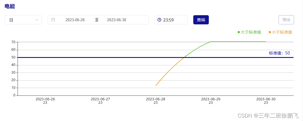
Echarts图实现折线图根据自定义标准线,超过标准值是一种颜色低于标准值是一种颜色
通过echarts图中的visualMap组件可以将数据分成若干个区间,每个区间都可以设置不同的颜色,然后结合series中的markLine设置标准线从而实现标准线上下折线呈现出两种颜色的效果
// 初始化echartsmyEcharts() {this.myChart = echarts.init(document.getElementById('main'))var option = {xAxis: {type: 'category',data: this.echartsX,axisLine: { onZero: true },splitLine: {show: false,// lineStyle: {// color: '#0c223c',// }},axisTick: {//隐藏刻度线show: false,},},yAxis: [{type: 'value',// 动态设置y轴的最大值// 如果数据的最大值大于标准值则以数据的最大值为准// 如果数据的最大值小于标准值则以标准值为准max: (value) => {if (value.max * 1 > this.first_card_data.standardValue * 1) {return Math.ceil(value.max * 1)} else {return Math.ceil(this.first_card_data.standardValue * 1)}},},],series: [{name: this.first_card_data.dataName,data: this.echartsY,type: 'line',smooth: true,showSymbol: false,markLine: {symbol: 'none',animation: false, // 是否开启动画label: {show: false},data: [{// silent: false,yAxis: this.first_card_data.standardValue * 1,label: {show: true,padding: [-13, -20, 15, -90], // 标签位置上右下左position: 'end', // 标签的位置formatter: '标准值:' + this.first_card_data.standardValue,color: '#101391',fontSize: 14,},lineStyle: { type: 'solid', color: '#101391', width: 3 } // 样式: 线型、颜色、线宽}]},},],tooltip: {show: true,trigger: 'axis'},visualMap: [{type: 'piecewise',show: false,dimension: 1,seriesIndex: 0,pieces: [{min: this.first_card_data.standardValue * 1 + 0.001, // 没有设置最大值,表明当前范围 [min, Infinity] 变色color: this.first_card_data.colorIdentify[0].color ? this.first_card_data.colorIdentify[0].color : '#909399'},{max: this.first_card_data.standardValue * 1, // 没有设置最小值,表明当前范围 [-Infinity, max] 变色color: this.first_card_data.colorIdentify[1].color ? this.first_card_data.colorIdentify[1].color : '#909399'},],}],grid: {left: '5%',right: '3%',containLabel: true},}this.myChart.setOption(option)},本文来自互联网用户投稿,文章观点仅代表作者本人,不代表本站立场,不承担相关法律责任。如若转载,请注明出处。 如若内容造成侵权/违法违规/事实不符,请点击【内容举报】进行投诉反馈!