用html和css制作静态小米网页(二)
目录
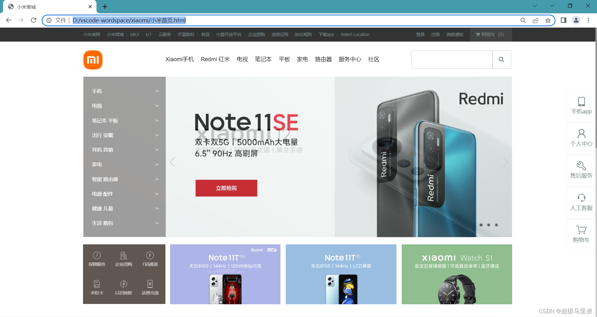
一、成果展示
二、html部分
三、css部分
3.1使用动画效果代替轮播图
3.2运用雪碧图对轮播图中的左右箭头进行设置
3.3使用伪类为页面底部左侧盒子添加竖线与横线
3.4使用固定定位将导航栏固定在右侧
一、成果展示
二、html部分
接上一部分这里制作了小米首页部分的中间轮播图部分以及底部和右边固定导航栏的制作。
- 手机>
 Note 11TPro+
- 电视>
- Note 11TPro+
- 笔记本 平板>
- Note 11TPro+
- 出行 穿戴>
- Note 11TPro+
- 耳机 音箱>
- Note 11TPro+
- 家电>
- Note 11TPro+
- 智能 路由器>
- Note 11TPro+
- 电源 配件>
- Note 11TPro+
- 健康 儿童>
- Note 11TPro+
- 生活 箱包>
- Note 11TPro+

三、css部分
对其中一些主要样式进行讲解
3.1使用动画效果代替轮播图
main{width: 1226px;height: 460px;margin: 0 auto;background-image: url(./img/背景1.jpg);background-size: cover;animation: banner 9s ease-out infinite;position: relative;
}
@keyframes banner{0%{background-image: url(./img/背景1.jpg);background-size: cover;}50%{background-image: url(./img/背景2.webp);background-size: cover;}100%{background-image: url(./img/背景3.webp);background-size: cover;}
}
3.2运用雪碧图对轮播图中的左右箭头进行设置
.arrow-left{background-image: url(./img/icon-slides.png);background-position: -83px 0;position: absolute;top: 210px;left: 236px;width: 41px;height: 69px;z-index: 1;
}
.arrow-right{background-image: url(./img/icon-slides.png);background-position: -125px 0;position: absolute;top: 210px;right: 0px;width: 41px;height: 69px;z-index: 1;
}
.arrow-left:hover{background-position: 0px 0;
}
.arrow-right:hover{background-position: -43px 0;
}
3.3使用伪类为页面底部左侧盒子添加竖线与横线
.footer-left>ul>li::after{position: absolute;content: " ";width: 1px;height: 68px;top: 6px;left: 0;background: #665e57;
}
.footer-left>ul>li::before{position: absolute;content: " ";width: 62px;height: 1px;left: 6px;top: 0px;background: #665e57;
}
3.4使用固定定位将导航栏固定在右侧
.right{width: 82px;height: 460px;position: fixed;right: 0px;top: 180px;background-color: white;z-index: 5;
}
.right>ul>li{width: 82px;height: 90px;border: 1px solid #f5f5f5;text-align: center;position: relative;z-index: 4;
}
.right>ul>li>a{display: block;width: 82px;height: 90px;text-align: center;padding-top: 16px;
}
本文来自互联网用户投稿,文章观点仅代表作者本人,不代表本站立场,不承担相关法律责任。如若转载,请注明出处。 如若内容造成侵权/违法违规/事实不符,请点击【内容举报】进行投诉反馈!