Python机器学习线性回归分析不同洲的人口和寿命
这个项目中我运用到机器学习里的线性回归制作模型,对其训练并生成新的回归函数。我这一次是从github导入csv文件,内容是过去50年不同大洲国家的人口和寿命。这个项目中我用到了seaborn库和sklearn库来制图和做线性回归模型。这个项目是在google colab中进行编写的。
import pandas as pd
import matplotlib.pyplot as plt
import numpy as np
import seaborn as sns
from numpy import mean
from sklearn.preprocessing import PolynomialFeatures
from sklearn.linear_model import LinearRegression
import statsmodels.api as smurl='https://raw.githubusercontent.com/jennybc/gapminder/master/data-raw/08_gap-every-five-years.tsv'
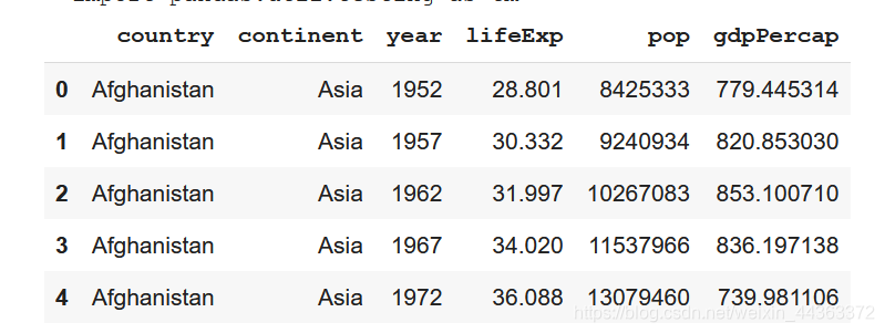
data = pd.read_csv(url,sep = '\t')
data.head()运行结果,这里是先爬取信息,查看爬取的信息是不是自己要用的csv文件里的信息。
做一个随时间变化的预期寿命散点图
data.plot.scatter(x = 'year', y = 'lifeExp', title = 'plot of life expectancy across time')
plt.show()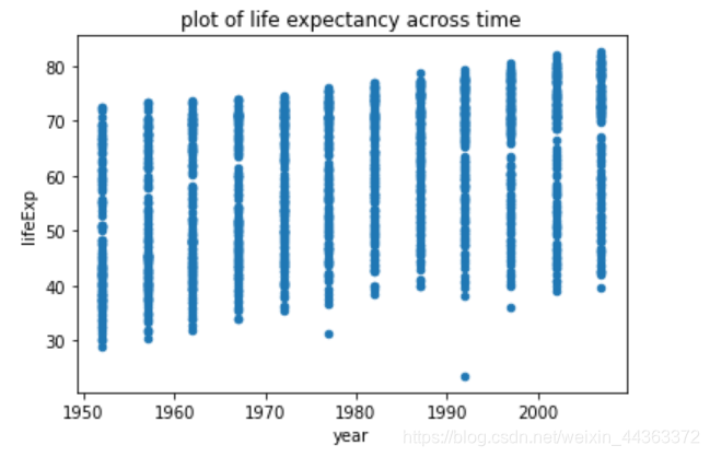
做一个随时间变化的预期寿命的小提琴图
sns.violinplot(x='year', y='lifeExp', showmeans=True, data=data)
plt.xlabel("Year")
plt.ylabel("Life Expectancy")
plt.title("Violin Plot Example")
plt.show()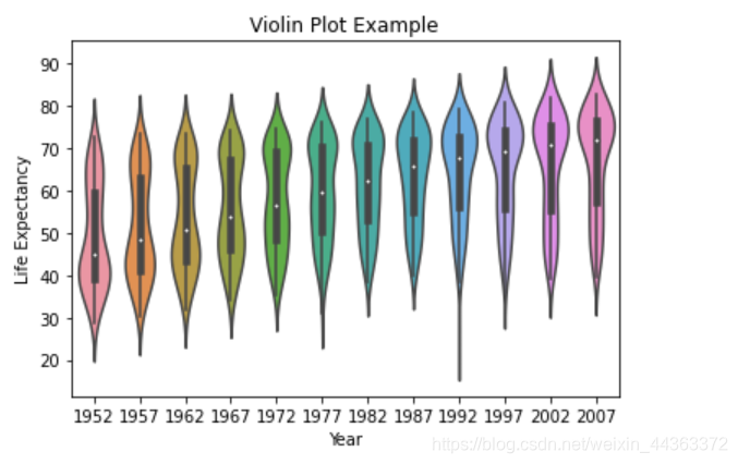
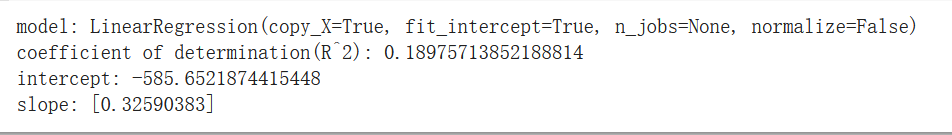
制作线性回归模型并打印出其基本信息
yearyear = data['year'].astype(float)
temp = yearyear.values
lifelife = data['lifeExp']
temp1 = lifelife.values
x1 = np.array(temp).reshape(-1,1)
y = np.array(temp1)
model = LinearRegression()
model = model.fit(x1,y)
print('model:',model)
result = model.score(x1,y)
print('coefficient of determination(R^2):',result)
print('intercept:',model.intercept_)
print('slope:',model.coef_)
运行结果
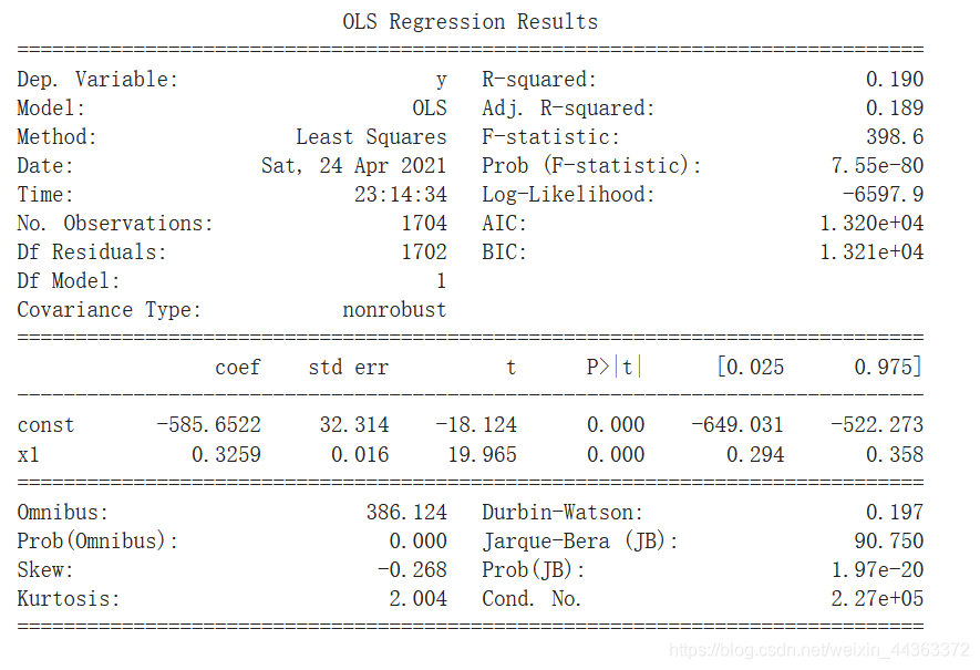
用statsmodel库打印出更为详细的模型信息
import statsmodels.api as stat
import scipy.stats as stats
x = np.array(data['year'].astype(float))
y = np.array(data['lifeExp'])
r = stats.pearsonr(x,y)[0]
print(r)#relationship between years and life_expectancy
X = sm.add_constant(x)
model = sm.OLS(y,X)
result = model.fit()
print(result.summary())
运行结果
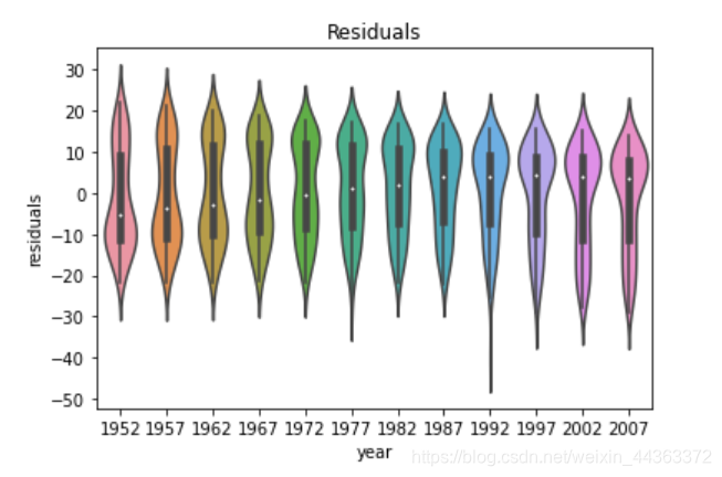
制作模型残缺随时间变化的小提琴图
model = LinearRegression()
model = model.fit(x1,y)
res = model.predict(x1)
for i in range(0,1704):res[i] = temp1[i] - res[i]
data['residuals'] = res
sns.violinplot(x='year', y='residuals', showmeans=True, data=data)
plt.title('Residuals')
plt.show()
效果图
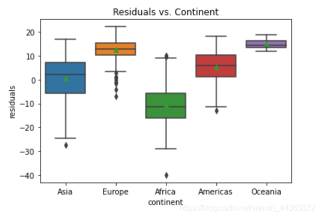
制作残缺随各大洲变化的boxplot图
sns.boxplot(x='continent', y='residuals',showmeans=True, data=data)
plt.title('Residuals vs. Continent')
plt.show()
效果图
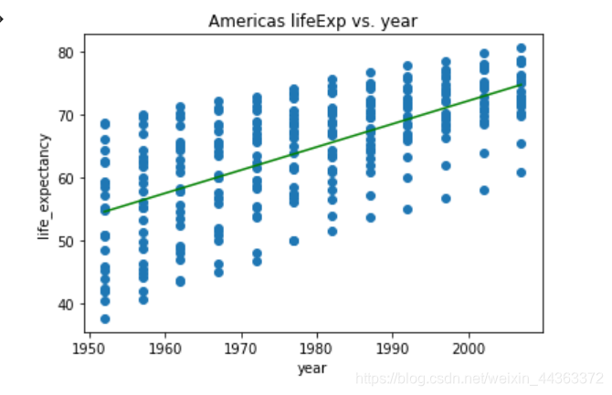
接下来我将把每个大洲的国家分在一起然后分别制作出每个大洲国家的预计寿命和时间的关系
grouped = data.groupby(['continent'])
group_Africa = grouped.get_group('Africa')
group_Americas = grouped.get_group('Americas')
group_Asia = grouped.get_group('Asia')
group_Europe = grouped.get_group('Europe')
group_Oceania = grouped.get_group('Oceania')
group_Africa.plot.scatter(x='year', y='lifeExp', title='Africa lifeExp vs. year')
afr_year = group_Africa['year'].astype(float).values.reshape(-1,1)
afr_life = group_Africa['lifeExp'].values
afr_model = LinearRegression()
afr_model.fit(afr_year, afr_life)
plt.plot(group_Africa['year'], afr_model.predict(afr_year),'g-')
plt.show()
ame_year = group_Americas['year'].astype(float).values.reshape(-1,1)
ame_life = group_Americas['lifeExp'].values
model_Ame = LinearRegression()
model_Ame.fit(ame_year,ame_life)
plt.plot(group_Americas['year'],model_Ame.predict(ame_year), 'g-')
plt.scatter(group_Americas['year'],group_Americas['lifeExp'])
plt.title("Americas lifeExp vs. year")
plt.xlabel("year")
plt.ylabel("life_expectancy")
plt.show()
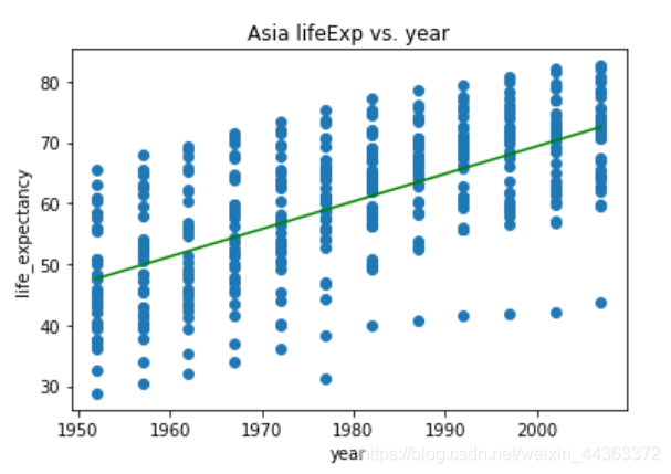
asi_year = group_Asia['year'].astype(float).values.reshape(-1,1)
asi_life = group_Asia['lifeExp'].values
model_Asi = LinearRegression()
model_Asi.fit(asi_year,asi_life)
plt.plot(group_Asia['year'],model_Asi.predict(asi_year), 'g-')
plt.scatter(group_Asia['year'],group_Asia['lifeExp'])
plt.title("Asia lifeExp vs. year")
plt.xlabel("year")
plt.ylabel("life_expectancy")
plt.show()
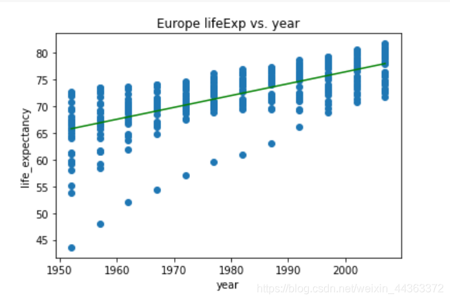
eur_year = group_Europe['year'].astype(float).values.reshape(-1,1)
eur_life = group_Europe['lifeExp'].values
model_Eur = LinearRegression()
model_Eur.fit(eur_year,eur_life)
plt.plot(group_Europe['year'],model_Eur.predict(eur_year), 'g-')
plt.scatter(group_Europe['year'],group_Europe['lifeExp'])
plt.title("Europe lifeExp vs. year")
plt.xlabel("year")
plt.ylabel("life_expectancy")
plt.show()
oce_year = group_Oceania['year'].astype(float).values.reshape(-1,1)
oce_life = group_Oceania['lifeExp'].values
model_Oce = LinearRegression()
model_Oce.fit(oce_year,oce_life)
plt.plot(group_Oceania['year'],model_Oce.predict(oce_year), 'g-')
plt.scatter(group_Oceania['year'],group_Oceania['lifeExp'])
plt.title("Oceania lifeExp vs. year")
plt.xlabel("year")
plt.ylabel("life_expectancy")
plt.show()
效果图

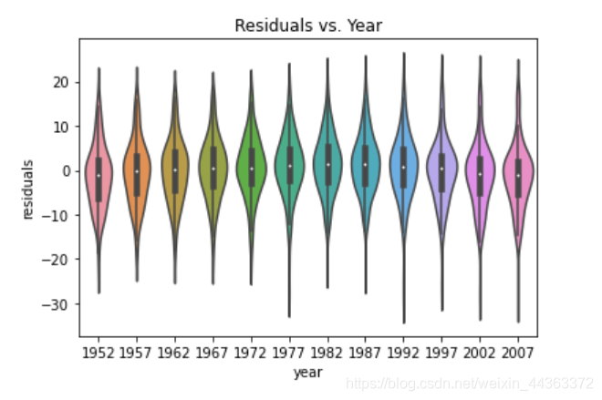
最后我制作了模型残缺随时间变化的小提琴图。
residual = poly_model.resid
residual = np.array(residual)
sns.violinplot(x='year', y=residual, showmeans=True, data=data)
plt.title("Residuals vs. Year")
plt.ylabel("residuals")
plt.show()
效果图
本文来自互联网用户投稿,文章观点仅代表作者本人,不代表本站立场,不承担相关法律责任。如若转载,请注明出处。 如若内容造成侵权/违法违规/事实不符,请点击【内容举报】进行投诉反馈!