CSS 各种百分比是基于什么工作的?
大家有没有对 CSS 中的百分比是如何工作的感兴趣?有没有想过,为什么它有时会乱七八糟,没啥头绪?反正我是有,所以今天分享这篇文章,对自己来说是加深理解,同时也希望对大家有所帮助。
什么百分比?
作为百分比,显然应该有一个目标作为参考源,这个参考一般是父元素。 这是正确的,但并不涵盖所有情况。 最正确的答案应该是包含块(containing block),即包含我们元素的块且它不必是直接的父元素。
看看下面的例子:
代码如下:
<!DOCTYPE html>
<html lang="en"><head><meta charset="utf-8"><title>css百分比</title><link rel="stylesheet" href="css/swiper.min.css"><link rel="stylesheet" href="css/certify.css"><script src="js/swiper.min.js"></script></head><body><div class="grandparent"><div class="parent"><div class="child"></div></div></div>
</body></html><style>.grandparent {position: relative;width: 200px;height: 200px;background: #eaeaea;}.parent {width: 100px;height: 100px;background: #aaa;}.child {position: absolute;width: 50%;height: 50%;top: 25%;left: 25%;background: red;}
</style>
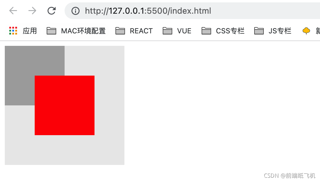
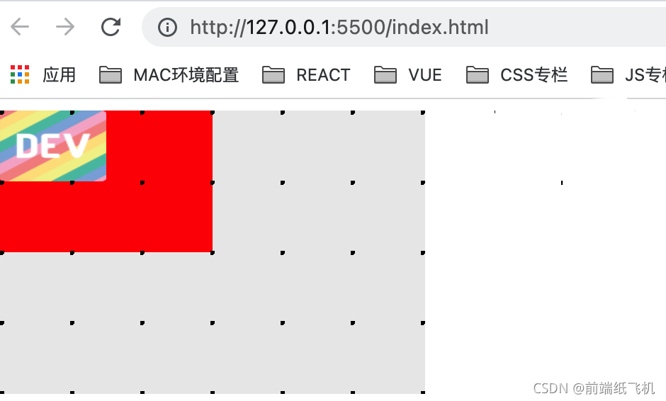
在上面的例子中,我创建了 3 个嵌套 div,它们是具有以下特征的3个正方形
- 最外面的组元
div是一个浅灰色,大小为4x4 - 父元素
div的颜色为深灰色,大小为2x2 - 以及分配
50%大小的红色子div
如果百分比单位以父级为来源,则子级的大小应该是它的 1/2,但上面的不是,子级的大小实际上等于父级,也就是祖父级的 1/2。 原因是祖父级 div 是子级 div 的真正包含块,因为子级具有 position: absolute ,对应于在祖父级中设置的 position:relative 。
因此,为了确定哪个是元素的实际包含块,它完全基于元素本身的 position 属性。
但是,对于某些属性,百分比单元的引用源既不是父块也不是包含块,而是它本身—— 自身元素。
百分比的属性
width/height
如上面的例子中看到的,当一个元素为其宽度分配一个百分比值时, width 是基于包含块的 width, height 是基于包含块的 height。
padding
对于 padding,垂直(padding-top/padding-bottom)或水平(padding-left/padding-right)都是基于包含块的 width 来计算。
来个例子:

代码如下:
<!DOCTYPE html>
<html lang="en"><head><meta charset="utf-8"><title>css百分比</title><link rel="stylesheet" href="css/swiper.min.css"><link rel="stylesheet" href="css/certify.css"><script src="js/swiper.min.js"></script></head><body><div class="grandparent"><div class="parent"><div class="child"></div></div></div>
</body></html><style>.parent {background: #eaeaea;width: 300px;height: 200px;}.child {display: inline-block;background: red;padding-top: 50%;padding-left: 50%;}.parent {position: relative;}.grandparent {position: relative;}.grandparent::before {content: "";position: absolute;top: 0;left: 0;right: 0;bottom: 0;z-index: 99;background: radial-gradient(circle at 1px 1px, #000 2px, transparent 0);background-size: 49.5px 49.5px;}
</style>
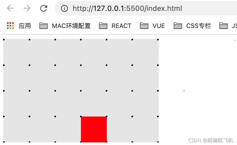
在这个例子中:
- 父
div的大小为6x4。 - 子
div的大小为 0,但padding-top和padding-left分别为50%
最后的结果是,子元素的大小相当于父级元素 1/2 宽度,也就是一个 3x3 的正方形。
margin
与 padding,margin 的百分比(垂直和水平)也是相对于包含块的宽度来计算。
来个例子:
代码如下:
<!DOCTYPE html>
<html lang="en"><head><meta charset="utf-8"><title>css百分比</title><link rel="stylesheet" href="css/swiper.min.css"><link rel="stylesheet" href="css/certify.css"><script src="js/swiper.min.js"></script></head><body><div class="grandparent"><div class="parent"><div class="child"></div></div></div>
</body></html><style>.parent {background: #eaeaea;width: 300px;height: 200px;}.child {display: inline-block;background: red;width: 50px;height: 50px;margin-top: 50%;margin-left: 50%;}.parent {position: relative;}.grandparent {position: relative;}.grandparent::before {content: "";position: absolute;top: 0;left: 0;right: 0;bottom: 0;z-index: 99;background: radial-gradient(circle at 1px 1px, #000 2px, transparent 0);background-size: 49.5px 49.5px;}
</style>
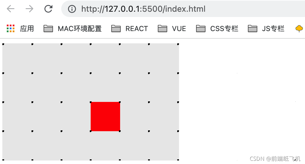
在这个例子中:
- 父级
div的大小为6x4。 margin-top和margin-left分别为50%
其结果是,子元素被定位在离父级元素的上边距和左边距3个单位的地方(父级宽度的1/2)。
top/bottom/left/right
top、bottom 基于包含块的 height 来计算,left、right 基于包含块的width来计算。
来个例子:
代码如下:
<!DOCTYPE html>
<html lang="en"><head><meta charset="utf-8"><title>css百分比</title><link rel="stylesheet" href="css/swiper.min.css"><link rel="stylesheet" href="css/certify.css"><script src="js/swiper.min.js"></script></head><body><div class="grandparent"><div class="parent"><div class="child"></div></div></div>
</body></html><style>.parent {position: relative;background: #eaeaea;width: 300px;height: 200px;}.child {position: absolute;background: red;width: 16.67%;height: 25%;top: 50%;left: 50%;}.parent {position: relative;}.grandparent {position: relative;}.grandparent::before {content: "";position: absolute;top: 0;left: 0;right: 0;bottom: 0;z-index: 99;background: radial-gradient(circle at 1px 1px, #000 2px, transparent 0);background-size: 49.5px 49.5px;}
</style>
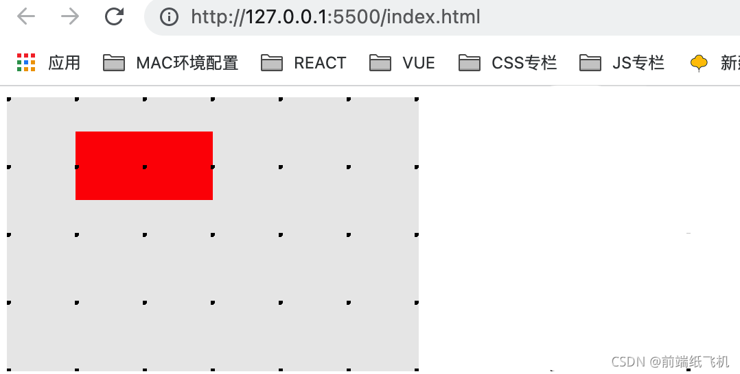
在这个事例中:
- 父级
div的大小为6x4 - 子元素有
position: absolute,top和left分别为50%
最终结果,子 div 被定位在离父 div 的顶部边缘 2 个单位的位置(父 div 高度的 1/2),并被定位在离父 div 的左侧边缘 3 个单位的位置(父 div 宽度的 1/2)。
transform: translate()
一个用于动画/过渡的不可思议的属性,它也支持百分比值。然而,这个属性并不指其包含的块,而是指其自身。
来个例子:
代码如下:
<!DOCTYPE html>
<html lang="en"><head><meta charset="utf-8"><title>css百分比</title><link rel="stylesheet" href="css/swiper.min.css"><link rel="stylesheet" href="css/certify.css"><script src="js/swiper.min.js"></script></head><body><div class="grandparent"><div class="parent"><div class="child"></div></div></div>
</body></html><style>.parent {background: #eaeaea;width: 300px;height: 200px;}.child {background: red;width: 100px;height: 50px;transform: translate(50%, 50%);}.parent {position: relative;}.grandparent {position: relative;}.grandparent::before {content: "";position: absolute;top: 0;left: 0;right: 0;bottom: 0;z-index: 99;background: radial-gradient(circle at 1px 1px, #000 2px, transparent 0);background-size: 49.5px 49.5px;}
</style>
在这个事例中:
- 父级
div的大小为6x4。 - 子
div的大小为2x1,使用transform: translate(50%, 50%)
最后结果,子 div 被定位在离父 div 的顶部边缘 0.5 个单位的位置(自身高度的 1/2),并被定位在离父 div 的左侧边缘 1 个单位的位置(自身宽度的 1/2)。
background-size
background-size 属性将百分比单元的复杂性提升到一个新的水平
此属性的百分比值指的是背景定位区域,类似于包含块,但添加了以下 3 个因素:
- 只有内容的块(
content-box) - 带有内容和
padding的块 (padding-box) - 带有内容、
padding和border的块(border-box)
这三个值是由 background-origin 给出,具体看 MDN。
来个例子:
代码如下:
<!DOCTYPE html>
<html lang="en"><head><meta charset="utf-8"><title>css百分比</title><link rel="stylesheet" href="css/swiper.min.css"><link rel="stylesheet" href="css/certify.css"><script src="js/swiper.min.js"></script></head><body><div class="grandparent"><div class="parent"><div class="child"></div></div></div>
</body></html><style>.parent {background: #eaeaea;width: 300px;height: 200px;}.child {background-image: url(https://media.mybj123.com/wp-content/uploads/2021/09/1632706681-f60540cafc9989b.png);background-size: 50% 50%;background-repeat: no-repeat;background-color: red;width: 50%;height: 50%;}.parent {position: relative;}.grandparent {position: relative;}.grandparent::before {content: "";position: absolute;top: 0;left: 0;right: 0;bottom: 0;z-index: 99;background: radial-gradient(circle at 1px 1px, #000 2px, transparent 0);background-size: 49.5px 49.5px;}
</style>
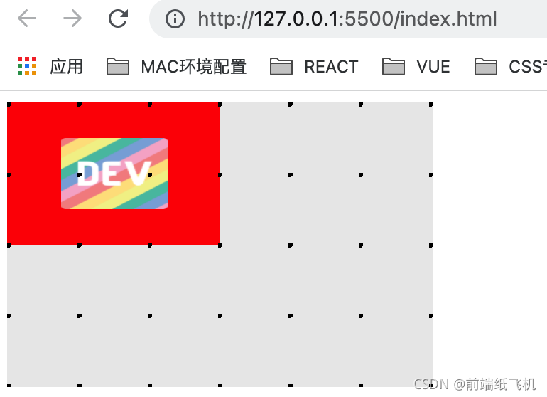
在这个例子中:
- 父
div的大小为6x4 - 子
div的大小为3x2,没有padding,没有border - 这里使用了一个DEV logo(比例为
1:1)作为子div的背景图像,背景大小属性设置为50% 50%
其结果是,背景图像被拉伸为 1.5 x 1 的大小。
background-position
与 background-size 类似,background-position 属性的百分比也依赖于背景定位区域。
来个例子:
代码如下:
<!DOCTYPE html>
<html lang="en"><head><meta charset="utf-8"><title>css百分比</title><link rel="stylesheet" href="css/swiper.min.css"><link rel="stylesheet" href="css/certify.css"><script src="js/swiper.min.js"></script></head><body><div class="grandparent"><div class="parent"><div class="child"></div></div></div>
</body></html><style>.parent {background: #eaeaea;width: 300px;height: 200px;}.child {background-image: url(https://d2fltix0v2e0sb.cloudfront.net/dev-rainbow.png);background-size: 50% 50%;background-position: 50% 50%;background-repeat: no-repeat;background-color: red;width: 50%;height: 50%;}.parent {position: relative;}.grandparent {position: relative;}.grandparent::before {content: "";position: absolute;top: 0;left: 0;right: 0;bottom: 0;z-index: 99;background: radial-gradient(circle at 1px 1px, #000 2px, transparent 0);background-size: 49.5px 49.5px;}
</style>
在这个例子中:
在本例中,使用了与前面相同的图像和布局。当我们改变background-position的值时,可以看到一些变化:
- 如果没有任何值(默认值为
0 0),背景图像将位于左上角。 - 使用 background-position:
0 50%,背景图片被定位在左边中间。 - 使用 background-position:
50% 50%,背景图片被定位在中心。 - 使用 background-position: 1
00% 100%,背景图片被定位在右下方。
注意: background-position: 0 50% 是下面的缩写:
background-position-x: 0background-position-y: 50%
显然,这个属性的百分比背后有一些计算,而不仅仅是图像的顶部和左侧边缘与孩子的距离。通过一些研究和测试,似乎 background-position 属性在产生一个实际值之前依赖于以下计算。
offset X = (容器的宽度-图像的宽度) * background-position-x
offset Y = (容器的高度-图像的高度) * background-position-y
在这种情况下:
- 容器作为子
div - 图像的宽度/高度是
background-size的结果。
font-size
对于 font-size ,百分比值仅指向它的直接父块。
来个例子:
代码如下:
<!DOCTYPE html>
<html lang="en"><head><meta charset="utf-8"><title>css百分比</title><link rel="stylesheet" href="css/swiper.min.css"><link rel="stylesheet" href="css/certify.css"><script src="js/swiper.min.js"></script></head><body><div class="grandparent">font-size: 13px<div class="parent">font-size: 26px<div class="child">font-size: 50%</div></div></div>
</body></html><style>.grandparent {position: relative;background: #eaeaea;width: 200px;height: 200px;font-size: 13px;}.parent {background: #aaa;width: 100px;height: 100px;font-size: 26px;}.child {position: absolute;background: red;color: #fff;width: 50%;height: 50%;top: 25%;left: 25%;font-size: 50%;}
</style>
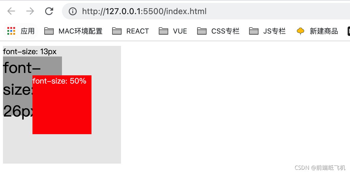
在这个例子中,我使用与第一个例子相同的布局,字体大小分配如下。
- grandparent 13px
- parent 26px
- child 50%
我们可以清楚地看到,child 的字体大小现在与 grandparent 一样,是 parent 的1/2。
结语
以上就为“CSS 各种百分比是基于什么工作的?”的全部内容,希望大家阅读后能有所收获。
本文来自互联网用户投稿,文章观点仅代表作者本人,不代表本站立场,不承担相关法律责任。如若转载,请注明出处。 如若内容造成侵权/违法违规/事实不符,请点击【内容举报】进行投诉反馈!