HTMLCSS实现导航栏滑动背景效果
大家可以先看一下背景滚动的效果

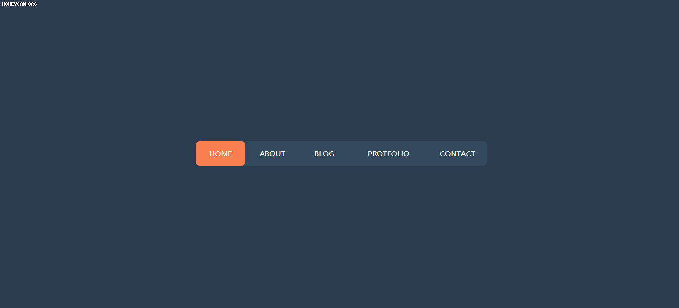
这个效果需要注意的就是鼠标悬浮的时机hover,鼠标在悬浮到不同的选项上时,背景的那个色块距离左侧的边距会发生改变。在鼠标离开导航栏时,色块会返回到你定义的那个位置(这个位置在实际的开发中,肯定是当前页面的位置,这个位置你可以自行更改)。
下面是代码部分:
html部分:
<div class="container"><nav><a href="#">homea><a href="#">abouta><a href="#">bloga><a href="#">protfolioa><a href="#">contacta><div class="animation start-home">div> nav>
div>
下面是css代码部分
* {margin: 0;padding: 0;}body {background-color: rgb(45, 60, 80);display: flex;justify-content: center;align-items: center;height: 800px;}nav {width: 590px;height: 50px;background-color: rgb(51, 73, 94);position: relative;border-radius: 8px;box-shadow: 0 2px 3px rgba(0, 0, 0, 0.1);}nav a {position: relative;display: block;float: left;font-size: 15px;line-height: 50px;width: 100px;height: 50px;color: #fff;text-transform: uppercase;text-decoration: none;text-align: center;z-index: 10;}nav a:nth-child(1) {width: 100px;}nav a:nth-child(2) {width: 110px;}nav a:nth-child(3) {width: 100px;}nav a:nth-child(4) {width: 160px;}nav a:nth-child(5) {width: 120px;}nav .animation {position: absolute;height: 100%;background-color: #f97f51;z-index: 9;border-radius: 8px;transition: all 0.3s;}/* 这个地方控制背景色块的起始位置 */.start-home,nav a:nth-child(1):hover~.animation {width: 100px;left: 0;}nav a:nth-child(2):hover~.animation {width: 110px;left: 100px;}nav a:nth-child(3):hover~.animation {width: 100px;left: 210px;}nav a:nth-child(4):hover~.animation {width: 160px;left: 310px;}nav a:nth-child(5):hover~.animation {width: 120px;left: 470px;}
下面就是完整的代码部分,需要的小伙伴直接复制就可以了。
<html><head><meta charset="utf-8" /><title>title><style type="text/css">* {margin: 0;padding: 0;}body {background-color: rgb(45, 60, 80);display: flex;justify-content: center;align-items: center;height: 800px;}nav {width: 590px;height: 50px;background-color: rgb(51, 73, 94);position: relative;border-radius: 8px;box-shadow: 0 2px 3px rgba(0, 0, 0, 0.1);}nav a {position: relative;display: block;float: left;font-size: 15px;line-height: 50px;width: 100px;height: 50px;color: #fff;text-transform: uppercase;text-decoration: none;text-align: center;z-index: 10;}nav a:nth-child(1) {width: 100px;}nav a:nth-child(2) {width: 110px;}nav a:nth-child(3) {width: 100px;}nav a:nth-child(4) {width: 160px;}nav a:nth-child(5) {width: 120px;}nav .animation {position: absolute;height: 100%;background-color: #f97f51;z-index: 9;border-radius: 8px;transition: all 0.3s;}.start-home,nav a:nth-child(1):hover~.animation {width: 100px;left: 0;}nav a:nth-child(2):hover~.animation {width: 110px;left: 100px;}nav a:nth-child(3):hover~.animation {width: 100px;left: 210px;}nav a:nth-child(4):hover~.animation {width: 160px;left: 310px;}nav a:nth-child(5):hover~.animation {width: 120px;left: 470px;}style>head><body><div class="container"><nav><a href="#">homea><a href="#">abouta><a href="#">bloga><a href="#">protfolioa><a href="#">contacta><div class="animation start-home">div>nav>div>body>
html>
最后,整理不易,走过路过的小伙伴们,留个赞再走吧。

本文来自互联网用户投稿,文章观点仅代表作者本人,不代表本站立场,不承担相关法律责任。如若转载,请注明出处。 如若内容造成侵权/违法违规/事实不符,请点击【内容举报】进行投诉反馈!